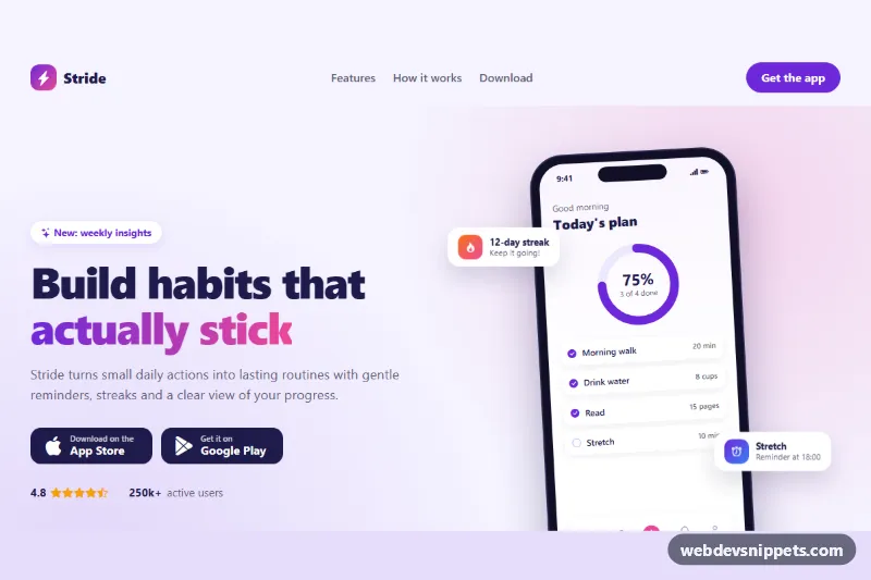
A complete Bootstrap 5 landing page for a mobile app, built around a CSS-only phone mockup with a live-looking app screen, floating notification cards and App Store and Google Play buttons. Use it to launch a consumer app, a side project or a beta waitlist page without any image assets.
How it works
Everything sits inside .bal-page. The header uses a standard Bootstrap navbar navbar-expand-lg with a collapse menu, so the hamburger button works through the auto-loaded Bootstrap bundle and no custom JavaScript is needed.
The hero is a two-column row: the text column holds the .bal-eyebrow badge, the headline with a gradient .bal-highlight, the .bal-stores download buttons and the .bal-proof rating line. The second column contains .bal-device, which wraps the .bal-phone frame. The phone is drawn entirely with CSS: an aspect-ratio body, a pill-shaped .bal-phone__notch and a .bal-screen with a status bar, a progress ring, a habit list and a tab bar. The ring is an inline SVG whose .bal-ring__value circle uses stroke-dashoffset calculated from the --bal-progress custom property. Two .bal-float cards bob next to the phone from the sm breakpoint up.
Below the hero follow a six-card .bal-features grid, a three-step .bal-steps list, a gradient .bal-cta box with light store buttons and a simple .bal-footer.
Customization
--bal-accent,--bal-accent-hoverand--bal-accent-rgbin.bal-page: recolor buttons, icons, the progress ring and focus shadows.--bal-pinkin.bal-page: change the second gradient color used in the logo mark, headline highlight, step numbers and CTA box.--bal-progressin.bal-page: set the ring fill from 0 to 100; update the.bal-ring__labeltext to match.--bal-phone-widthin.bal-page: make the phone mockup larger or smaller.transform: rotate(-3deg)in.bal-phone: remove it for an upright phone.- The
.bal-habititems: replace them with screens from your own app; add.bal-habit--doneto mark one as completed. - Delete either
.bal-floatelement to show only one floating card. - The
hrefof each.bal-storelink: point them to your real store listings.
Accessibility
A visually hidden skip link jumps to #bal-main. The navbar has aria-label="Main" and the toggler exposes aria-controls and aria-expanded. The decorative phone screen is hidden from screen readers and the .bal-phone element carries role="img" with a short description instead. Each section is labelled by its heading, the steps are an ordered list and the star rating has a visually hidden text equivalent. Links and buttons get a high-contrast pink focus outline, and prefers-reduced-motion: reduce disables the floating animation and hover lifts.
Usage notes
Requires Bootstrap 5 (CSS and JS bundle for the mobile menu) and Bootstrap Icons. All colors are defined on .bal-page, so you can drop the page into any layout without touching global styles.