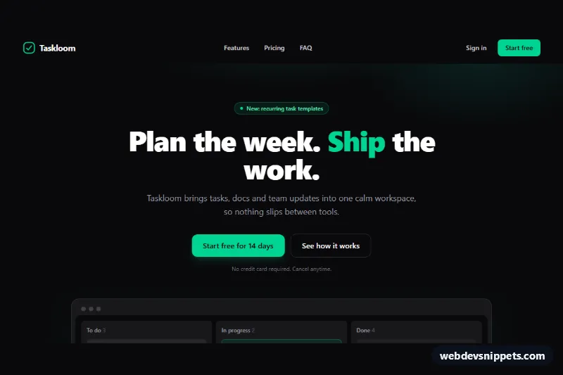
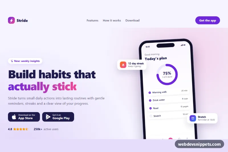
A complete SaaS landing page template built with Tailwind CSS and a few lines of vanilla JavaScript. It stacks every section a product launch needs: a dark hero with a drawn product preview, a social-proof strip, a six-item feature grid, a three-plan pricing table with a monthly/yearly switch, an FAQ and a footer.
How it works
The root is .tsl-page, a full-page wrapper with a skip link that jumps to #tsl-main. The header holds the logo, the desktop navigation and a hamburger button marked data-tsl-menu-toggle, which controls the #tsl-mobile-menu panel through aria-controls. The hero (.tsl-hero) uses a ::before pseudo element in style.css to paint a soft emerald radial glow, and the "app window" below the buttons is made of plain div blocks, so there is no image to load.
Pricing lives in .tsl-pricing. Two buttons with data-tsl-billing="monthly" and data-tsl-billing="yearly" act as a segmented control: the script flips their aria-pressed state and copies the data-monthly or data-yearly value of every [data-tsl-price] element into its text, then adds the tsl-price-swap class for a short fade. The FAQ uses native details and summary elements (.tsl-faq-item), so it opens and closes without JavaScript; the plus icon rotates through the group-open:rotate-45 utility.
The script initializes every .tsl-page on DOMContentLoaded. The mobile menu closes when a link is chosen, on Escape and when the viewport grows past the md breakpoint.
Customization
emerald-400utilities (buttons, badge, highlighted plan ring): replace withsky-400oramber-400to rebrand the whole page.data-monthlyanddata-yearlyon each[data-tsl-price]: set your own prices; the switch picks them up automatically.lg:-mt-4andring-2 ring-emerald-400on the middlearticle: move them to another plan to change which tier is featured.radial-gradientvalues in.tsl-hero::before: adjust size, position or opacity of the hero glow, or delete the rule for a flat background.- Add or remove
details.tsl-faq-itemblocks; add theopenattribute to any item that should start expanded. sm:grid-cols-2 lg:grid-cols-3on the feature list: switch tolg:grid-cols-4for a denser grid.
Accessibility
Landmarks (header, nav, main, footer) and a skip link make the page easy to navigate. The menu button exposes aria-expanded and a label that changes between "Open menu" and "Close menu". The billing buttons sit in a role="group" with aria-pressed, and price changes are announced through the visually hidden [data-tsl-billing-status] live region. Every link and button shows an emerald focus outline, decorative SVGs are aria-hidden, and smooth scrolling plus the price animation are disabled under prefers-reduced-motion: reduce.
Usage notes
This is a full-page template, so style.css sets scroll-behavior on html. The ids (tsl-main, tsl-mobile-menu and the section ids) are meant for one page per document.