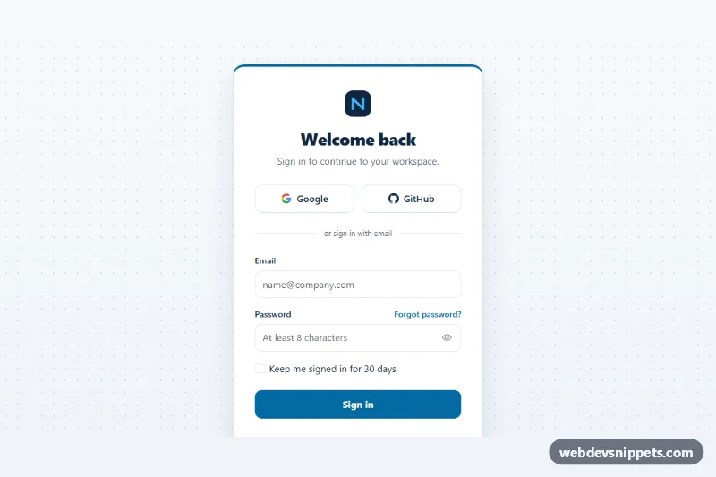
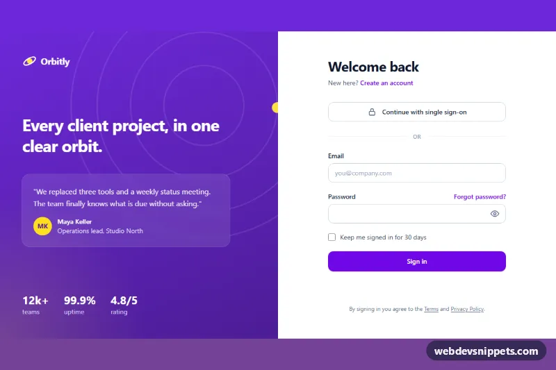
A full-page Bootstrap 5 sign-in screen with a centered card, Google and GitHub buttons, email and password fields with validation, a show/hide password toggle, a Caps Lock warning and a "keep me signed in" option. Use it as the login page of a SaaS app, an admin panel or a member area.
How it works
The root is main.blc-page, a full-height flex container that centers its content on a dotted background. Inside, .blc-wrap limits the width and holds the .blc-card and the .blc-legal links below it. The card starts with an inline SVG .blc-logo, the heading and a short subtitle, followed by the two .blc-sso__btn buttons in a two-column grid and a .blc-divider with the text "or sign in with email".
The .blc-form uses novalidate and native constraints: type="email" with a pattern that requires a dot in the domain, and minlength="8" on the password. On submit the script adds Bootstrap's was-validated class, sets aria-invalid and aria-describedby on each .blc-input and focuses the first invalid field. A valid form shows a spinner in .blc-submit, then resets and shows the .blc-alert success message.
The .blc-pass__toggle button switches the password field between password and text and updates its icon, aria-pressed and aria-label. On keydown and keyup in the password field the script reads getModifierState('CapsLock') and shows the .blc-caps warning when Caps Lock is on.
Customization
--blc-accent,--blc-accent-hoverand--blc-accent-rgbin.blc-page: recolor the top border of the card, the submit button, links, the checkbox and focus rings.--blc-bgand--blc-dotin.blc-page: change the page background and the dot pattern, or set--blc-dottotransparentfor a plain background.--blc-widthin.blc-page: make the card wider or narrower.--blc-radiusin.blc-page: adjust how round the card corners are.minlength="8"on#blc-password: change the minimum password length and update the text of#blc-password-error.- Remove one
.blc-sso__btn, or the whole.blc-ssogrid and.blc-divider, if you only offer one sign-in method. - The
window.setTimeoutin the submit handler ofscript.js: replace it with afetch()to your authentication endpoint and redirect on success.
Accessibility
Every field has a visible label and the correct autocomplete value (username, current-password), so password managers work. Error messages are linked with aria-describedby only while a field is invalid, and the Caps Lock warning is linked while it is visible. The toggle button is a real button with aria-controls and aria-pressed. The success alert lives in a role="status" region, and during sign-in the submit button uses aria-disabled so focus stays on it. All controls show a clear blue focus outline.
Usage notes
Requires Bootstrap 5 and Bootstrap Icons. Client-side validation only helps users; always check the credentials on the server and protect the endpoint against brute-force attempts.