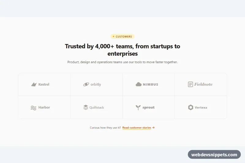
A client logo cloud built with Tailwind CSS: a short heading block followed by a bordered grid of eight company logos drawn as inline SVG placeholders. Use it under a hero, on a pricing page or next to testimonials to show social proof without loading any external images.
How it works
The root is section.tlc-logos, labelled by the #tlc-title heading. An amber "Customers" pill sits above it, and a short paragraph follows.
The logos live in a ul with role="list" (so Safari keeps the list semantics even though the bullets are removed). The grid shows two columns on phones and four from sm. It uses the gap-px technique: the list has a bg-stone-200 background and every li has its own bg-stone-50, so the 1px gaps become clean divider lines, and rounded-2xl with overflow-hidden rounds the outer corners.
Each logo is an svg with a 132×32 viewBox, a simple icon (wing, orbit, cloud, notebook, waves, stacked layers, leaf, hexagon) and a text wordmark. Every shape uses currentColor, so the whole logo is tinted by one text color class. By default all logos share a muted text-stone-400 for a calm, uniform look. The li is a group, and hovering a cell turns its background white and reveals a brand color through group-hover: classes such as group-hover:text-sky-600 and group-hover:text-violet-600. No JavaScript or custom CSS is needed.
Customization
- Replace an
svginside anliwith your client's SVG logo; setfill="currentColor"on its paths to keep the muted and hover colors working, and updatearia-label. text-stone-400on eachsvg: usetext-stone-500for stronger logos ortext-stone-300for a lighter cloud.group-hover:text-sky-600and the othergroup-hover:colors: set each to the real brand color, or remove them for a fully monochrome grid.grid-cols-2 sm:grid-cols-4on theul: addlg:grid-cols-6for twelve smaller logos, keeping the count a multiple of the column count so no gap cell remains.h-24 sm:h-28on eachli: make the cells taller or shorter.bg-stone-200on theulandbg-stone-50on the cells: change the divider and cell colors, or usegap-6and drop the borders for floating logos.bg-amber-100 text-amber-800on the pill andtext-amber-700on the link: switch the accent color.
Accessibility
Each logo has role="img" and an aria-label with the company name, so screen readers announce a clean name instead of reading the SVG text and shapes. The list keeps its item count for assistive technology. Decorative icons in the pill and link are aria-hidden. Hover effects are purely decorative and nothing important depends on them. Color transitions are removed with motion-reduce:transition-none, and the link shows a visible focus-visible outline in amber.
Usage notes
Only the Tailwind browser build is required; the snippet has no style.css or script.js. If you wrap logos in links to case studies, move the group and focus styles to the a element.