
Stats Section with Background Image
Bootstrap 5 stats section with four key numbers in glass cards over a darkened background photo, with a count-up animation on scroll.
Ready-made blocks for building landing pages and marketing sites.
47 component(s)
Bootstrap 5 stats section with four key numbers in glass cards over a darkened background photo, with a count-up animation on scroll.
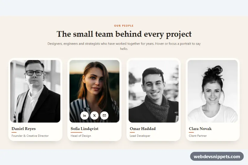
Pure CSS team section where grayscale portraits turn to full color, zoom in slightly and reveal social links on hover or keyboard focus.
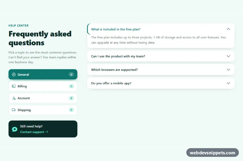
Bootstrap 5 FAQ section where category pills switch between separate accordion sets, with question counts and a support card.
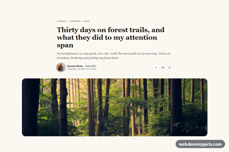
Bootstrap 5 article header with breadcrumb, serif headline, standfirst, author photo, date, reading time, share and save buttons and a wide cover photo.
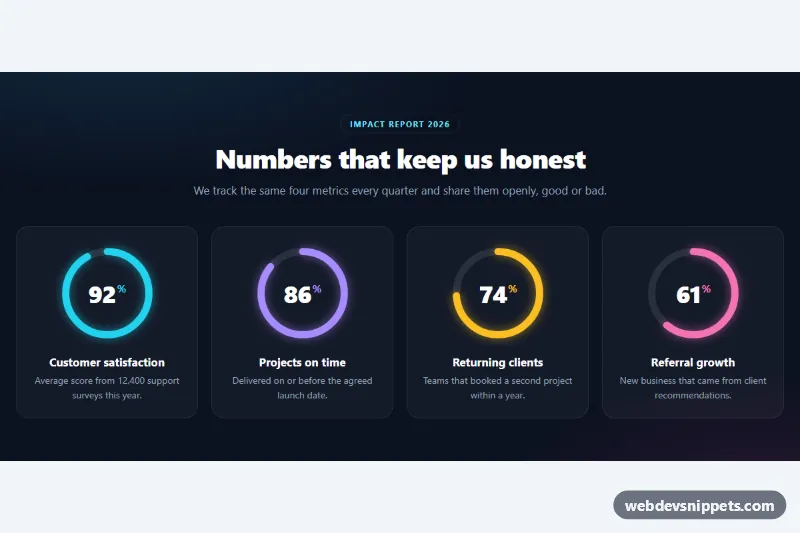
Dark stats section with four SVG circular progress rings that fill and count up to their percentage when scrolled into view.
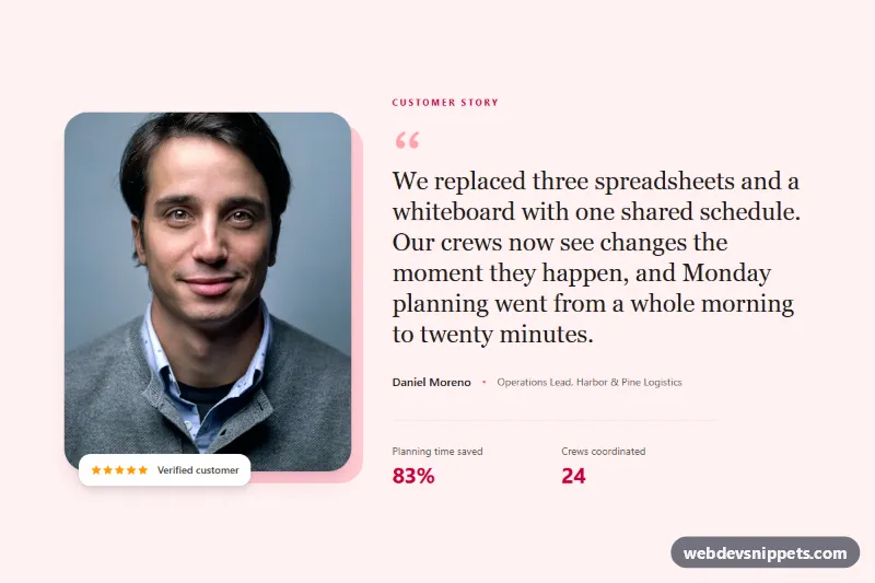
Featured Tailwind CSS testimonial with a large customer portrait, offset frame, serif quote, star rating and result metrics.
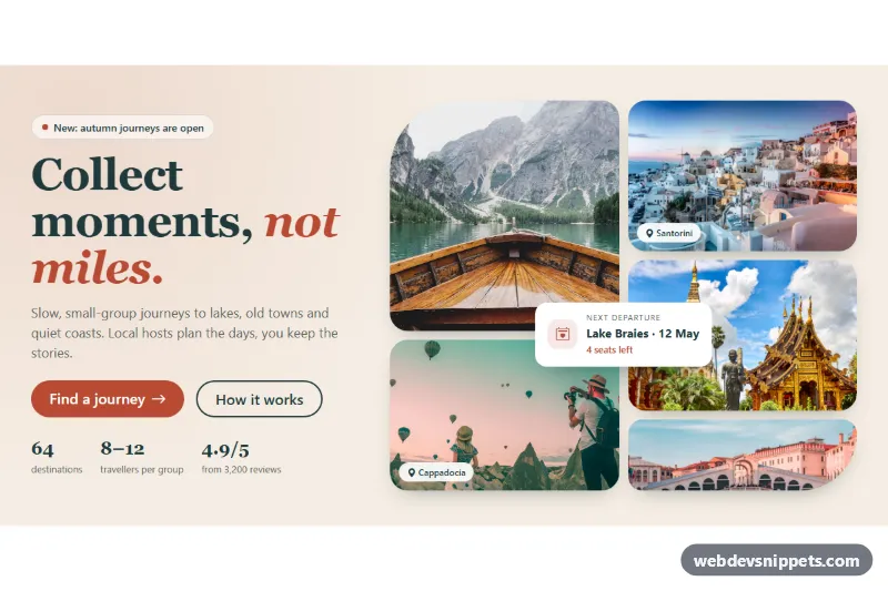
Bootstrap 5 hero section with a serif headline, call-to-action buttons and stats on the left and a five-photo collage grid with a floating card on the right.
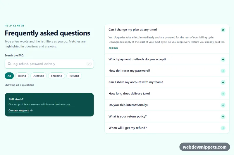
Tailwind CSS FAQ section with a live search box that filters questions as you type, highlights matches, adds topic chips and shows an empty state.
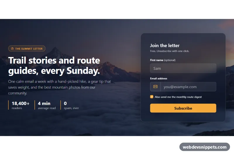
Bootstrap 5 newsletter signup section over a full-width mountain photo with a glass form card, email validation and a simulated subscribe state.
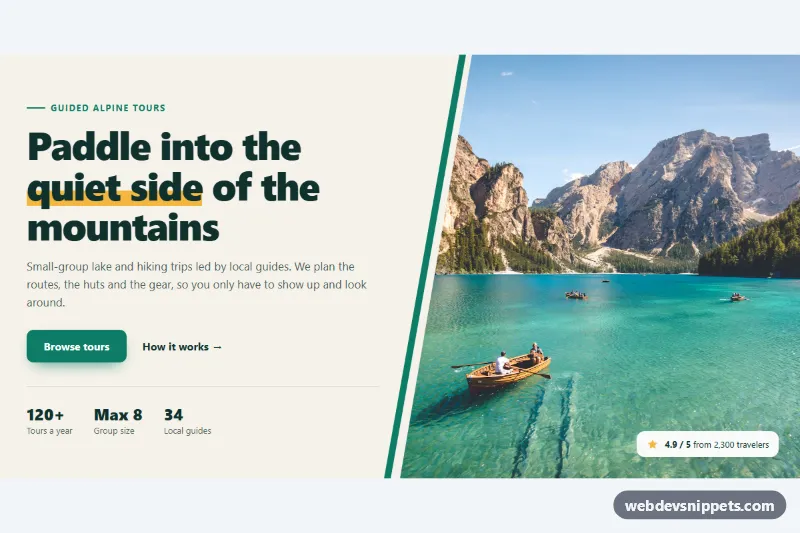
Pure CSS split hero with headline, buttons and stats beside a full-height photo cut on a diagonal with clip-path, plus an accent stripe and rating badge.
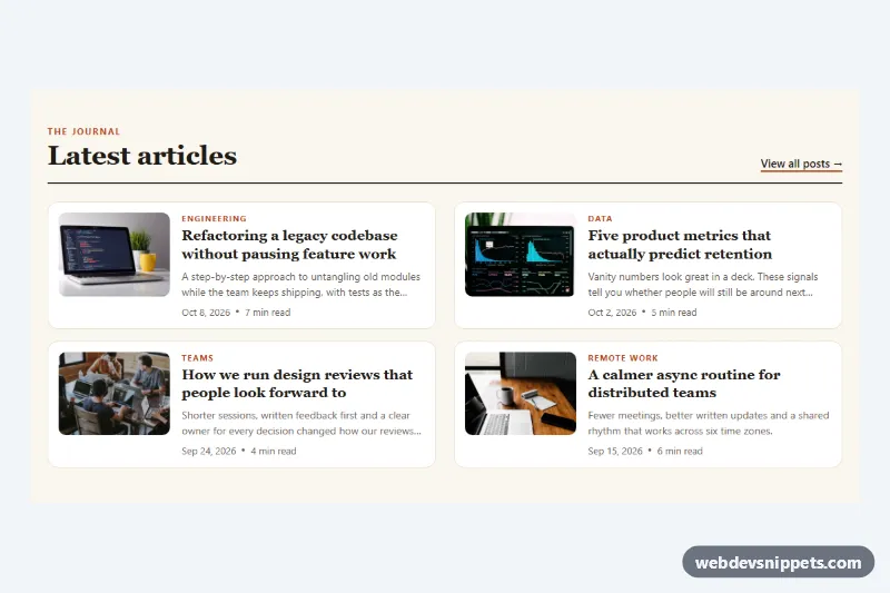
Compact pure CSS blog list with thumbnail images, category labels, clamped excerpts, dates and reading time, in one or two responsive columns.
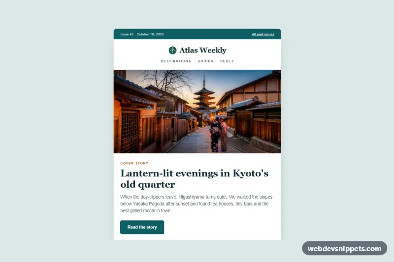
Travel magazine article digest in plain HTML and CSS with a cover photo, lead story, two-column photo articles, a feature block and a dark footer that stacks on mobile.
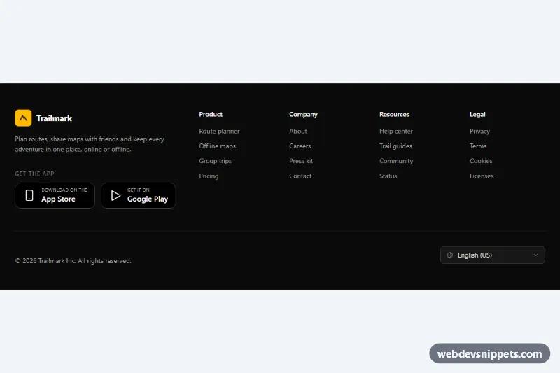
Dark Tailwind CSS footer with four link columns, App Store and Google Play badges, and a language select that remembers the choice.
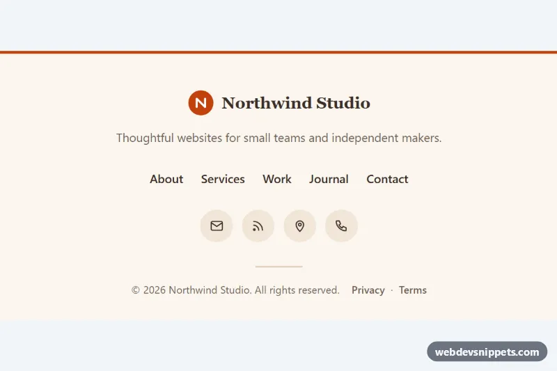
Minimal centered footer in pure CSS with a logo, tagline, links with animated underlines, round icon links and an auto-updating copyright year.
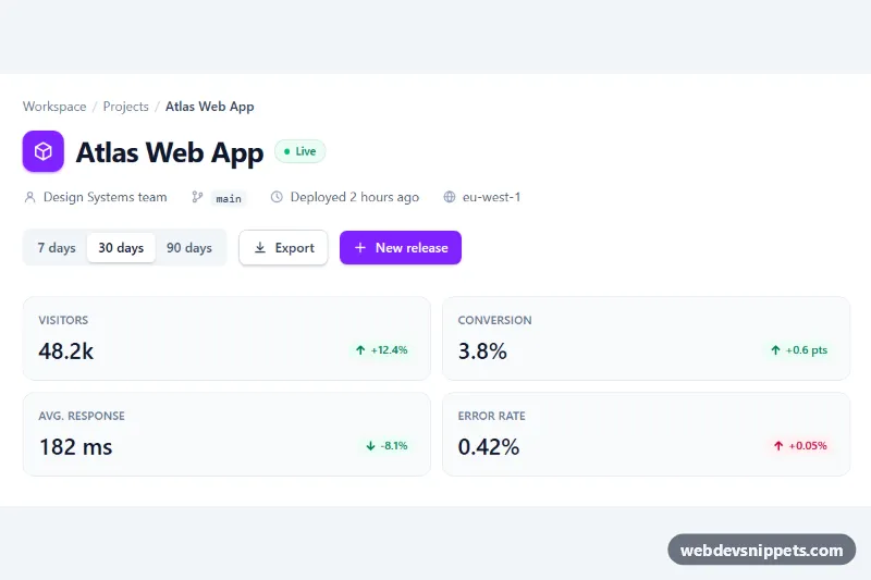
Tailwind CSS dashboard page header with breadcrumb, project meta info, action buttons and stat chips that update with a date range switch.
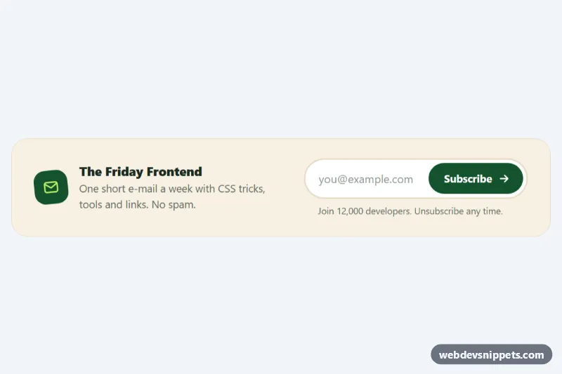
Compact pure CSS newsletter signup with a pill email field, an animated subscribe button and loading, error and success states.
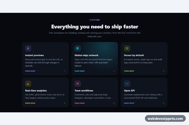
Dark pure CSS feature grid whose card borders and backgrounds light up with a colored glow that follows the mouse pointer.
Two-row infinite logo marquee with seamless CSS loop, edge fade, pause on hover, a pause button and a static fallback for reduced motion.
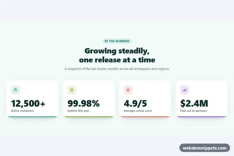
Stats section with four number cards that count up when scrolled into view, using IntersectionObserver, locale formatting and reduced-motion support.
Horizontally scrolling testimonial cards using CSS scroll snap, with star ratings, avatars and accessible previous and next buttons.
Dark hero section whose headline cycles through words with a slide-and-fade animation, a pause button and decorative stat cards.
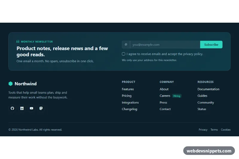
Dark Bootstrap 5 footer with a newsletter signup panel, email validation, social icons, three link columns and a legal bar.
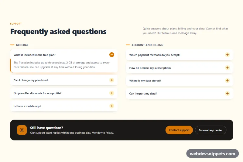
Bootstrap 5 FAQ section with questions split into two accordion columns, plus/minus icons and a dark contact support prompt.
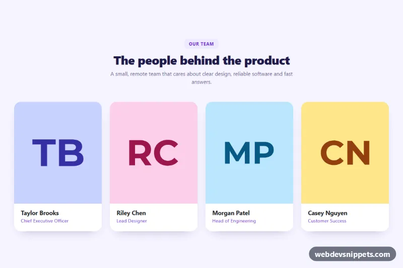
Bootstrap 5 team section with portrait cards that reveal a bio and social links on hover or keyboard focus. Pure CSS, no JavaScript.
Page sections are the large, reusable building blocks of a landing page or marketing site: the hero at the top, feature grids, testimonials, pricing teasers, stats, FAQs, contact blocks, newsletter signups, blog previews and the footer. Instead of designing every page from scratch, you stack a handful of well-built sections and adjust the copy, images and colours.
Start with a clear order: hero, problem or features, proof, details, final call to action, footer. Keep spacing consistent between sections so the page feels like one design, and reuse the same container width and heading scale throughout. Use one <h1> per page (usually in the hero) and a logical heading order inside each section, which helps both screen readers and search engines.
Make every section responsive by designing the mobile stack first: multi-column grids should collapse to a single column, images should use max-width: 100% and sensible loading="lazy" attributes below the fold, and buttons should remain large enough to tap. Check text contrast on coloured or image backgrounds, and give decorative images an empty alt attribute.
Sections are available for Bootstrap 6, Bootstrap 5, Tailwind CSS and pure CSS. The Bootstrap 6 alpha versions use theme-* colour roles, so switching a section to a different brand colour is mostly a matter of changing the theme. Filter by framework, open the live preview to see how a section behaves at different widths, and use the copy button or download to drop the HTML and CSS straight into your project. Mixing sections from the same framework gives you a complete, consistent landing page quickly.