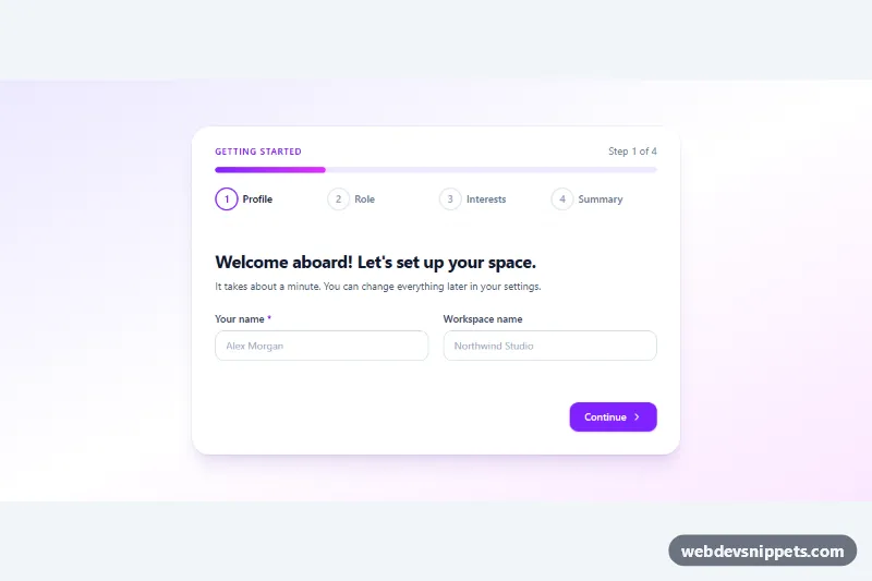
A four-step onboarding wizard built with Tailwind CSS and a small vanilla JavaScript controller. It welcomes a new user, asks for a name, a role and a few interests, then shows an editable summary before finishing: the kind of first-run flow you see in SaaS dashboards, team tools and productivity apps.
How it works
The root is .tow-wizard. The header holds a step counter (data-tow-counter), a role="progressbar" track whose fill is .tow-bar, and an ordered list of four data-tow-step items. Each item carries data-state="done|current|upcoming", and Tailwind's group-data-[state=current]: and group-data-[state=done]: variants restyle the numbered circle.
The form (data-tow-form) contains four data-tow-panel sections, a success section (data-tow-done) and the navigation bar (data-tow-nav) with Back, Continue and Finish buttons. Radio cards and checkbox chips use has-[:checked]: utilities, so their selected look needs no JavaScript.
On DOMContentLoaded the script initializes every .tow-wizard. Continue validates the current panel: every element with data-tow-required must have a value (text inputs) or a checked input (fieldsets). The attribute value is the error message, written into the panel's data-tow-error paragraph. On success show() hides the other panels, updates the step states, the counter, aria-valuenow and the --tow-progress custom property that sizes .tow-bar, then moves focus to the new panel heading. On the last step the data-tow-summary fields are filled from the form values, and data-tow-goto buttons jump back to a step. Submitting simulates a request with a 900 ms timeout and then reveals the success state; replace that timeout in script.js with fetch() and send new FormData(form).
Customization
data-tow-requiredon an input or fieldset: makes the field mandatory and sets the error text shown below the panel.- Add a new
data-tow-panelsection plus a matchingdata-tow-stepitem and the counter, progress bar and step states adapt automatically; setdata-tow-labelfor the progress bar's spoken text. data-tow-summary="name"on any element in the last panel: shows the value of the form field with thatname;data-tow-emptysets the fallback text.from-violet-100 via-white to-fuchsia-100on.tow-wizard: change the page gradient, and swapvioletin the buttons and chips for another Tailwind color to rebrand.max-w-2xlon the card: widen tomax-w-3xlfor longer forms.transition: width 0.4son.tow-barand thetow-enterkeyframes instyle.css: tune or remove the progress and panel animations.
Accessibility
Each panel is a labelled section whose heading receives focus on every step change, so screen readers announce where the user is. The current list item has aria-current="step", and the progress bar exposes aria-valuenow and a readable aria-valuetext. Invalid fields get aria-invalid="true" and point to their message with aria-describedby; focus moves to the first invalid control. Grouped choices sit in fieldsets with legends, the digest toggle is a checkbox with role="switch", Edit buttons include hidden context text, and the Finish button sets aria-busy while saving. All controls show a violet focus outline, and animations are disabled under prefers-reduced-motion.
Usage notes
Enter in a text field acts as Continue. For several wizards on one page, use unique id values.