
Star Rating Input
Accessible pure CSS star rating input with half stars, built on native radio buttons, hover preview and a live value label.
Inputs, controls and complete form layouts.
27 component(s)
Accessible pure CSS star rating input with half stars, built on native radio buttons, hover preview and a live value label.
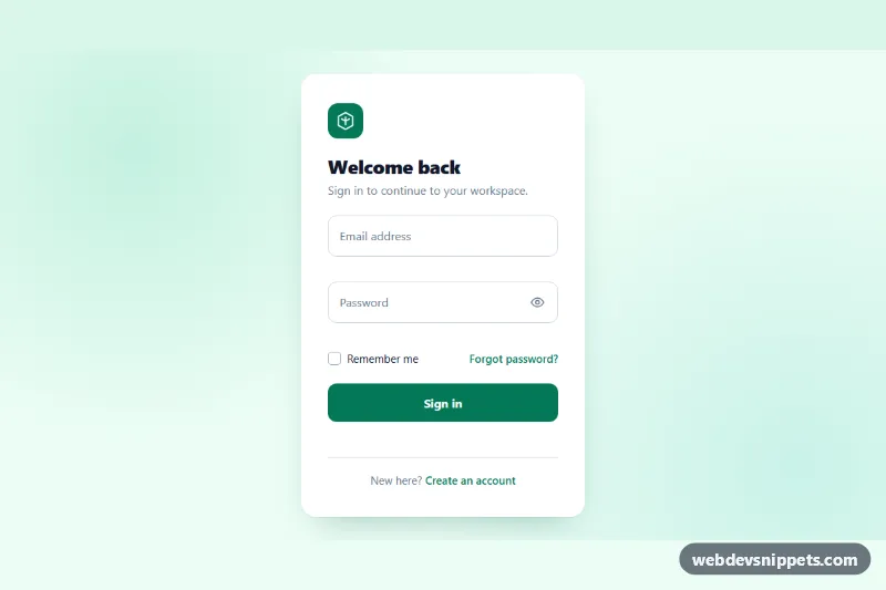
Clean pure CSS login card with animated floating labels, show/hide password, inline validation and a simulated sign-in state in vanilla JavaScript.
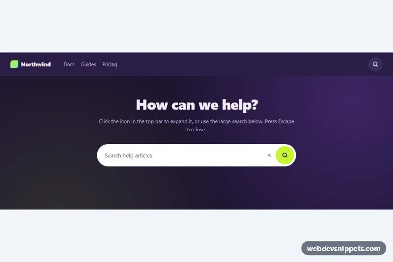
Search icon button that expands into a pill-shaped input, shown in a dark navbar and a large hero search, with Escape to close and a demo submit.
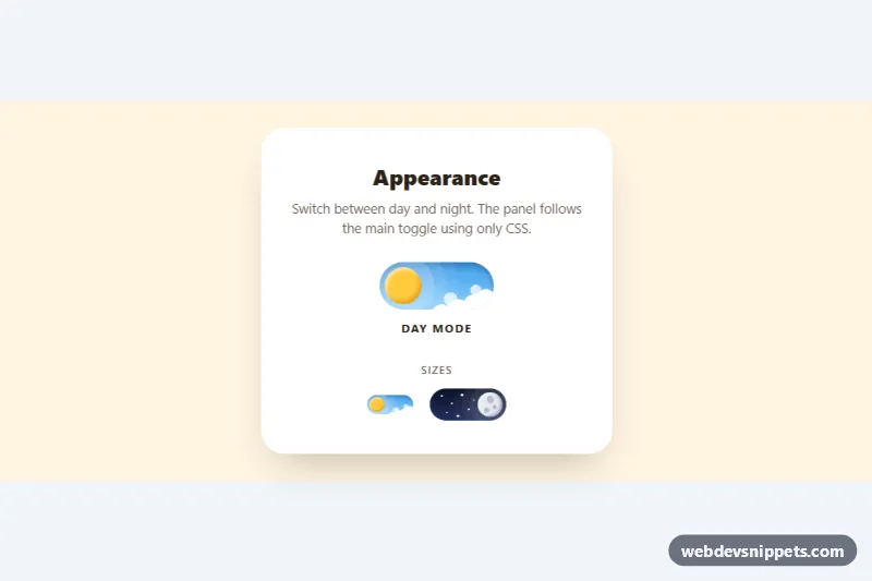
Animated pure CSS day and night toggle switch where the sun turns into a cratered moon, clouds drift away and stars appear.
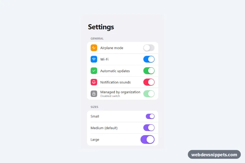
Pure CSS iOS style toggle switches built on real checkboxes, in a grouped settings list with three sizes, five colors and a disabled state.
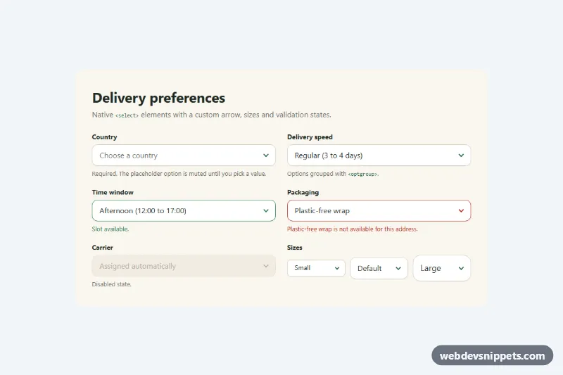
Pure CSS restyle of the native select element with a custom arrow, focus ring, error, success and disabled states, and three sizes.
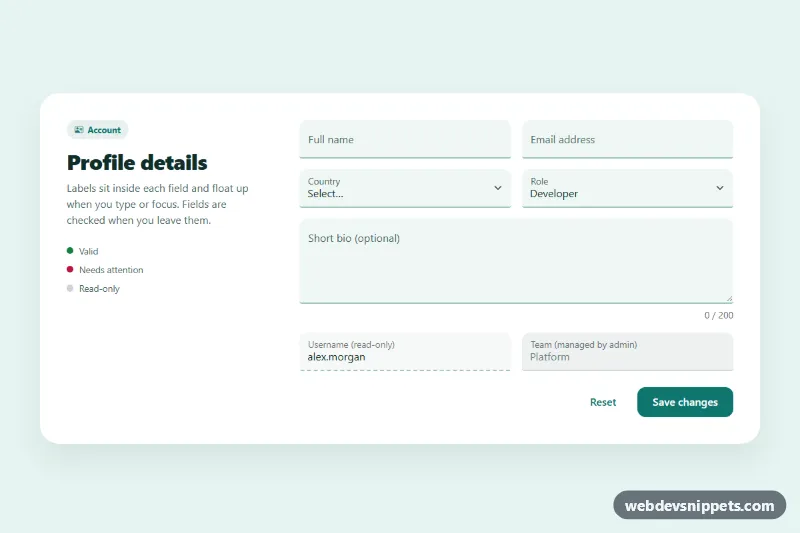
Bootstrap 5 floating label inputs for text, email, select and textarea, styled as filled fields with validation, read-only and disabled states.
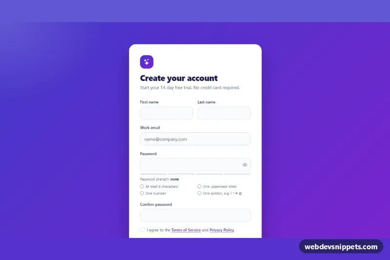
Bootstrap 5 signup form with live password rules, a strength meter, show/hide toggle, password confirmation and a required terms checkbox.
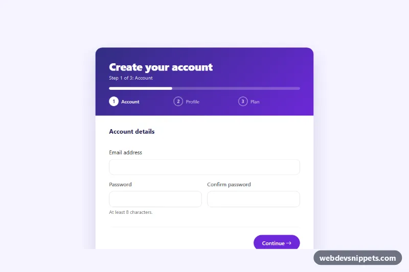
Bootstrap 5 three-step registration form with a progress bar, step indicators, per-step validation, password matching, plan cards and a success screen.

Bootstrap 5 help center search bar with an accessible autocomplete list built from local data, highlighted matches, keyboard navigation and popular search chips.

Bootstrap 5 drag-and-drop image uploader with thumbnail previews, remove buttons, type and size validation and simulated upload progress.
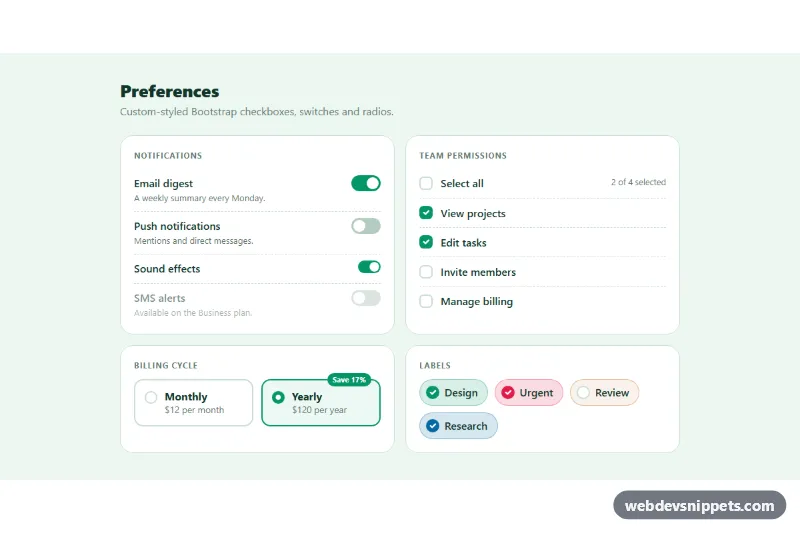
Restyled Bootstrap 5 checkboxes, large switches, select-all with indeterminate state, radio cards and colored checkbox chips.
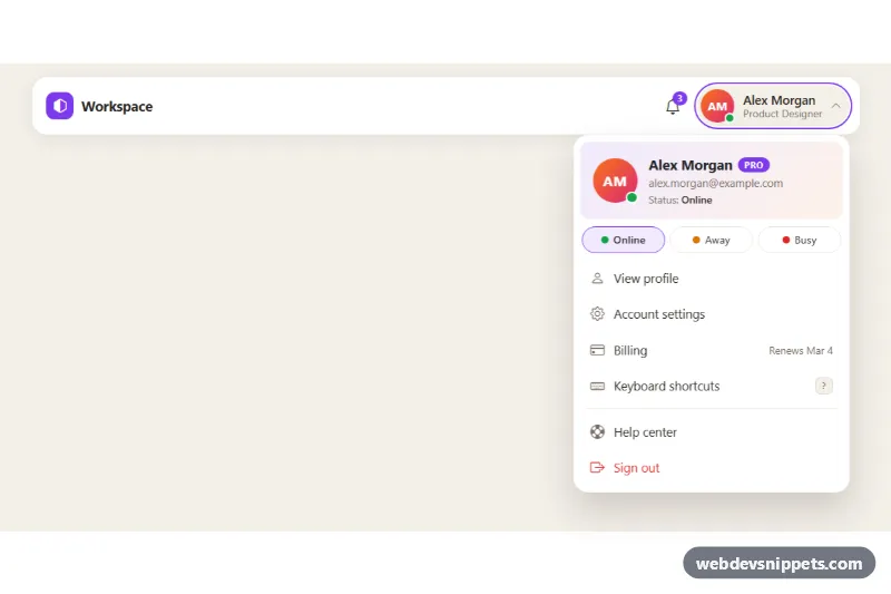
Bootstrap 5 avatar dropdown with profile header, plan badge, online/away/busy status picker and account menu links for app headers.
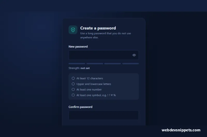
Bootstrap 5 password input with show/hide toggle, four-step strength meter, live requirements checklist and confirmation match check.
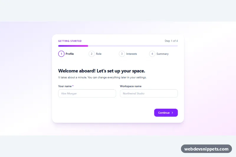
Tailwind CSS onboarding wizard with step indicator, progress bar, radio cards, topic chips, validation and an editable summary before finishing.
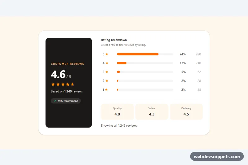
Tailwind CSS review summary with an average score, partial star fill and clickable rating distribution bars that filter reviews.
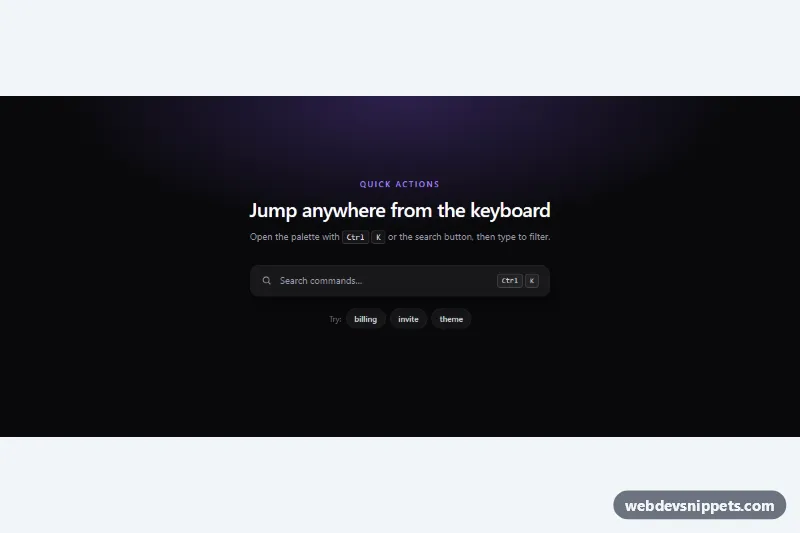
Dark Tailwind CSS command palette opened with Ctrl+K: live filtering with match highlights, grouped results and full keyboard navigation.

Accessible Tailwind CSS date picker: a text input with a calendar popup, keyboard grid navigation, locale-aware labels and min/max dates.
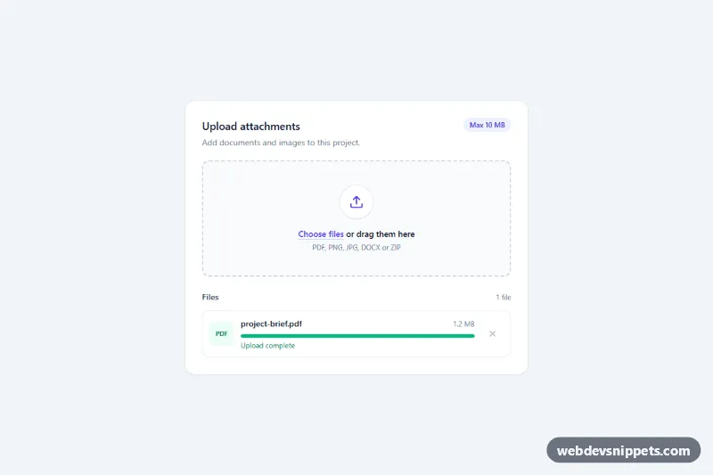
Tailwind CSS drag-and-drop file upload zone with keyboard support, type and size validation, a file list and per-file progress bars.
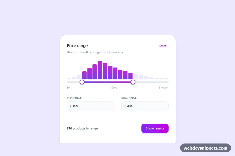
Tailwind CSS min/max price slider with two handles, synced number inputs and a live histogram that counts products in the selected range.
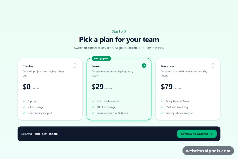
Tailwind CSS plan picker that turns native radio inputs into selectable pricing cards with a check indicator, focus ring and live summary.
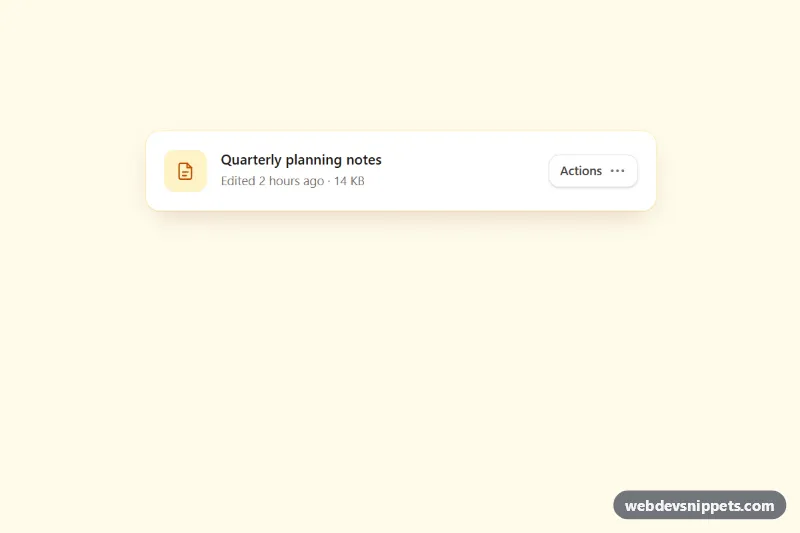
Accessible Tailwind CSS menu button with icons, grouped items, dividers, shortcut hints, typeahead and full arrow-key navigation.

Accessible Tailwind CSS combobox that filters options as you type, highlights matches and supports full keyboard navigation.
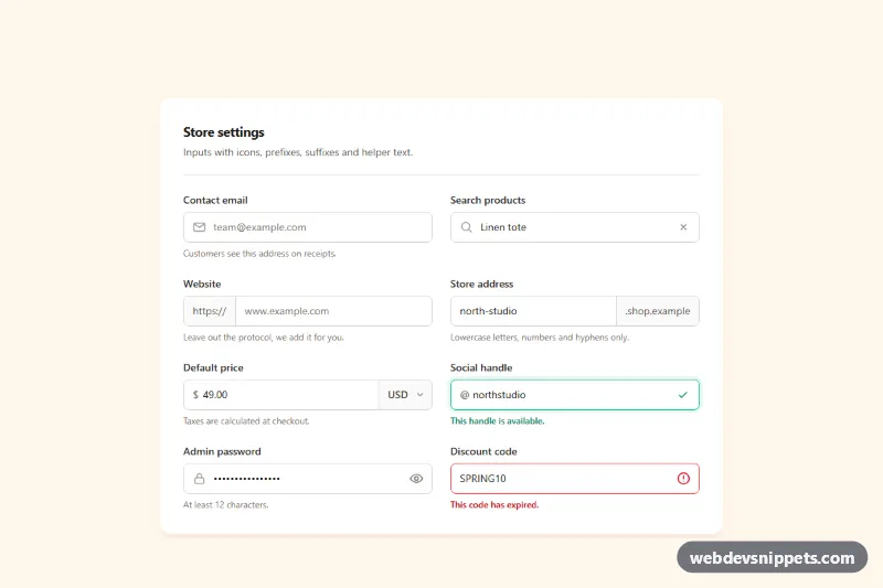
Tailwind CSS input group examples with leading icons, text prefixes and suffixes, a currency select, password toggle, clear button and helper text.