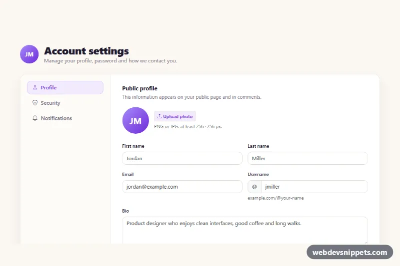
A Bootstrap 5 account settings page with three tabbed sections: a public profile form, security settings with a password strength meter and active sessions, and a notification preferences matrix. Drop it into a SaaS app, a community site or any product that lets users manage their own account.
How it works
The root .as-settings contains a header with an avatar and a card-like .as-shell. Inside, .as-tabs is a Bootstrap pills nav with data-bs-toggle="pill" buttons. On phones it is a horizontally scrolling row; from the md breakpoint it turns into a vertical rail beside the .tab-content. Bootstrap's tab plugin switches the panes and handles arrow-key navigation.
Each section is an .as-form with novalidate. On submit the script calls checkValidity(); invalid forms get Bootstrap's was-validated class and focus moves to the first invalid field. Valid forms show a spinner in .as-save, wait 900 ms and then write the button's data-as-message into the form's .as-status region. Replace that timeout with a fetch() call that posts new FormData(form) to your API.
The profile form counts characters in .as-bio and previews an uploaded photo in every .as-avatar__img. In the security pane, buttons with data-as-toggle reveal or hide the matching password field, typing in .as-new sets data-level (0 to 4) on .as-strength to color the four segments, and .as-confirm uses setCustomValidity() until both passwords match. .as-signout buttons remove a session row and announce it. The notifications pane uses switches in a table plus btn-check radios for the digest frequency.
Customization
--as-accent,--as-accent-hoverand--as-accent-rgbon.as-settingsinstyle.css: change the violet used by active tabs, buttons, switches and focus rings.--as-page-bgand--as-radius: set the warm page background and the corner radius of the main card.data-as-messageon each.as-savebutton: change the confirmation text shown after saving.scorePassword()inscript.js: adjust the rules that decide the strength level shown by.as-strength..as-strength[data-level="1"]to[data-level="4"]rules: recolor the strength segments.pattern="[a-z0-9_]{3,20}"on#as-username: relax or tighten the allowed username format.maxlength="160"on.as-bio: the counter reads it automatically.- Add a new
nav-linkbutton andtab-panepair (for example Billing) following the samearia-controlspattern.
Accessibility
The tab list has role="tablist", aria-orientation="vertical" and a label; each tab is linked to its panel with aria-controls and aria-labelledby. Every field has a visible label, the username field links its help text with aria-describedby, and each switch in the matrix has its own aria-label. Show/hide buttons expose aria-pressed and update their label. Save results and signed-out sessions are announced through role="status" live regions, and the save button uses aria-disabled so it keeps focus while busy. Focus rings use the accent color, and transitions stop under prefers-reduced-motion.
Usage notes
Requires Bootstrap 5.3 with its JS bundle and Bootstrap Icons. Ids such as as-new and as-pane-profile are fixed, so use one instance per page.