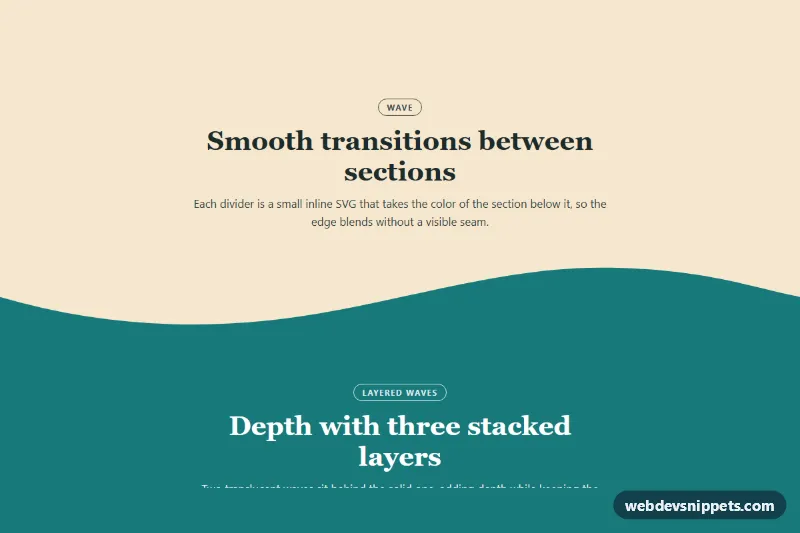
Wave section dividers in pure CSS and inline SVG: a smooth wave, a three-layer wave, a single curve and a diagonal tilt that join colored page sections without a hard horizontal line. They are a quick way to give landing pages, portfolios and marketing sites a softer, more organic rhythm.
How it works
The demo is a .wd-page wrapper with five .wd-section blocks in sand, teal, forest green, cream and coral. Each section that needs an edge contains a .wd-divider as its last child. The divider is absolutely positioned at the bottom of the section, spans the full width and has a fixed height from --wd-height. A bottom: -1px offset hides the hairline gap browsers sometimes leave between the SVG and the next section.
Inside, the svg uses preserveAspectRatio="none", so the shape stretches to any width while keeping its height, and fill: currentColor. The divider's text color therefore decides the shape color: a modifier such as .wd-divider--to-teal sets color to the next section's background, so the shape looks like the top of the following block rising into the current one. The section's bottom padding adds the divider height, so text never sits under the shape.
The layered variant stacks three paths in one SVG; .wd-layer-back and .wd-layer-mid are translucent copies that create depth. .wd-divider--flip mirrors any shape horizontally, which turns the tilt into a slope in the opposite direction. No JavaScript is used.
Customization
--wd-sand,--wd-teal,--wd-forest,--wd-creamand--wd-coralon.wd-page: change the palette; sections and divider fills update together.--wd-heightand--wd-height-tall: the divider heights (70px / 100px on phones, 110px / 150px from 768px); larger values make the waves more dramatic.- Swap a
.wd-divider--to-*class to match whichever section follows, e.g..wd-divider--to-coral. - Add
.wd-divider--flipto mirror a shape left to right, or.wd-divider--invertto turn it upside down. - Add
.wd-divider--tallfor a taller divider; the parent section adds matching bottom padding automatically. - Change the opacity of
.wd-layer-backand.wd-layer-midto make the layered wave more or less transparent. - Replace the
dattribute of apathto draw your own shape inside the0 0 1440 120viewBox; keep the bottom edge closed at120.
Accessibility
Dividers are purely decorative: every .wd-divider has aria-hidden="true", the SVGs have focusable="false", and pointer-events: none keeps them from blocking clicks on content above. Each section is labelled by its own heading via aria-labelledby. Text colors were chosen to contrast with each background, including white on the darkened teal. There is no animation, so no reduced-motion handling is needed.
Usage notes
The tall-divider padding uses the :has() selector, supported in all current browsers; in older ones the section simply keeps its normal padding. To use a divider at the top of a section instead, place it as the first child, set top: -1px instead of bottom, and add .wd-divider--invert.