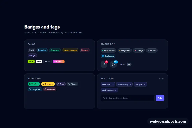
A dark-themed collection of badges and tags built with Tailwind CSS: soft color labels, solid and outline micro badges, status badges with a dot, notification counters on icon buttons, badges with inline SVG icons and an editable list of removable tags. Drop the pieces you need into dashboards, issue trackers, admin panels or blog post headers.
How it works
The root is .tbc-root, a slate-950 section with four cards in a grid that stacks on phones and becomes two columns from md. The static badges are plain span elements styled only with utilities: a translucent background such as bg-sky-400/10, a matching text-sky-300 and an inset ring (ring-1 ring-inset ring-sky-400/30) for the soft style. Status badges add a small rounded-full dot, and the "Deploying" badge stacks a second dot with the .tbc-ping animation from style.css. Counters are absolutely positioned on relative icon buttons and carry ring-2 ring-slate-900 so they cut out of the button edge. The gradient "Featured" badge uses .tbc-shine for a light sweep.
The removable tags live in the card marked data-tbc-tags. On DOMContentLoaded the script keeps a copy of the first .tbc-tag as a blueprint. Clicking a data-tbc-remove button deletes that tag and moves focus to the next tag, the previous one, or the input. Submitting data-tbc-form normalizes the text (lowercase, spaces to hyphens), rejects empty and duplicate names, enforces the limit, and appends a new tag with the .tbc-tag--new entrance animation. Backspace in an empty input removes the last tag. data-tbc-count always shows the current number of tags.
Customization
data-tbc-max="8"ondata-tbc-form: raise or lower the maximum number of tags.maxlength="24"on#tbc-new-tag: limit how long a single tag may be.- Swap
indigofor another color in.tbc-tagclasses (bg-indigo-500/15,text-indigo-200,ring-indigo-400/30) to restyle all tags; new tags copy the first one, so only the first needs to change. - Turn a soft badge solid by replacing
bg-emerald-400/10 text-emerald-300withbg-emerald-500 text-emerald-950. rounded-fullvsrounded-mdon any badge switches between pill and square shapes.animation: tbc-ping 1.4sinstyle.css: slow down the deploy pulse or remove.tbc-pingfor a static dot.- For a light page, replace
bg-slate-950on.tbc-rootand use-50backgrounds with-700text on the badges.
Accessibility
Decorative dots and icons are aria-hidden, so each badge is read by its text alone. Counter buttons hide the visual number and expose a full label such as "Notifications, 3 unread" through sr-only text. Every remove button has an aria-label naming its tag, the input has a label, and adds, removals and errors are announced through the role="status" region data-tbc-status. All controls show a visible focus-visible outline, and every animation stops under prefers-reduced-motion: reduce.
Usage notes
Keep at least one .tbc-tag in the markup, because new tags are cloned from it. Several data-tbc-tags boxes can share a page; give each input its own id. Send the tag list to your server with fetch() in the submit handler if it must persist.