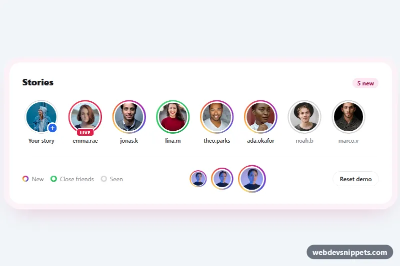
Story Ring Avatars with Gradient Border
Pure CSS story avatars with Instagram-style gradient rings, close friends and live variants, and a seen state that turns the ring grey on click.
Components for presenting content and data.
51 component(s)
Pure CSS story avatars with Instagram-style gradient rings, close friends and live variants, and a seen state that turns the ring grey on click.
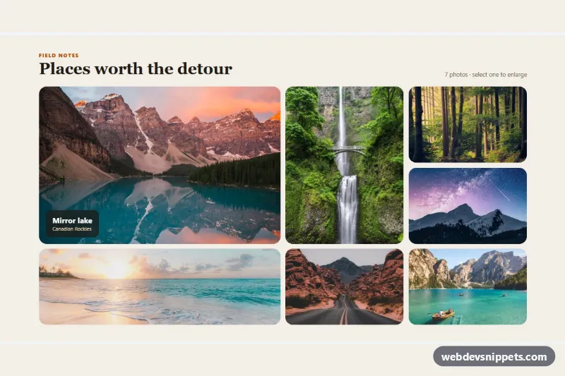
Bento-style photo gallery with mixed tile sizes from CSS Grid spans, hover captions and a keyboard-friendly dialog lightbox.
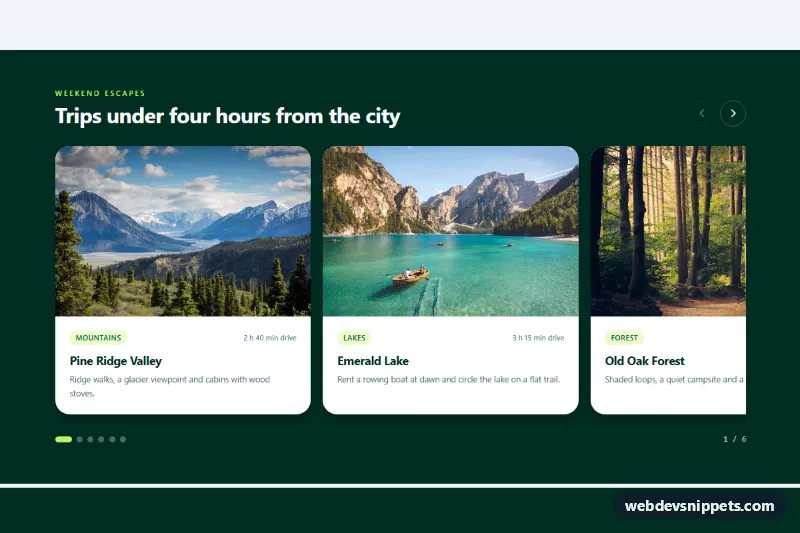
Swipeable Tailwind CSS photo card carousel with scroll snap, a peeking next card, arrow buttons, dots and keyboard support.
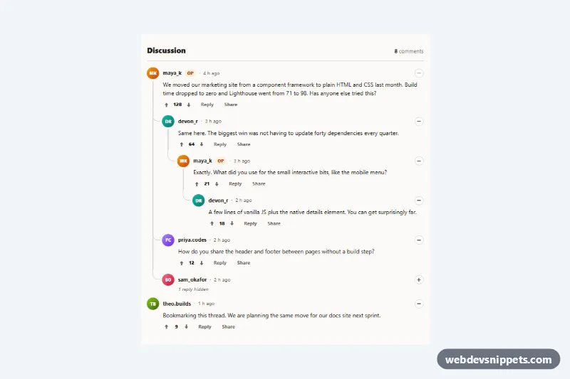
Reddit-style nested comment thread with curved CSS thread lines, collapsible branches, voting and inline replies in vanilla JS.
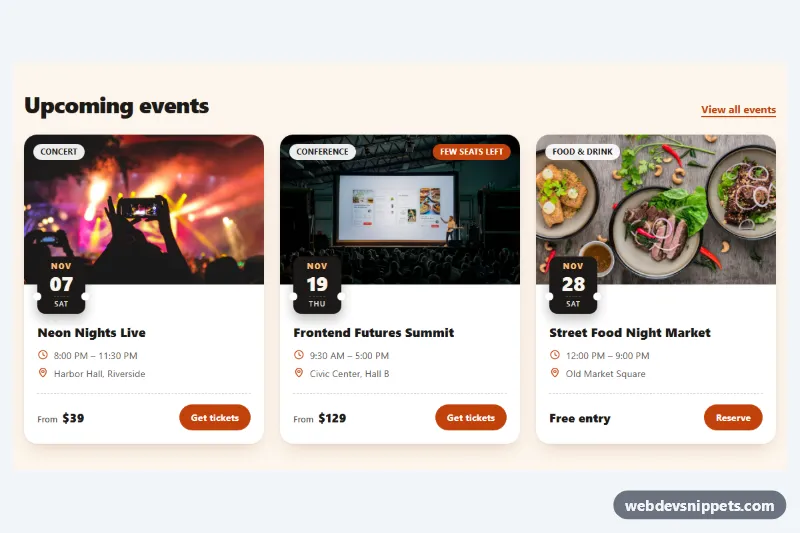
Pure CSS event cards with a cover photo, ticket-stub date badge, category chip, time and venue details, price and a ticket button.
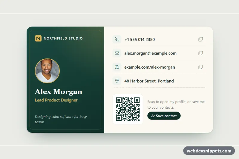
Bootstrap 5 digital business card with portrait, role, tap-to-call contact links, copy buttons, a QR code and a downloadable vCard.
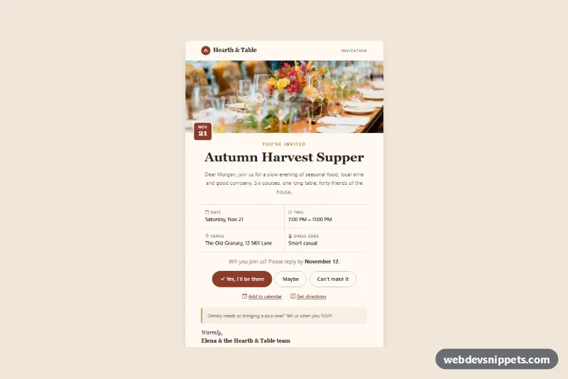
Bootstrap 5 event invitation card with a header photo, date chip, event details grid, RSVP buttons, calendar and directions links.
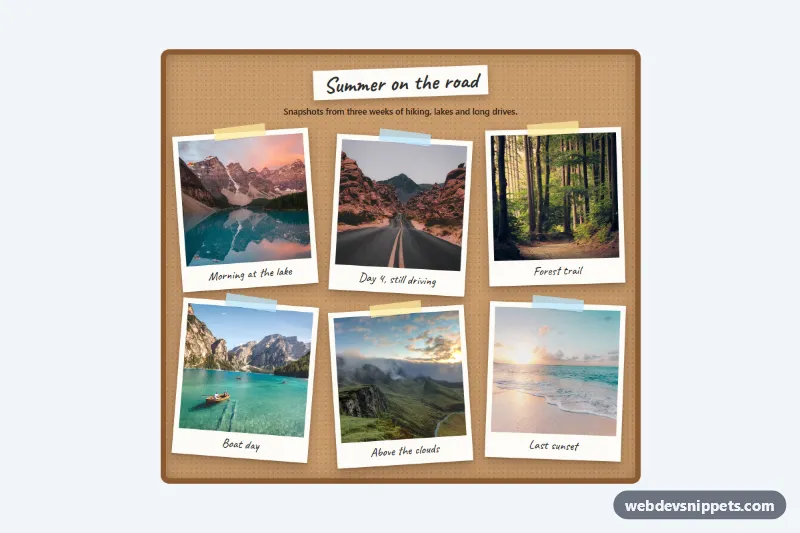
Pure CSS polaroid gallery on a cork board: tilted photo frames with tape and handwritten captions that straighten and lift on hover or focus.
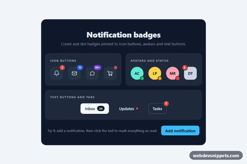
Pure CSS notification badges: count bubbles, 99+ pills, pulsing dots and status dots positioned on icon buttons, avatars and text buttons.
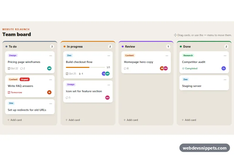
Bootstrap 5 kanban board with four columns, labelled task cards, drag and drop, a keyboard-friendly move menu, live counts and inline add-card forms.
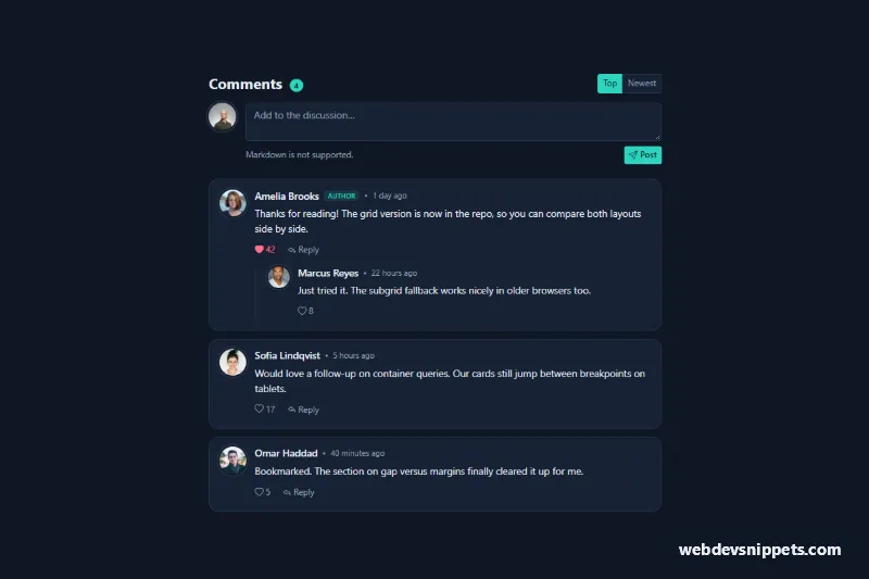
Dark Bootstrap 5 comment section with user photos, timestamps, like buttons, inline reply forms, nested replies and Top/Newest sorting.
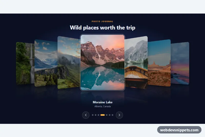
Coverflow-style image carousel with rotated 3D side photos, reflections, captions, dots, swipe and keyboard navigation in pure CSS and vanilla JS.
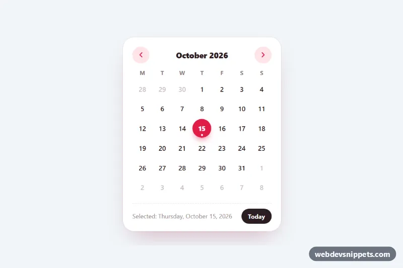
Compact month calendar generated with vanilla JS and styled with pure CSS: selectable days, today marker, month navigation and full arrow-key support.
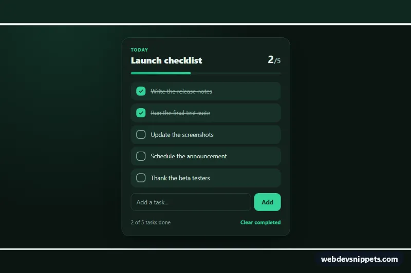
Dark to-do checklist in pure CSS with self-drawing check marks, an animated strike-through, a progress bar and vanilla JS to add and clear tasks.
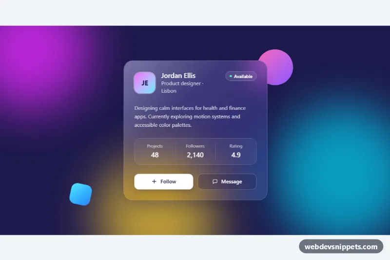
Frosted glass profile card in Tailwind CSS with backdrop blur, a light reflection and a follow button over colorful animated gradient blobs.
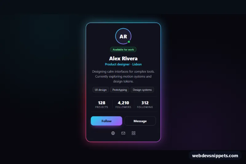
Dark profile card with an animated neon conic-gradient border, soft glow, stats, skill tags and a Follow toggle, built with pure CSS and vanilla JS.
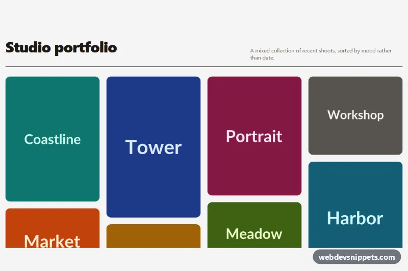
Pure CSS masonry image gallery using multi-column layout, with hover and focus captions that slide up over each photo. No JavaScript needed.
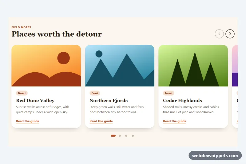
Native CSS scroll-snap carousel with arrow buttons, synced pill dots and keyboard support, enhanced by a few lines of vanilla JavaScript.
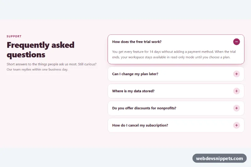
No-JavaScript FAQ accordion built on native details and summary elements with smooth height animation and one-open-at-a-time behavior.
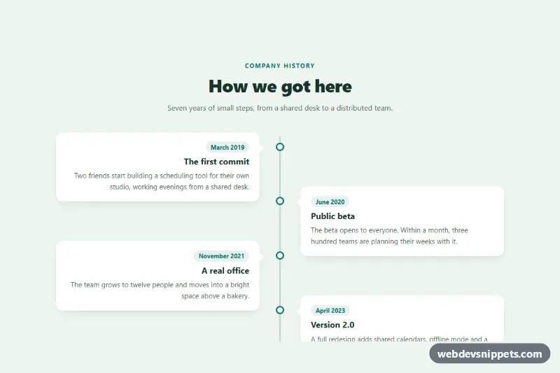
Pure CSS vertical timeline with a center line and entries that alternate left and right, collapsing to a single column on mobile.
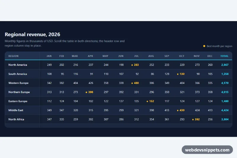
Dark striped data table in pure CSS with a sticky header row and sticky first column inside a scrollable, keyboard-focusable container.
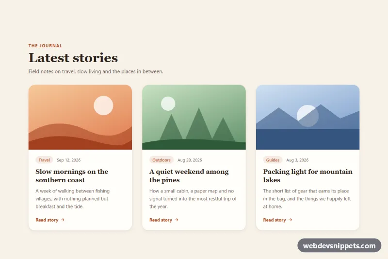
Pure CSS blog card grid where each card lifts with a deeper shadow and zooms its image on hover or keyboard focus.
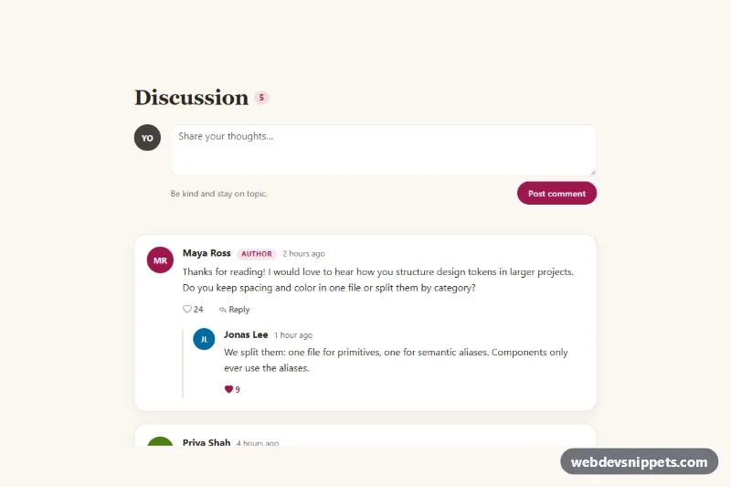
Bootstrap 5 comment section with threaded replies, collapsible reply forms, like buttons, a new comment form and live comment count.
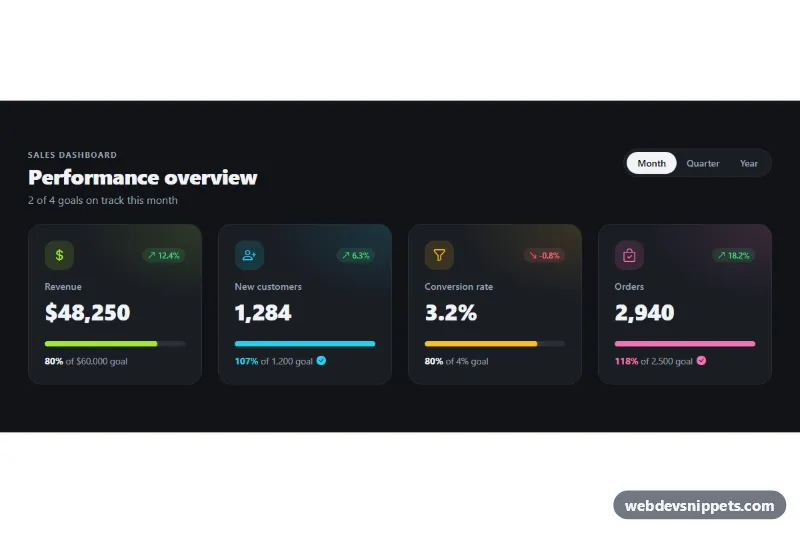
Dark Bootstrap 5 KPI cards with trend badges, goal progress bars and a Month, Quarter and Year switch for admin and sales dashboards.
Data display components present information so people can scan, compare and understand it quickly. This group covers cards, lists, tables, timelines, accordions, carousels and galleries, the containers you reach for whenever a page needs to show products, records, articles, events or images in an organised way.
Pick the pattern by the shape of your data. Use a table when users compare values across the same attributes, cards when each item is visually distinct and has its own action, and a list when items are short and uniform. Timelines suit anything ordered by date, while accordions work best when only part of the content is needed at a time.
Use semantic HTML: real <table> elements with <th> and scope for tabular data, <ul> or <ol> for lists, and headings inside cards so screen reader users can jump between items. For wide tables, wrap them in a horizontally scrollable container on small screens. Carousels and accordions need keyboard support, visible focus and correct aria-expanded states. Lazy-load images in galleries and carousels to keep pages fast.
Data display snippets are offered in Bootstrap 6, Bootstrap 5, Tailwind CSS and pure CSS versions. Bootstrap 6 examples use the alpha's ES module JavaScript and theme-* colour roles; Bootstrap 5 examples use the standard card, table, accordion and carousel classes. Use the framework filter, check the live preview, and copy the code from the code tabs or download the snippet, then replace the sample content with your own data.