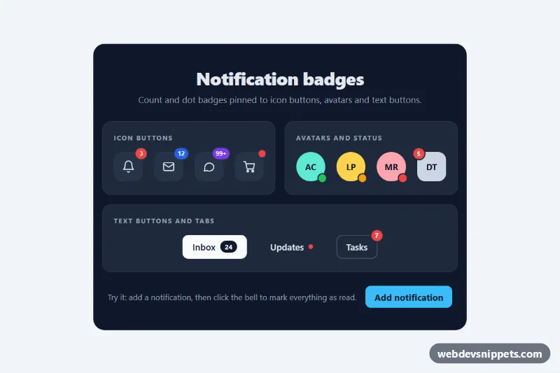
Notification Dot and Count Badges
Pure CSS notification badges: count bubbles, 99+ pills, pulsing dots and status dots positioned on icon buttons, avatars and text buttons.
Labels, tags, chips and status indicators.
3 component(s)
Pure CSS notification badges: count bubbles, 99+ pills, pulsing dots and status dots positioned on icon buttons, avatars and text buttons.
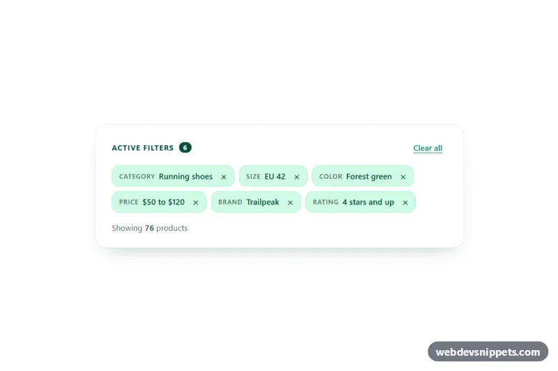
Bootstrap 5 active filter bar with removable chips, Clear all button, undo for recently removed filters and live result count.
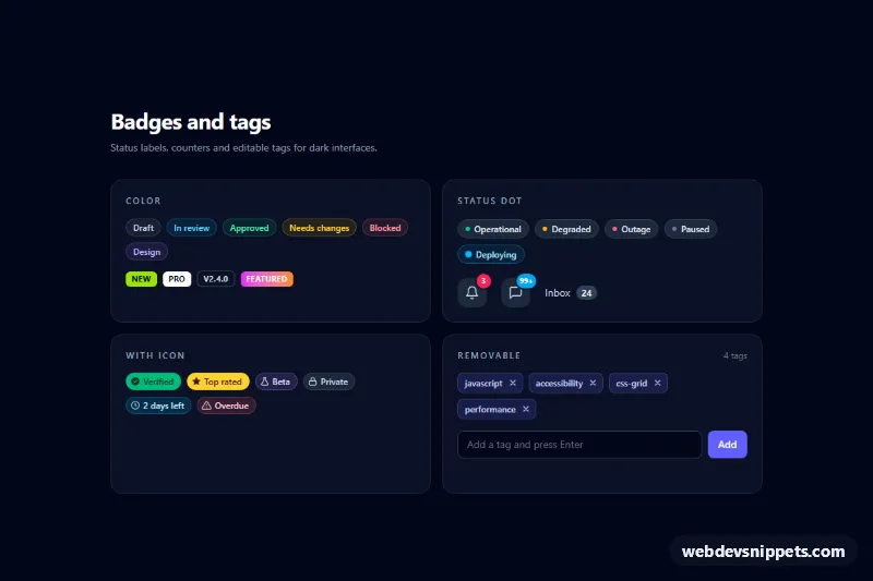
Dark Tailwind CSS badge collection: color pills, status dots, notification counters, icon badges and removable tags with an add-tag input.
A badge is a small label that adds context to another element: a count of unread messages, a "New" or "Sale" tag, a status such as "Active" or "Overdue", or a removable chip in a filter bar. Badges, tags, pills and chips all belong to this family. They are tiny, but they carry a lot of meaning, which makes clear styling and accessibility important.
<button> with an aria-label such as "Remove filter: Red".aria-live="polite" only if a counter changes while the user is on the page and the change matters.This category includes pill badges, dot indicators, outlined tags, notification counters and dismissible chips. Bootstrap 6 versions use the theme-* colour roles, so a "danger" or "success" badge adapts to light and dark themes. Bootstrap 5 versions build on .badge with rounded-pill and background utilities, Tailwind CSS versions use small padding, text-xs and colour utilities, and pure CSS badges are a few lines you can drop into any project. Preview each one live, switch between code tabs and copy the markup into your interface.