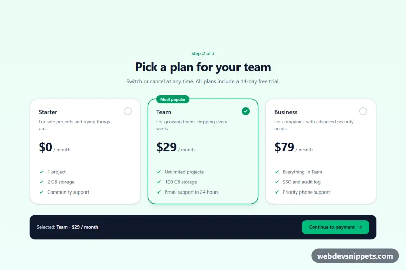
A plan selector built with Tailwind CSS where each option is a native radio input styled as a large card with price, features and a check indicator. It is a common step in sign-up, checkout and onboarding flows, and works as a regular form field even without JavaScript.
How it works
The root is .trc-plans, which contains a form marked data-trc-form and a fieldset whose legend holds the step label, heading and intro text. Each plan is a label with the group class wrapping a visually hidden input type="radio" name="plan" (sr-only). Because the input sits inside the label, clicking anywhere on the card selects it, and the browser handles arrow-key movement between the three options.
All visual states come from Tailwind v4 has-* variants, so no JavaScript is needed for styling: has-[:checked]:border-emerald-600 and has-[:checked]:bg-emerald-50/60 highlight the selected card, group-has-[:checked]:bg-emerald-600 fills the round indicator and group-has-[:checked]:opacity-100 reveals its check mark. has-[:focus-visible]:outline-2 draws a focus ring around the whole card when the radio is focused with the keyboard. The middle card starts checked and shows a "Most popular" badge.
script.js initializes every .trc-plans on DOMContentLoaded. A change listener on each radio writes the plan name and price, read from data-trc-name and data-trc-price, into data-trc-summary in the dark footer bar. Submitting the form disables data-trc-submit, shows "Saving your plan…" in the data-trc-status region and simulates a request with setTimeout. style.css only adds a subtle press effect on :active.
Customization
data-trc-nameanddata-trc-priceon each radio: change the text shown in the summary bar.valueon each radio (starter,team,business): set the values your backend expects for theplanfield.- Move the
checkedattribute to another radio to change the default plan, and move the#trc-team-badgespan to highlight a different card. emeraldutilities (has-[:checked]:border-emerald-600,group-has-[:checked]:bg-emerald-600,bg-emerald-500on the button): replace withvioletorblueto rebrand.md:grid-cols-3on the card grid: usemd:grid-cols-2for two plans or addlg:grid-cols-4for four.rounded-3xlandborder-2on eachlabel: userounded-xlandborderfor a tighter, more compact look.- Replace the
setTimeoutin the submit handler ofscript.jswith afetch()call to your billing endpoint.
Accessibility
The options are real radio buttons grouped by a fieldset and legend, so screen readers announce the group name, the number of options and the current choice. Each radio gets a short accessible name through aria-labelledby (plan name and price) and its description through aria-describedby, instead of reading the whole card. Arrow keys move between plans, Space selects, and the card shows a clear outline on keyboard focus. The selected state is shown by border, background and a check icon, not by color alone. Decorative icons are aria-hidden, form feedback uses role="status", and transitions are disabled with motion-reduce:transition-none.
Usage notes
For several selectors on one page, give each group a different name and unique id values.