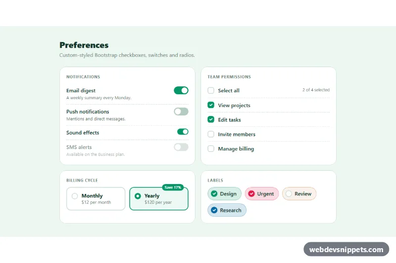
Custom Checkboxes and Switches
Restyled Bootstrap 5 checkboxes, large switches, select-all with indeterminate state, radio cards and colored checkbox chips.
Custom checkbox and radio controls.
2 component(s)
Restyled Bootstrap 5 checkboxes, large switches, select-all with indeterminate state, radio cards and colored checkbox chips.
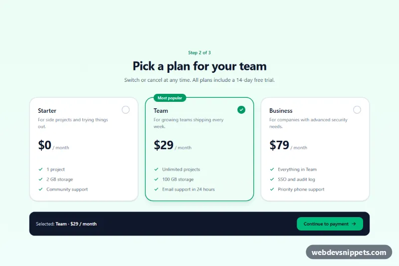
Tailwind CSS plan picker that turns native radio inputs into selectable pricing cards with a check indicator, focus ring and live summary.
Checkboxes let users select any number of options, or toggle a single setting such as "I agree to the terms". Radio buttons let users choose exactly one option from a group. Custom checkbox and radio controls restyle the native inputs with brand colours, larger hit areas, card-style options or icons, while keeping their built-in behaviour.
<input type="checkbox"> or type="radio" in the markup and style it; do not replace it with divs. Modern CSS supports appearance: none and accent-color for this.<label> so the text is clickable and the target is large.<fieldset> with a <legend> describing the question.:focus-visible.This category includes custom checkbox CSS, radio button groups, option cards and checkbox lists. Bootstrap 6 versions use theme-* colour roles for the checked state. Bootstrap 5 versions build on .form-check, .form-check-input and .btn-check, Tailwind CSS versions use utilities with peer and checked: variants, and pure CSS versions show accessible styling with only native inputs. Preview them live, copy the HTML and CSS, and drop them into your forms.