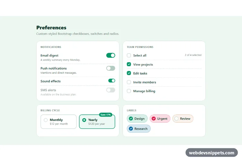
A set of restyled Bootstrap 5 checkboxes, switches and radios in a fresh green settings panel: large switches with helper text, a "select all" checkbox with a mixed state, radio cards for a billing choice and colored round checkbox chips. Use it as a starting point for settings pages, permission editors, filters and onboarding forms.
How it works
The root is section.cs-panel. Every group is a fieldset.cs-card with a legend, laid out in a Bootstrap row g-3 that shows two columns from the md breakpoint. All controls keep the standard Bootstrap markup (form-check, form-switch, form-check-input, form-check-label), so they work like normal inputs. The .cs-row class replaces Bootstrap's float layout with flexbox, which keeps inputs of any size aligned with their label and the optional .cs-hint text inside .cs-row__text.
.cs-switch makes the switch wider and taller, moves it to the right with order: 2 and keeps the knob white, also on focus, by overriding --bs-form-switch-bg. .cs-switch--sm is a compact version. .cs-check draws a rounded square checkbox and .cs-check--round a circle. The billing radios are wrapped in label.cs-tile, and :has(.cs-radio:checked) highlights the selected card. In the "Labels" card, each .cs-chip sets its own color through the .cs-tone-rose, .cs-tone-amber and .cs-tone-sky classes.
The only script handles .cs-group. Changing the [data-cs-all] checkbox checks or clears every [data-cs-item], and changing any item runs sync(), which sets the master to checked, unchecked or indeterminate and writes the "2 of 4 selected" text into .cs-count. Without JavaScript all inputs still work; only the select-all link is missing.
Customization
--cs-colorand--cs-color-rgbin.cs-panel: change the checked color and the focus ring of every control.--cs-check-sizein.cs-panel: make the checkboxes larger or smaller.--cs-switch-widthand--cs-switch-heightin.cs-panel: resize the switches.--cs-radiusin.cs-panel: round or square the cards and radio tiles.- Add
.cs-tone-rose,.cs-tone-amberor.cs-tone-skyto any.cs-row, or define a new tone class with both color variables. - Remove
.cs-check--roundfrom a checkbox to give it the rounded square shape. grid-template-columnsin.cs-tiles: show the radio cards in one column or add a third option.
Accessibility
The controls are native inputs, so Space toggles them and arrow keys move between the radios. Each group is a fieldset with a legend, the switches use role="switch", and helper text is connected through aria-describedby. The master checkbox exposes the mixed state through the native indeterminate property and is described by the aria-live counter. The focus ring uses the accent color, disabled rows are dimmed and show a not-allowed cursor, and transitions are disabled under prefers-reduced-motion: reduce.
Usage notes
Requires only Bootstrap 5 CSS; the script is optional. The radio highlight uses :has(), which is supported by all current browsers; in older ones the radio itself still shows the selection.