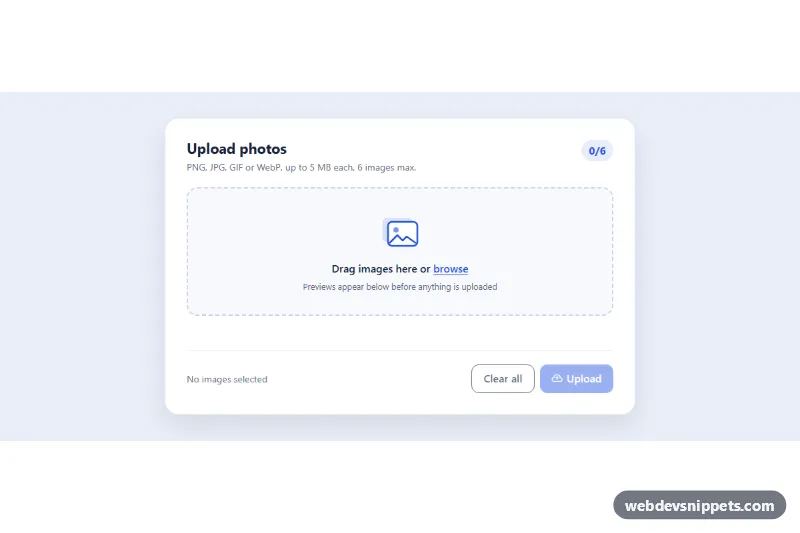
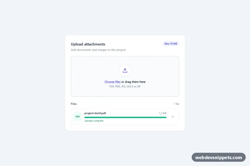
A Bootstrap 5 image uploader with a drag-and-drop zone, instant thumbnail previews, per-file size labels, remove buttons, type and size validation and a simulated upload with progress bars. Use it for profile galleries, product photo forms, listing editors and any form that collects several images.
How it works
The root is section.iu-uploader, which holds the .iu-card. A visually hidden input.iu-input (type="file", multiple, with an accept list) is followed by label.iu-drop, so clicking the drop zone or pressing Space on the focused input opens the file dialog. The zone also listens for dragenter, dragover, dragleave and drop; while files hover over it the root gets is-dragover and the illustration lifts.
Every chosen or dropped file goes through addFiles(). It checks the type against the ACCEPTED array, the size against data-iu-max-size and the count against data-iu-max-files, and lists rejected files in the .iu-feedback line. Accepted files are cloned from the template.iu-template into the .iu-grid: the preview uses URL.createObjectURL(), so nothing is read or sent before upload, and formatSize() writes the size. Removing an item calls URL.revokeObjectURL() to free memory. The .iu-summary line, the .iu-counter__num badge and the state of the Clear all and Upload buttons are updated by refresh().
Clicking .iu-upload marks the pending items with is-uploading, fills their Bootstrap .progress bars step by step and finally adds is-done, which shows a green check on the thumbnail.
Customization
data-iu-max-fileson.iu-uploader: change the image limit; also update the "/6" in.iu-counterand the subtitle.data-iu-max-sizeon.iu-uploader: change the size limit per image in MB.ACCEPTEDinscript.jsand theacceptattribute of.iu-input: allow other formats such asimage/avif.--iu-accentand--iu-accent-rgbin.iu-uploader: recolor the drop zone, counter, progress bars and Upload button.--iu-thumb-minin.iu-uploader: make the preview tiles larger or smaller; the grid adds columns automatically.aspect-ratioin.iu-thumb: use4 / 3or16 / 9instead of square previews.- The
window.setIntervalblock in the.iu-uploadclick handler: replace it withfetch()orXMLHttpRequestthat sends eachentry.filein aFormDatato your server.
Accessibility
The file input stays a real, focusable control; its focus ring is drawn on the drop zone through .iu-input:focus-visible + .iu-drop. Drag and drop is optional, the dialog works with the keyboard. Each preview has a descriptive alt, each remove button an aria-label with the file name, and after removal focus moves to the next remove button or back to the input. Validation errors and progress messages are announced through the aria-live="polite" feedback line, which also describes the input. The progress bars use role="progressbar" with aria-valuenow. Entry animations and transitions are disabled under prefers-reduced-motion: reduce.
Usage notes
Requires Bootstrap 5 and Bootstrap Icons. Client-side checks only help users: validate type and size again on the server. For several uploaders on one page, give each input its own id and update the label's for.