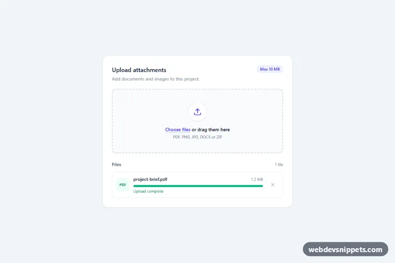
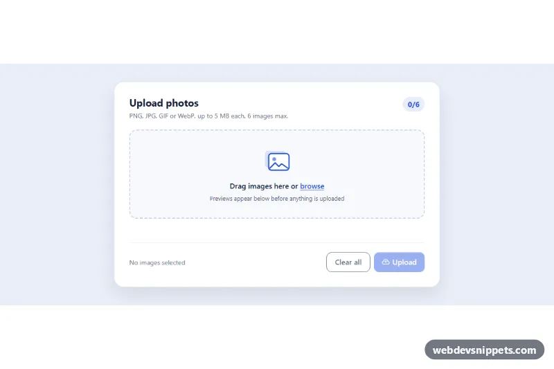
A drag-and-drop file upload dropzone built with Tailwind CSS and vanilla JavaScript. Users can drop files onto the dashed area or pick them with the native file dialog, and every file appears in a list with its own progress bar, size and remove button. It fits attachment fields, project settings, support forms and media libraries.
How it works
The root is .tfd-dropzone. The drop area is a label (.tfd-zone, marked data-tfd-zone) that wraps a visually hidden input type="file" with multiple and an accept list. Because the input is only hidden with sr-only, clicking the label or pressing Enter/Space on the focused input opens the file dialog, and has-[input:focus-visible] draws a focus ring around the whole zone.
The script listens for dragenter, dragover, dragleave and drop on the zone. A drag counter keeps the tfd-zone--active highlight from flickering while the pointer moves over child elements. Dropped or selected files are passed to addFile(), which clones the row from the <template data-tfd-template>, fills in the extension badge, name and size, and appends it to data-tfd-list.
Each file is checked against the input's accept attribute and the size limit. Invalid files get data-state="error" and a red message. Valid files run through simulateUpload(), which raises the bar width and aria-valuenow in steps and then sets data-state="done". The row colors switch with group-data-[state=done] and group-data-[state=error] variants, so no extra CSS classes are toggled. Remove buttons cancel the timer, delete the row and update the counter in data-tfd-summary.
Customization
data-tfd-max-mb="10"on.tfd-dropzone: set the maximum file size in megabytes; larger files show "Larger than 10.0 MB". Update the "Max 10 MB" badge to match.accepton#tfd-input: list the allowed extensions or MIME types (.pdf,.pngorimage/*); dropped files are validated against the same rule.simulateUpload()inscript.js: replace the timer withfetch()or anXMLHttpRequestthat reportsupload.onprogresstosetProgress().bg-indigo-500on.tfd-barand theindigoclasses on the zone: swap forsky,violetoremeraldto rebrand..tfd-zone.tfd-zone--activeinstyle.css: change the border and background shown while files are dragged over.- Remove
multiplefrom the input to accept one file at a time.
Accessibility
The hidden input stays in the tab order and is described by the format hint through aria-describedby. Each row has a role="progressbar" with aria-valuemin, aria-valuemax, aria-valuenow and a file-specific aria-label. Remove buttons are labelled "Remove file name", and focus moves to the next row (or back to the input) after a removal. Completed uploads, errors and removals are announced through a role="status" live region. Animations in style.css and the bar transitions are turned off under prefers-reduced-motion: reduce.
Usage notes
For several dropzones on one page, wrap each in its own .tfd-dropzone and give each input a unique id and matching for. The sample row shows the completed state and can be deleted.