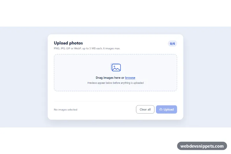
Image Upload with Preview
Bootstrap 5 drag-and-drop image uploader with thumbnail previews, remove buttons, type and size validation and simulated upload progress.
Drag-and-drop and file picker components.
2 component(s)
Bootstrap 5 drag-and-drop image uploader with thumbnail previews, remove buttons, type and size validation and simulated upload progress.
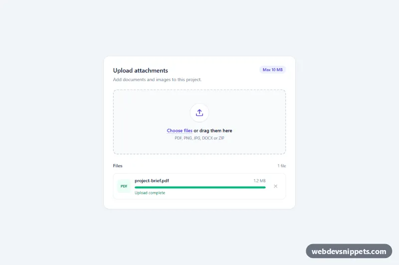
Tailwind CSS drag-and-drop file upload zone with keyboard support, type and size validation, a file list and per-file progress bars.
A file upload component lets users select files from their device and send them to your application. Beyond the plain file input, this category covers drag-and-drop zones, image upload with previews, multiple file lists with progress bars, and avatar upload controls. You find them in profile settings, support forms, document portals and content management systems.
<input type="file"> behind the design, so keyboard users and mobile users can open the system picker. Drag and drop should be an enhancement, never the only way.accept attribute to filter file types and multiple when more than one file is allowed, but always validate on the server as well.<progress> element or role="progressbar" for upload progress.URL.createObjectURL and release them afterwards to save memory.The drag and drop file upload examples here include drop zones, image previews, file lists and avatar uploaders. Bootstrap 6 versions use theme-* colour roles for active and error states and ES module scripts. Bootstrap 5 versions build on .form-control file inputs with small vanilla JavaScript, Tailwind CSS versions use dashed borders and state utilities, and pure CSS versions style the native input. Preview them live, copy the HTML, CSS and JS, and connect the upload to your own endpoint.