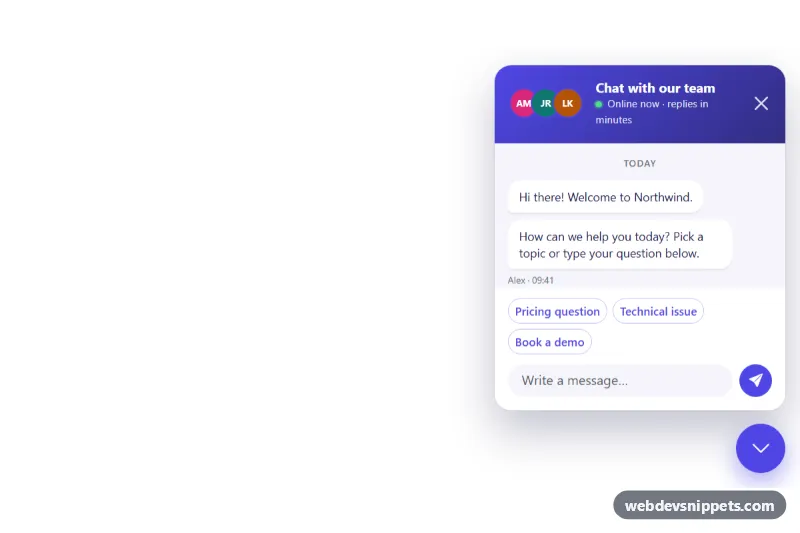
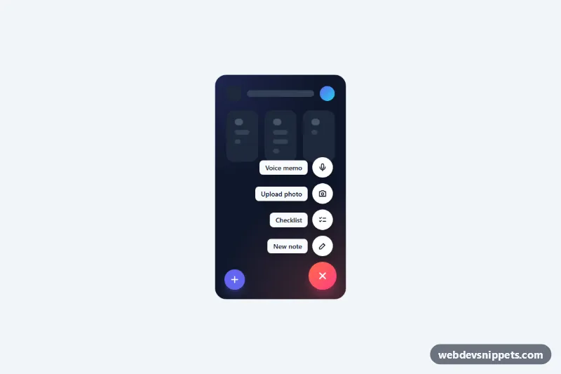
A Bootstrap 5 floating chat button that sits in the bottom-right corner of the page and opens a compact support chat panel with team avatars, quick-reply chips, a typing indicator and an unread badge. Use it on SaaS sites, online stores and help pages where visitors should reach your team without leaving the page.
How it works
The root .fcb-chat is position: fixed to the bottom-right corner and stacks two children in a column: the .fcb-panel chat window and the round .fcb-toggle button. The panel is hidden with opacity, transform and visibility, so it is out of the tab order while closed; adding .fcb-chat--open to the root fades and scales it in and swaps the chat icon (.fcb-icon-open) for a chevron (.fcb-icon-close).
The panel contains a gradient .fcb-header, the scrollable .fcb-log message list, the .fcb-quick group of .fcb-chip buttons and the .fcb-form composer. The script listens for click on the toggle and the .fcb-close button, keydown for Escape on the root, click on each chip and submit on the form. Sending a message appends a .fcb-msg--user bubble, hides the chips, shows a three-dot .fcb-typing indicator and, after a short timeout, adds a reply from the REPLIES array. Opening the panel hides the .fcb-badge counter. On load the script reads data-fcb-open on the root to decide whether the panel starts open.
Customization
--fcb-accent,--fcb-accent-darkand--fcb-accent-rgbin.fcb-chat: recolor the button, header gradient, user bubbles, chips and focus rings.--fcb-offsetin.fcb-chat: move the widget further from or closer to the corner. Swaprightforleftto dock it on the left side.--fcb-sizeand--fcb-panel-widthin.fcb-chat: change the diameter of the round button and the width of the chat window.data-fcb-open="true"on.fcb-chat: remove it or set it tofalseso the panel starts closed and only the button is visible.- The
REPLIESarray inscript.js: replace the canned answers, or replace thewindow.setTimeoutcall insend()with afetch()to your chat backend or support API. - The
.fcb-chipbuttons inside.fcb-quick: edit, add or remove suggested topics; each chip sends its own text as a message. - Delete
.fcb-badgefrom the toggle if you do not want an unread counter.
Accessibility
The toggle is a real button with aria-controls and aria-expanded, and its visually hidden .fcb-toggle-label switches between "Open chat" and "Minimize chat". The panel has role="dialog" (non-modal) labelled by the header title. The message list uses role="log" with aria-live="polite", so new replies are announced, and the typing indicator carries hidden text. Opening by click moves focus to the message field; Escape or the close button returns focus to the toggle. Focus rings are visible on every control, and transitions and the typing animation are disabled under prefers-reduced-motion: reduce.
Usage notes
Requires Bootstrap 5 and Bootstrap Icons. Place the markup once, just before the closing body tag, so the fixed widget sits above page content (z-index: 1050).