Social Share Buttons
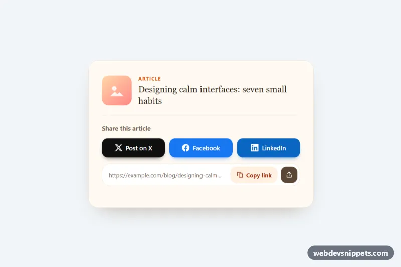
Pure CSS social share card with brand-colored X, Facebook and LinkedIn buttons, a copy-link field with clipboard feedback and a native share fallback.
Buttons and action triggers.
12 component(s)
Pure CSS social share card with brand-colored X, Facebook and LinkedIn buttons, a copy-link field with clipboard feedback and a native share fallback.
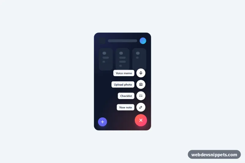
Pure CSS floating action button that expands into a staggered speed dial of labeled actions, with vertical and horizontal variants and keyboard support.
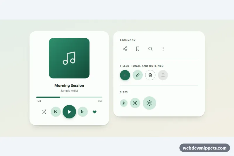
Round icon buttons with a Material-style ripple, toggle states and tooltips: standard, filled, tonal and outlined variants in three sizes.
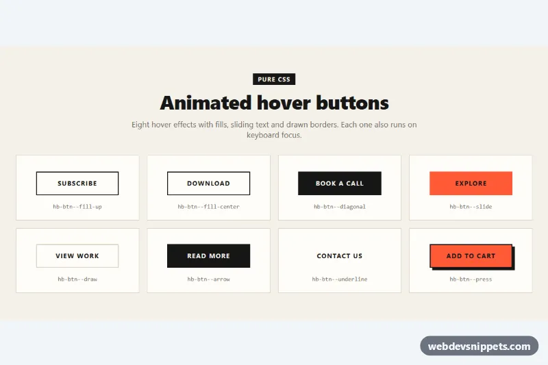
Eight pure CSS hover buttons with fill, diagonal, sliding text, border drawing, arrow, underline and press effects that also run on focus.
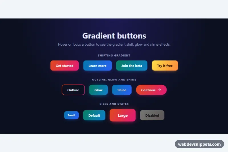
Pure CSS gradient buttons with shifting colors on hover, a gradient outline, glow and shine effects, sizes and a disabled state.
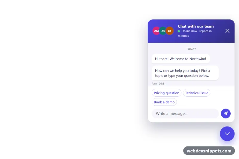
Bootstrap 5 floating chat button fixed to the bottom-right corner that opens a support chat panel with quick replies, typing indicator and unread badge.
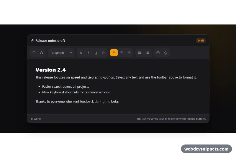
Dark Bootstrap 5 text editor toolbar with grouped icon buttons, toggle states, a block style dropdown, arrow key navigation and a working editable area.
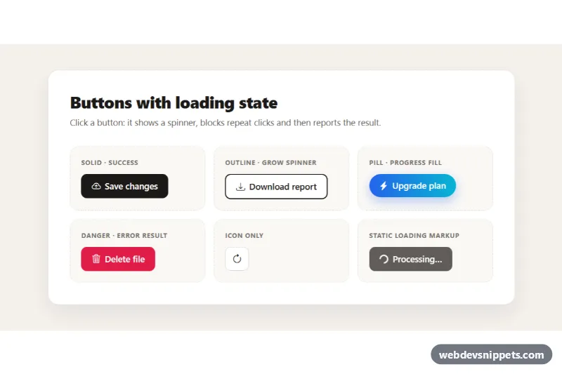
Bootstrap 5 buttons that show a spinner, block repeat clicks while working and then display a success or error state, in solid, outline, pill and icon styles.
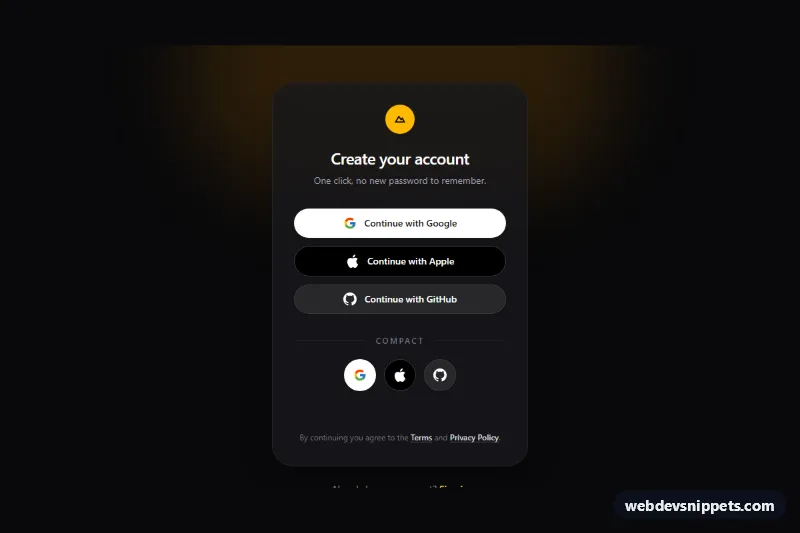
Dark Tailwind CSS social login buttons for Google, Apple and GitHub with full-width and icon-only variants and a loading spinner state.
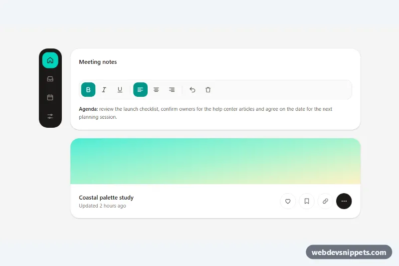
Accessible Tailwind CSS icon buttons with tooltips as labels, toggle states, a keyboard-friendly toolbar, a navigation rail and Escape to dismiss.
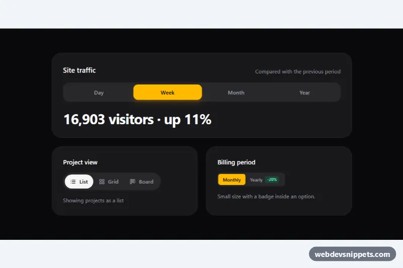
Tailwind CSS segmented control with a sliding thumb, built on native radio inputs for single-choice view, range and billing toggles.
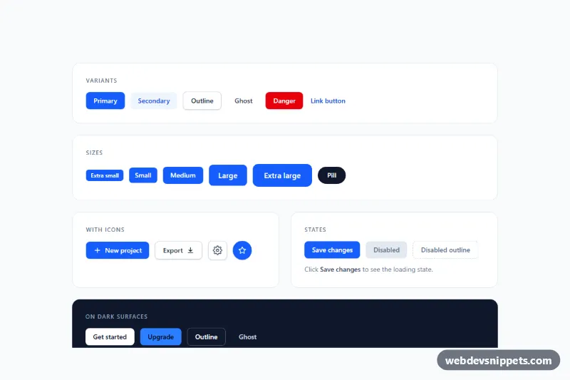
Tailwind CSS button set with primary, secondary, outline, ghost, danger and link variants, five sizes, icon buttons, loading and disabled states.