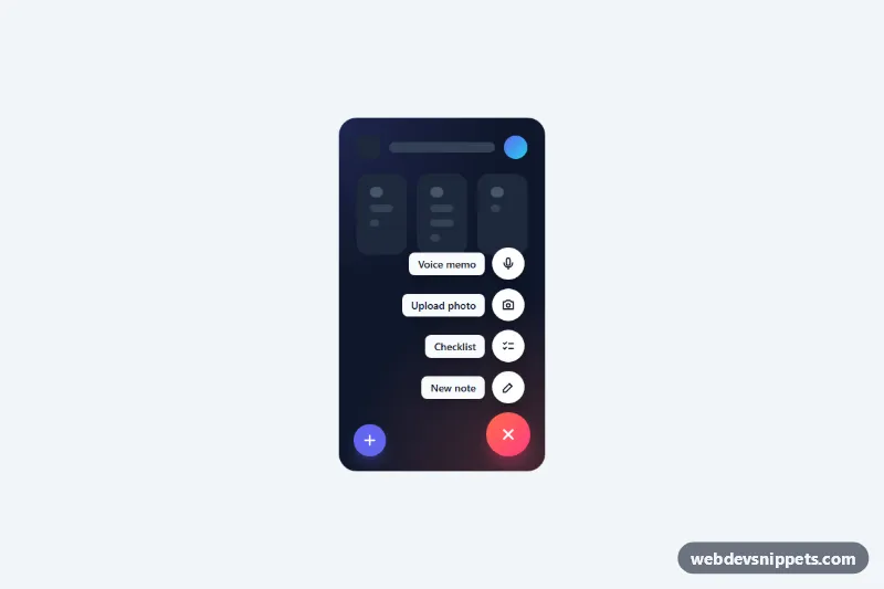
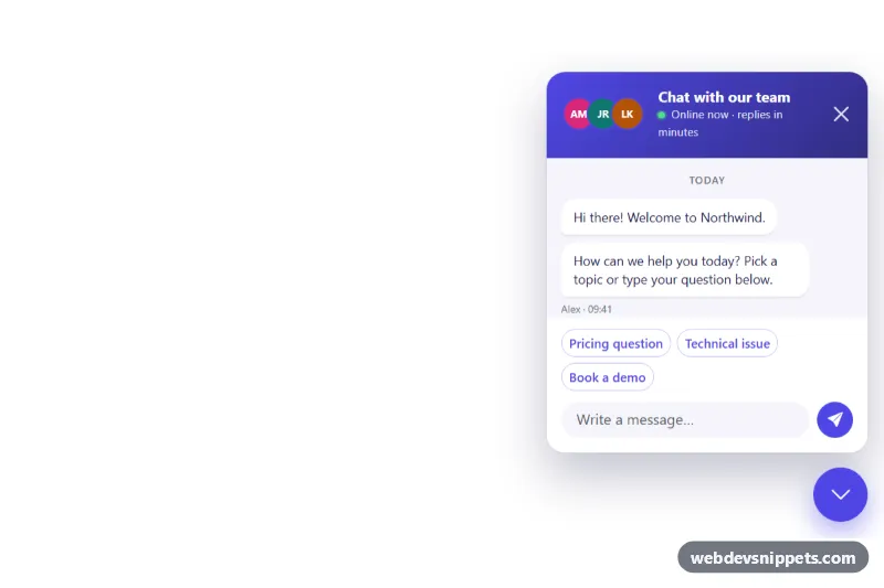
A floating action button (FAB) speed dial in pure CSS and vanilla JavaScript. One round button expands into a stack of smaller action buttons with labels, the way mobile apps offer "create" shortcuts. The demo shows a vertical dial with labels on a dark app mock-up and a compact horizontal dial for share actions.
How it works
The root section.sd-stage holds the mock content, a .sd-status live region and one or more .sd-dial elements. Each dial contains a .sd-toggle button followed by ul.sd-actions, whose .sd-item entries wrap a .sd-action button with a .sd-label and a round .sd-icon. .sd-dial--up stacks the actions above the main button with flex-direction: column-reverse, so the first action in the markup sits closest to the FAB. .sd-dial--row lays them out to the right instead and turns the labels into small tips that appear on hover and focus.
The open state is a single class. When .sd-dial has .is-open, .sd-actions becomes visible, every .sd-item scales and fades in with a staggered transition-delay, and the plus icon rotates into a close icon. While closed, the list uses visibility: hidden, so the actions cannot be reached with Tab.
The script toggles .is-open and aria-expanded on click, closes other dials in the same stage, and closes the dial on an outside click, when focus leaves it, or after an action is chosen. Choosing an action writes a message to .sd-status and fires a bubbling sd:select event with detail.action, which is where you hook in your own code.
Customization
--sd-accentand--sd-accent-2on.sd-stage: the gradient of the main button.--sd-sizeand--sd-mini-size: diameter of the main button and of the action buttons; the vertical list re-centers itself automatically.--sd-gap: spacing between the actions.--sd-speedand--sd-stagger: duration of the open animation and the delay between consecutive actions.--sd-label-bgand--sd-label-text: colors of the label chips.data-sd-actionon each.sd-action: the name sent in thesd:selectevent and shown in.sd-status.- Remove
is-openfrom the first.sd-dialand set itsaria-expandedtofalseto start closed. - Swap
.sd-dial--upfor.sd-dial--rowto change the direction; adjustright,leftandbottomto place it.
Accessibility
The main button has an aria-label, aria-expanded and aria-controls pointing to its list. Each action is a real button whose visible label is its accessible name; icons are aria-hidden. Arrow Up and Down (Left and Right for the row variant) open the dial and move between the actions, Escape closes it and returns focus to the main button. All buttons show a visible focus ring with --sd-focus. With prefers-reduced-motion: reduce the scale and slide animations are removed.
Usage notes
Several stages and dials can share a page. In a real app, change the position: absolute of .sd-dial to position: fixed so the button stays in the corner of the viewport.