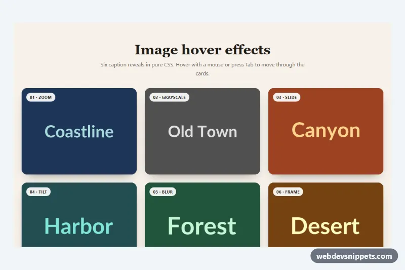
Six image hover effects with captions, written in pure CSS without any JavaScript: zoom, grayscale to color, sliding panel, tilt, blur and an animated frame. Use them for portfolios, project galleries, blog archives, team pages and product category tiles.
How it works
The root section.ih-gallery holds a header and an .ih-grid of figure.ih-card elements. Each card contains an img.ih-img and a figcaption.ih-caption with an .ih-tag, an .ih-title, an .ih-text paragraph and an .ih-link. The caption is absolutely positioned over the image, and the tag stays visible at rest so every tile is labeled.
The effect is chosen with one modifier class per card:
.ih-card--zoomscales the image and slides the caption up on a dark gradient..ih-card--monoshows the photo in grayscale and fades in color and caption..ih-card--slideslides a tinted panel (a::beforeon the caption) in from the left, with staggered text..ih-card--tiltrotates and scales the image while the caption pops in at the center..ih-card--blurblurs and darkens the photo while the title's letter spacing tightens..ih-card--framedraws a thin border in from the center using two pseudo-elements.
Every effect is triggered by :hover and by :focus-within, so keyboard users get the same reveal. The hidden state only applies inside @media (hover: hover); on touch screens the captions are always visible. The .ih-link has a stretched ::after, so the whole card is clickable.
Customization
srcandaltof each.ih-img: replace theplacehold.coplaceholders with your own photos;object-fit: covercrops them to the 4:3 card.aspect-ratioon.ih-card: use1for square tiles or3 / 4for portrait cards.--ih-speedand--ih-easeon.ih-gallery: duration and easing of every transition.--ih-overlay: the dark tint behind captions in the zoom and grayscale effects.--ih-accent: the color of the sliding panel in.ih-card--slide.--ih-radius: the corner radius of the cards.--ih-focus: the color of the outline drawn around a focused card.- Swap the modifier class, e.g.
.ih-card--zoomto.ih-card--frame, to use one effect for the whole grid.
Accessibility
Each figure uses a real figcaption, every image has descriptive alt text, and the link text names its target. Tabbing to a card's link reveals the caption through :focus-within and draws a visible outline around the card. Captions are never hidden from screen readers; they are only faded visually. With prefers-reduced-motion: reduce transitions become instant and images no longer zoom or rotate.
Usage notes
The grid shows one column on phones, two from 640px and three from 960px. The slide panel uses color-mix(), which is supported in all current browsers.