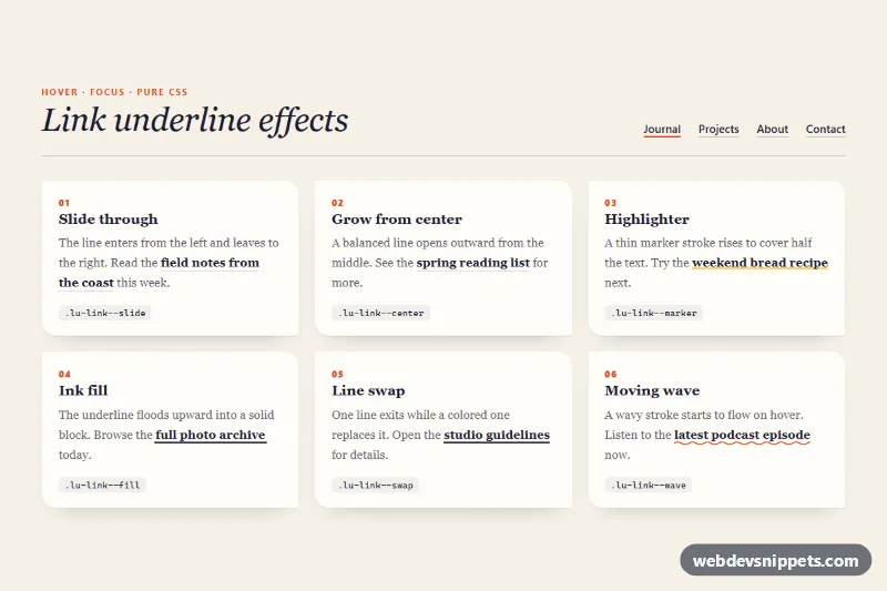
Link Underline Effects
Six animated link underline styles in pure CSS (slide, center, highlighter, ink fill, line swap and wave) that also work on links that wrap.
Interactive hover states for cards, images and links.
2 component(s)
Six animated link underline styles in pure CSS (slide, center, highlighter, ink fill, line swap and wave) that also work on links that wrap.
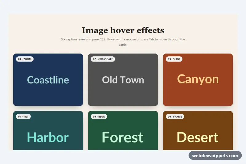
Six pure CSS image hover effects with captions: zoom, grayscale to color, sliding panel, tilt, blur and frame, also revealed by keyboard focus.
Hover effects are visual changes that happen when the pointer moves over an element: cards that lift with a shadow, images that zoom or reveal a caption, buttons that fill with colour, links with animated underlines and tilt or glow effects. They give feedback that an element is interactive and add polish to galleries, product grids, portfolios and navigation.
Use hover effects to support interaction, not to hide it. A subtle change confirms that something is clickable. Avoid putting essential content only in a hover state, because touch devices have no real hover and keyboard users never trigger it unless you also style focus.
Best practices for CSS hover animations:
:hover with :focus-visible so keyboard users get the same feedback.@media (hover: hover) to apply hover-only effects on devices that support them.transform, opacity and box-shadow sparingly; avoid animating width, height or top for better performance.prefers-reduced-motion.Each hover effect has a live preview and code tabs, and most are pure CSS so they work in any stack. Bootstrap 6 versions use the new alpha ES module build and theme-* colour roles, Bootstrap 5 versions combine effects with cards and buttons, Tailwind CSS versions use hover:, focus-visible: and group-hover: utilities, and pure CSS versions use plain selectors and transitions. Filter by framework, copy or download the code and apply the classes to your own cards, images and links.