Icon Buttons with Ripple
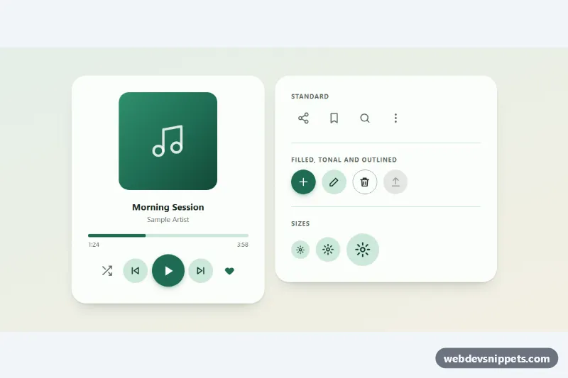
Round icon buttons with a Material-style ripple, toggle states and tooltips: standard, filled, tonal and outlined variants in three sizes.
Buttons with icons only or icon plus text.
2 component(s)
Round icon buttons with a Material-style ripple, toggle states and tooltips: standard, filled, tonal and outlined variants in three sizes.
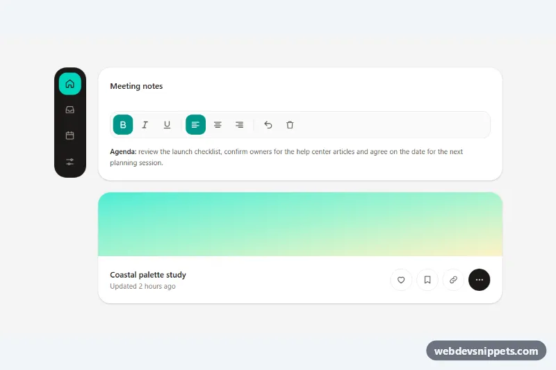
Accessible Tailwind CSS icon buttons with tooltips as labels, toggle states, a keyboard-friendly toolbar, a navigation rail and Escape to dismiss.