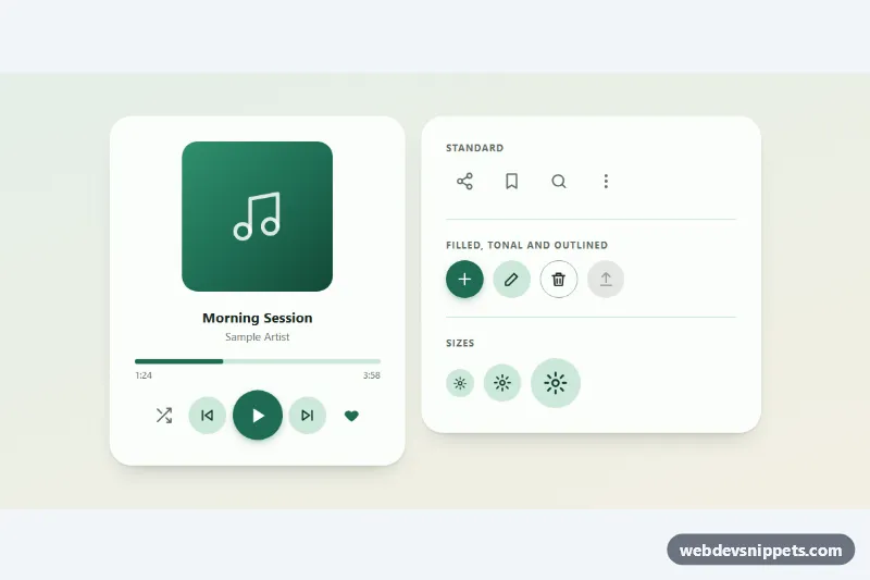
Round icon buttons with a Material-style ripple, built with pure CSS and a small vanilla JavaScript helper. The demo shows them in an audio player card and a panel of standard, filled, tonal and outlined variants in three sizes, ready for toolbars, media controls, cards and app bars.
How it works
The root section.rb-demo holds a .rb-layout grid with two .rb-card panels: .rb-player with .rb-controls, and .rb-variants with .rb-group rows. Every button is a button.rb-btn containing an inline SVG .rb-icon. A ::before state layer uses currentColor at 8% opacity on hover and 12% on focus, and ::after shows a small tooltip from the button's aria-label after a short hover or keyboard focus.
script.js initializes each .rb-demo with delegated listeners. On pointerdown it creates an .rb-ink layer (once per button, clipped to the circle) and appends a .rb-ripple span. The press point and the diameter needed to reach the farthest edge are passed as --rb-x, --rb-y and --rb-d, and the rb-ripple keyframes scale the circle from 0 to full size while fading it out. The span removes itself on animationend. Keyboard clicks (event.detail === 0) start the ripple from the center. Buttons with data-rb-toggle flip aria-pressed, or, when data-rb-label-on is present, switch data-rb-state and the aria-label (Play / Pause). An rb:toggle event bubbles from the button after each change. Without JavaScript the buttons still work, only without ripples and toggles.
Customization
--rb-primaryand--rb-on-primaryon.rb-demo: background and icon color of.rb-btn--filledand of pressed toggles.--rb-tonaland--rb-on-tonal: the soft green fill of.rb-btn--tonaland the progress track.--rb-size: default button diameter (3rem);.rb-btn--smand.rb-btn--lgoverride--rb-btn-size.--rb-ripple-duration: speed of the ripple wave,550msby default.- Add
data-rb-toggleandaria-pressed="false"plus two SVGs with.rb-icon--offand.rb-icon--onto make any button a toggle. - Add
data-rb-label-onanddata-rb-label-offto a toggle to swap its name instead of usingaria-pressed. - Use
.rb-icon--solidon an SVG to fill the shape instead of stroking it.
Accessibility
Each icon-only button has an aria-label, and SVGs are aria-hidden with focusable="false". Toggles expose aria-pressed, while the play button changes its label so the action is always clear. :focus-visible draws a 3px blue outline, and the tooltip also appears on keyboard focus. The disabled upload button uses the native disabled attribute. With prefers-reduced-motion: reduce the script skips ripples and CSS removes transitions.
Usage notes
Several .rb-demo roots can share a page. To use buttons elsewhere, rename the root selector in init or wrap them in an element with the rb-demo class.