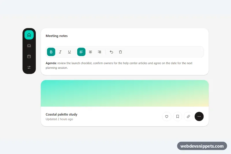
Icon-only buttons with accessible tooltips, built with Tailwind CSS, a few lines of custom CSS and a small vanilla JavaScript helper. The demo combines three common places for icon buttons: a dark vertical navigation rail, a text formatting toolbar and the action row of a content card. Each button gets its accessible name from its tooltip, so the label you see on hover is exactly what a screen reader announces.
How it works
The root is .tib-demo. Every icon button or link sits in a .tib-wrap span together with a <span role="tooltip" class="tib-tip">, and the button points to that tooltip with aria-labelledby. The tooltips are positioned and animated in style.css: they appear when the wrapper is hovered (after a short delay), when its button has keyboard focus (:has(:focus-visible)), or when the script adds tib-show. An invisible ::before bridge keeps the tooltip open while the pointer moves onto it, and ::after draws the arrow. data-tib-placement on the wrapper switches between the default top position, bottom, and right (used by the rail from 768 px up; on phones the rail is horizontal and its tooltips drop below).
script.js initializes each .tib-demo on DOMContentLoaded. Buttons with data-tib-toggle flip aria-pressed; buttons that share a data-tib-group value (the three alignment buttons) behave as a single choice. The role="toolbar" element gets a roving tabindex, so it is one Tab stop and the arrow keys, Home and End move between buttons. The data-tib-copy button copies the page address, swaps its tooltip to the data-tib-done text and announces it through the data-tib-status region. Pressing Escape adds tib-hide to any visible tooltip until the pointer or focus leaves.
Customization
--tib-tip-bgand--tib-tip-fgon.tib-demoinstyle.css: change the tooltip and arrow colors in one place.--tib-delay: the hover delay before a tooltip appears; set it to0sfor instant tooltips.--tib-gap: the distance between the button and its tooltip.data-tib-placement="bottom"or"right"on.tib-wrap: move a tooltip below or beside its button; omit it for the top position.aria-pressed:bg-teal-600 aria-pressed:text-whiteon toolbar buttons: restyle the pressed state, for example withindigo..tib-kbdinside a tooltip: shows a keyboard shortcut; pair it witharia-keyshortcutson the button.COPIED_MSinscript.js: how long the "Link copied" feedback stays visible.
Accessibility
Each icon-only control is named by its role="tooltip" element via aria-labelledby, and every SVG is aria-hidden. Shortcut hints are hidden from the accessible name and exposed through aria-keyshortcuts instead. Tooltips appear on keyboard focus as well as hover, stay visible while hovered and can be dismissed with Escape, which meets WCAG 1.4.13. Toggle buttons expose aria-pressed, the toolbar follows the ARIA toolbar keyboard pattern, the active rail link uses aria-current="page", and all controls have a visible focus outline with targets of at least 40 px. Tooltip motion is removed under prefers-reduced-motion.
Usage notes
Tooltip ids must be unique on the page. Keep tooltip text short, because it doubles as the button name.