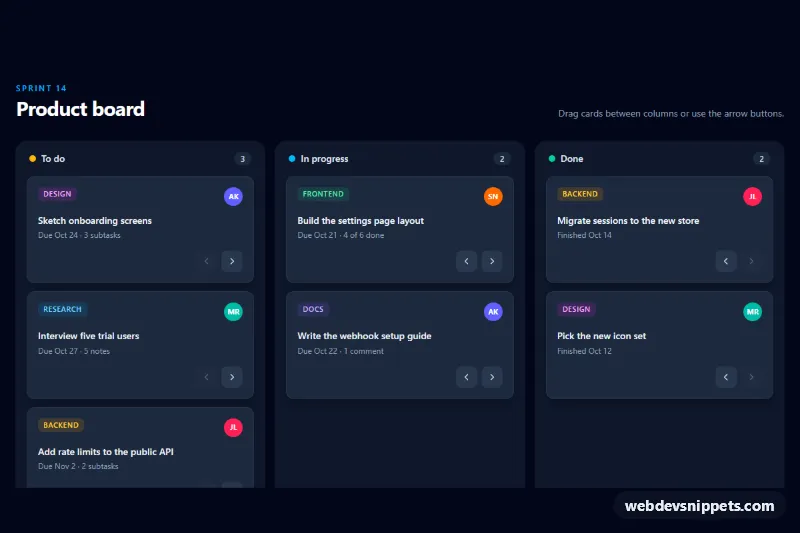
A dark kanban board built with Tailwind CSS and vanilla JavaScript, with three columns (To do, In progress, Done) and task cards that move by native HTML drag and drop or by arrow buttons that work from the keyboard. Use it for sprint boards, project dashboards or content pipelines.
How it works
The root is .tkb-board. Each column is a section.tkb-column with a data-tkb-column attribute that holds its name, a heading, a counter marked data-tkb-count and a ul.tkb-list marked data-tkb-list. Every task is an li.tkb-card with draggable="true", a tag pill, an assignee avatar, a title marked data-tkb-title and two buttons with data-tkb-move="-1" and data-tkb-move="1". On phones the columns sit in a horizontal scroll-snap strip; from the md breakpoint they form a three-column grid.
The script initializes every .tkb-board on DOMContentLoaded and uses delegated listeners on the root. On dragstart it remembers the card and its original position and adds .tkb-dragging. On dragover it finds the card below the pointer by comparing clientY to each card's vertical middle and moves the dragged card there live; .tkb-over highlights the target list. If the drag ends without a drop (for example after Escape), the card returns to where it started. A click on a move button appends the card to the neighbouring column and keeps focus on the button. After every move, refresh() updates the counters and gives each button an aria-label such as "Move "Sketch onboarding screens" to In progress"; buttons in the first and last column are disabled. A :has() rule shows a "Drop tasks here" hint in empty lists.
Customization
data-tkb-columnon eachsection.tkb-column: rename a column; the name is used in button labels and announcements.- Add a fourth
section.tkb-columnand changemd:grid-cols-3tomd:grid-cols-4for a Review column; the move buttons pick it up automatically. bg-amber-400,bg-sky-400andbg-emerald-400on the heading dots: set a status color per column.bg-slate-950,bg-slate-900andbg-slate-800on the root, columns and cards: switch tobg-slate-100,bg-whiteandbg-whitefor a light board..tkb-draggingand.tkb-overinstyle.css: change the look of the dragged card and the hovered drop zone.content: "Drop tasks here"instyle.css: change the empty-column hint text.listOf(target).appendChild(card)inscript.js: useprependto place keyboard-moved cards at the top of the column.
Accessibility
Drag and drop is never the only way to move a card: the arrow buttons are real button elements with descriptive aria-label values and a visible focus-visible outline. Each column is a labelled section with a role="list" list, counters include hidden "tasks" text, and assignee initials are prefixed with hidden "Assigned to". Every move is announced through a role="status" live region. The landing highlight animation is disabled under prefers-reduced-motion: reduce.
Usage notes
Cards only move within their own .tkb-board, so several boards can share a page (use unique heading id values). To persist the order, read the cards in each data-tkb-list after refresh() runs and send them to your API with fetch().