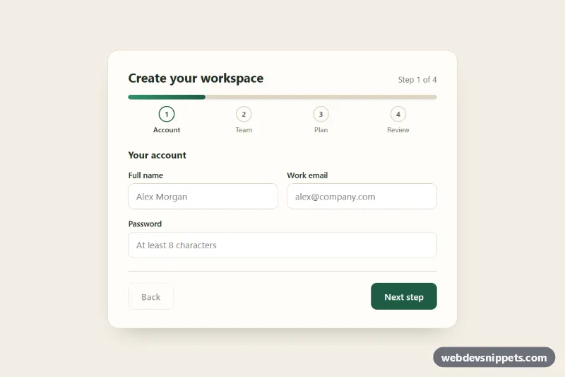
A four-step signup form with a progress bar and numbered step labels at the top, plus Back and Next buttons. Built with plain CSS and vanilla JavaScript, it suits onboarding flows, account creation, checkout or any long form that is easier to fill in small pieces.
How it works
The root form.msf-form sits inside a .msf-wrap background. At the top are the .msf-progress bar with its .msf-progress-fill, and the ol.msf-steps list of .msf-step items. Each step of the form is a fieldset.msf-panel with a data-msf-step number; only the current one is visible, the others carry hidden. The last panel shows a dl.msf-summary whose [data-msf-show] cells are filled from the form data, and a .msf-done message replaces the form after submitting.
The Next button is the form's submit button, so Enter also advances. On submit the script validates only the fields of the visible panel with checkValidity() and an extra email pattern, adds .is-invalid to the wrapping .msf-field to reveal its .msf-error, and focuses the first invalid field. When the step is valid it moves on, sets the --msf-progress custom property on the form (25%, 50%, 75%, 100%) and marks earlier steps with .is-done. The final submit is simulated with a short timeout; replace it with fetch() to your API where the comment says so.
Customization
--msf-accentand--msf-accent-softon.msf-wrap: the color of the progress fill, finished step circles, the primary button and the selected plan card.--msf-bar-height: the thickness of the progress bar, for example4pxfor a thinner line.--msf-speed: the duration of the fill animation and the panel slide-in.--msf-radius: the corner radius of the plan cards and the summary box.- Add a step by copying a
fieldset.msf-paneland anli.msf-step, then update the "of 4" text in.msf-counter; the percentage is calculated from the number of panels. - Edit the messages inside each
.msf-errorto change the validation text.
Use cases
- Account creation: break signup into four short steps with a progress bar on top
- Onboarding flows: numbered step labels show where the user is and what comes next
- Checkout and booking forms: validate each step before moving on and review everything at the end
- Long applications: a Back button lets users fix earlier answers without losing data
- Plan selection: radio plan cards sit inside a step before the final summary
Accessibility
The bar uses role="progressbar" with aria-valuenow updated on every step, and the active .msf-step gets aria-current="step". The step counter is an aria-live region, so screen readers hear "Step 2 of 4". Each panel is a fieldset with a legend. Invalid fields get aria-invalid="true" and aria-describedby pointing to their error text. Focus moves to the first field of each new step and to the success message at the end. The plan cards are real radio inputs with a visible focus ring, and animations are removed under prefers-reduced-motion.
Usage notes
The plan cards use :has() for the selected style; in older browsers the radios still work. Several forms can share a page because the script scopes every query to its own .msf-form.