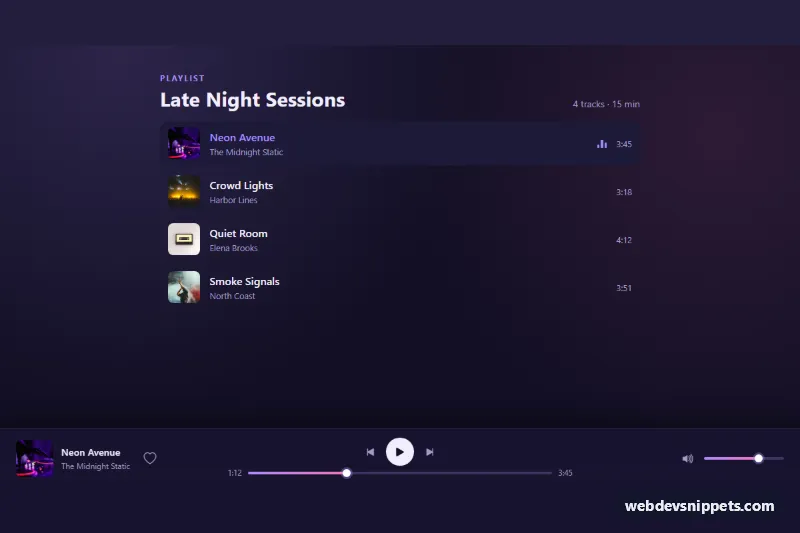
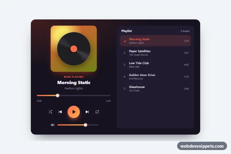
A Bootstrap 5 mini audio player that stays fixed to the bottom of the screen, with cover art, play and skip buttons, a seekable progress bar, volume with mute and a favorite button. A demo playlist above it selects tracks. It fits podcasts, music blogs and band websites.
How it works
The wrapper .ap-root holds a demo playlist (ol.ap-tracks) and the bar itself (.ap-bar), which uses position: fixed at the bottom. The bar is a CSS Grid: on phones it shows the cover, title and the play and next buttons, and the progress bar becomes a thin line along the top edge. From 768px it switches to three columns: now playing (.ap-now), the controls with the timeline (.ap-center) and the volume group (.ap-volume).
Each li.ap-track stores its details in data-ap-title, data-ap-artist, data-ap-cover, data-ap-duration and data-ap-src. Its load() function copies the details into the bar, marks the track with is-current and aria-current, and resets the timeline. When data-ap-src contains a file URL, a real Audio object plays it and the timeupdate, loadedmetadata and ended events drive the progress. When it is empty, as in this demo, a 250 ms interval simulates playback for testing without media files.
One delegated click listener handles the data-ap-action buttons (toggle, prev, next). Previous restarts the song after 3 seconds. The .ap-seek and .ap-vol range inputs listen for input, and a setFill() helper writes --ap-fill so the gradient follows the thumb. The play button toggles is-playing on the root, which animates the small .ap-eq bars of the current track.
Customization
data-ap-srcon eachli.ap-track: add the MP3 or AAC URL to play real audio instead of the simulated clock.data-ap-starton.ap-bar: the start position in seconds for the first track (72 shows a partly played song).--ap-accentand--ap-accent-2on.ap-rootinstyle.css: change the gradient of both sliders, the active track and the equalizer.--ap-bar-bgon.ap-root: change the bar background or its transparency.--ap-bar-heighton.ap-root: bottom padding that keeps page content clear of the bar.value="70"on.ap-vol: set the starting volume in percent.- Remove the
.ap-pagesection to use only the bar on your own pages.
Use cases
- Podcast sites: a fixed bottom bar keeps playback controls in reach while visitors browse
- Music blogs: a clickable playlist loads each track's cover, title and artist
- Band websites: play, skip, seek and volume controls with a mute button and a favorite button
- Demos without audio files: simulated playback lets you test the layout before adding MP3 URLs
- Mobile pages: the bar shrinks to cover, title and play button with a thin progress line
Accessibility
The bar is a role="region" with an aria-label. All icon buttons have labels; the play button switches its aria-label between "Play" and "Pause", and the mute and favorite buttons use aria-pressed. The sliders are native range inputs, so arrow keys work, and they expose readable values through aria-valuetext, such as "1:12 of 3:45". Playlist rows are real buttons with a visually hidden "Play" prefix. Every control has a :focus-visible outline, and the equalizer animation is turned off under prefers-reduced-motion.
Usage notes
Requires Bootstrap 5 (loaded automatically) and Bootstrap Icons. The cover photos come from Unsplash; replace them with your own artwork. Browsers only start audio after a user gesture, which this player respects because playback always begins from a click.