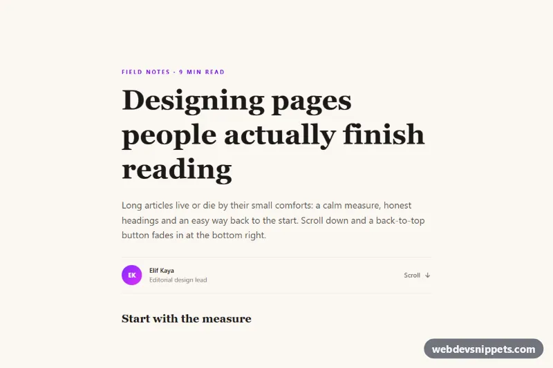
Back to Top Button that Fades In
Floating Tailwind CSS back-to-top button that fades in after scrolling, smooth-scrolls up and returns keyboard focus to the page title.
Small, self-contained interactive widgets.
18 component(s)
Floating Tailwind CSS back-to-top button that fades in after scrolling, smooth-scrolls up and returns keyboard focus to the page title.
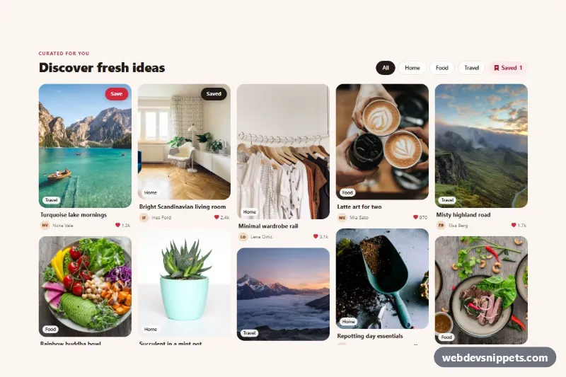
Bootstrap 5 masonry pin board with photo pins, topic filter chips, save buttons and a live saved counter.
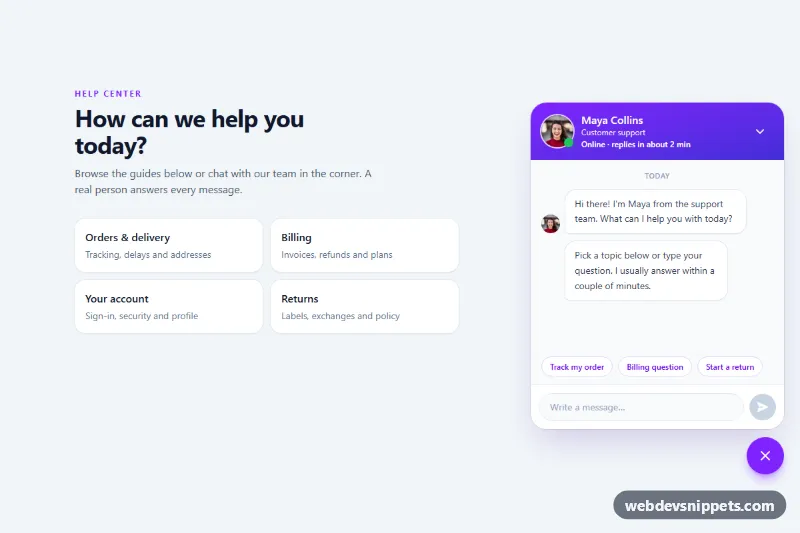
Tailwind CSS support chat popup with an agent photo, online status dot, suggested questions, typing indicator, unread badge and simulated replies.
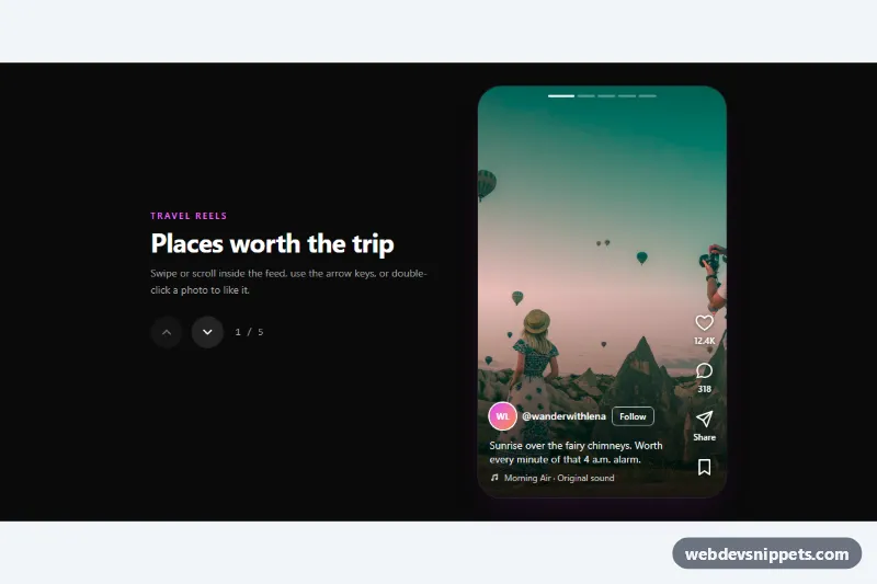
Tailwind CSS reels-style vertical feed with snap-scrolling full-height photos, like, comment, share and save buttons, double-click to like and keyboard navigation.
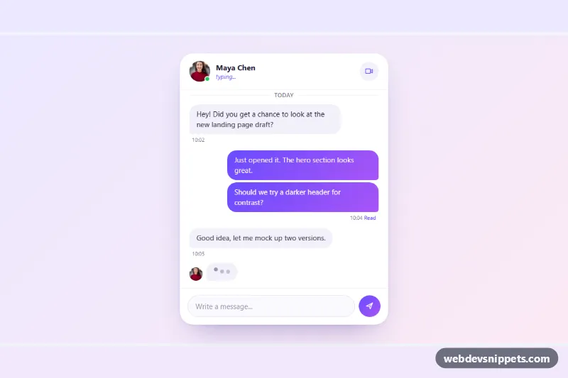
Pure CSS chat window with grouped incoming and outgoing message bubbles, an animated three-dot typing indicator and a working composer.
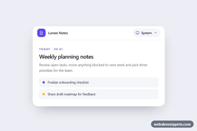
Accessible Tailwind CSS dropdown to choose a light, dark or system theme, with live OS sync, saved preference and CSS variable tokens.
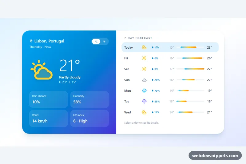
Tailwind CSS weather widget with current conditions, a selectable 7-day forecast with temperature range bars, and a °C/°F switch.
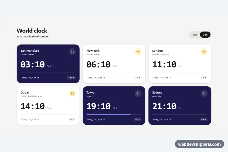
Tailwind CSS world clock with live digital times for six cities, day and night cards, time differences, a 12h/24h switch and the Intl API.
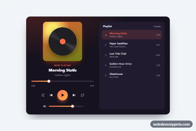
Dark music player card with a spinning vinyl cover, seek bar, play, skip, shuffle and repeat controls, volume slider and a clickable playlist.
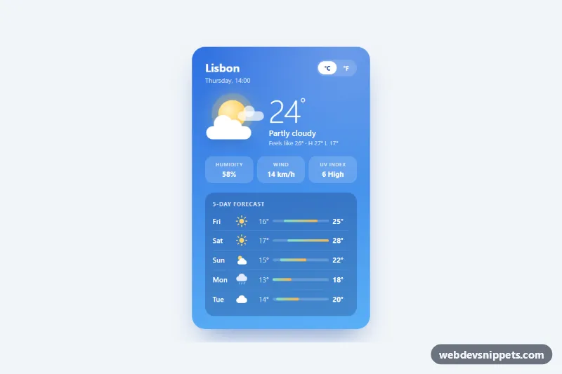
Sky-blue weather card with a CSS-drawn sun and clouds, current conditions, quick stats, a 5-day forecast with range bars and a Celsius/Fahrenheit switch.
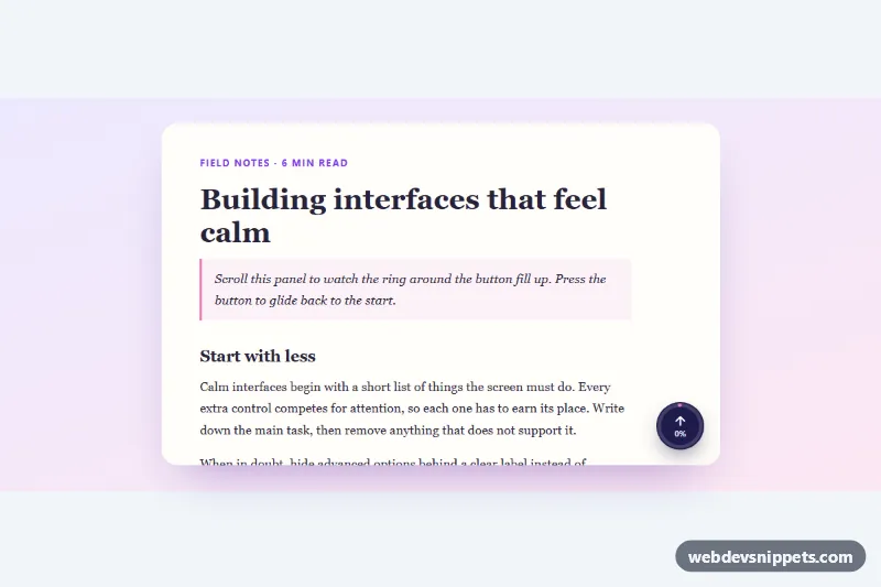
Round back-to-top button with an SVG ring that fills as you scroll, a percentage label and smooth scrolling, for the page or any scroll container.
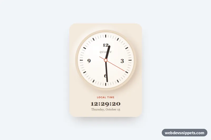
Live analog clock with CSS-rotated hands, conic-gradient ticks, a digital readout and optional time zone support, in pure CSS and vanilla JS.
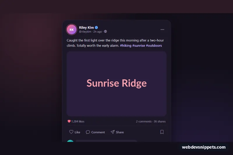
Dark Bootstrap 5 social post card with photo, double-tap like, save, native share with copy-link fallback and an inline comment thread.
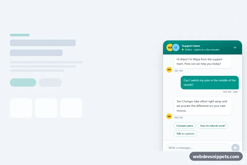
Tailwind CSS support chat widget with floating launcher, unread badge, message bubbles, suggested replies, typing indicator and Enter-to-send input.
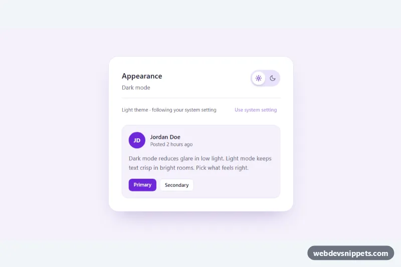
Tailwind CSS dark mode toggle with an animated sun/moon switch that follows the system preference, remembers the choice and can reset to system.
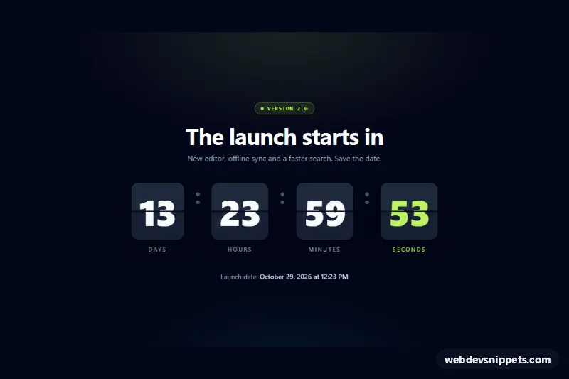
Tailwind CSS flip-clock countdown timer with 3D split-flap cards for days, hours, minutes and seconds, reduced-motion support and a completion event.
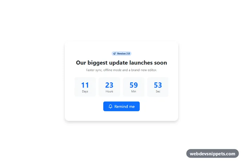
Bootstrap 5 countdown card for product launches with a reminder button.
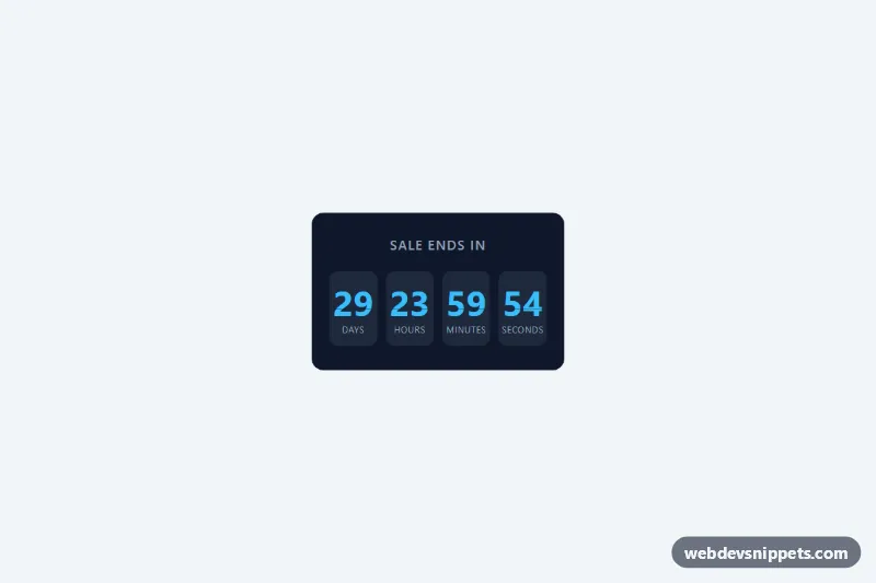
Pure CSS countdown with days, hours, minutes and seconds in flip-style cards.
Widgets are small, self-contained interactive pieces you can drop into almost any page: countdown timers, weather and clock widgets, rating stars, calculators, to-do lists, chat bubbles, back-to-top buttons, copy-to-clipboard boxes, cookie notices, search boxes, theme switchers and similar mini tools. Each one solves a single job and usually needs only a little HTML, CSS and JavaScript.
Use widgets to add useful interactivity without pulling in a large library. They work well in sidebars, dashboards, landing pages and blog posts, or as a starting point when you need a specific behaviour and want to see a clean implementation first. Because they are isolated, they are also easy to test and to remove later.
aria-live where it matters.prefers-reduced-motion.localStorage only when it improves the experience, and handle the case where storage is unavailable.Widgets are offered in Bootstrap 6, Bootstrap 5, Tailwind CSS and pure CSS variants. Many work with plain JavaScript regardless of framework; the Bootstrap 6 alpha versions use its ES module approach and theme-* colour roles, and the Bootstrap 5 versions reuse familiar utility and component classes. Filter by framework, try the widget in the live preview, then copy the HTML, CSS and JS from the code tabs or download it and adapt the options to your needs.