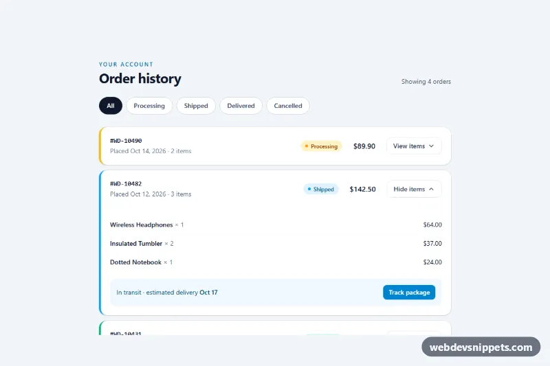
An order history list for customer account pages, built with Tailwind CSS and a few lines of vanilla JavaScript. Each order shows its number, date, item count, a colored status badge and the total, and expands to reveal the purchased items with a context-specific action such as Track package, Return or Buy again. Filter chips at the top narrow the list by status.
How it works
The root is .toh-history. Orders are li elements inside a labelled list; each one carries data-toh-status (processing, shipped, delivered or cancelled) and a matching colored left border. Inside, an article holds a responsive grid: on phones the order number spans the full width with the badge and total below and a full-width toggle button; from sm up everything sits on one row using sm:grid-cols-[1fr_auto_auto_auto].
Every toggle is marked data-toh-toggle and points to its .toh-panel with aria-controls. On click the script flips aria-expanded, toggles the panel's hidden attribute and swaps the data-toh-toggle-label text between "View items" and "Hide items". In style.css, .toh-chevron rotates 180 degrees when its button is expanded and .toh-panel fades in with the toh-reveal keyframes.
The filter chips are buttons with data-toh-filter and aria-pressed. Choosing one hides orders whose status does not match, updates the pressed state (styled with Tailwind's aria-pressed: variant), refreshes the data-toh-count text and shows the data-toh-empty message when nothing matches. Adding data-toh-open to an order li expands it on page load.
Customization
data-toh-statuson eachli: add a new value such asreturned, then add a chip withdata-toh-filter="returned"to filter by it.data-toh-openon an orderli: remove it from the shipped order to start with every order collapsed, or add it to others.border-l-4 border-sky-500on an order: change the stripe color or dropborder-l-4for a plain card.bg-sky-100 text-sky-800on a badge: recolor a status; keep the dot (bg-sky-500) in the same hue.aria-pressed:bg-slate-900 aria-pressed:text-whiteon the chips: change the selected chip style.animation: toh-reveal 0.22sinstyle.css: tune or remove the panel entrance.max-w-3xlon thesection: widen it for a full account dashboard.
Accessibility
Each order is an article labelled by its h3, and dates use time elements with machine-readable datetime values. Toggle buttons expose aria-expanded and aria-controls, and a visually hidden suffix (for example "for order WD-10482") gives every button a unique name. Filter chips sit in a role="group" with an aria-label and report their state through aria-pressed; the result count is a polite role="status" region. The cancelled total is struck through visually and prefixed with a hidden "Refunded" label. All controls are native buttons with visible focus outlines, and the chevron and panel animations are disabled under prefers-reduced-motion.
Usage notes
Panel IDs (toh-o1-panel and so on) must be unique on the page; prefix them when rendering several lists. Wire the action buttons to your own routes.