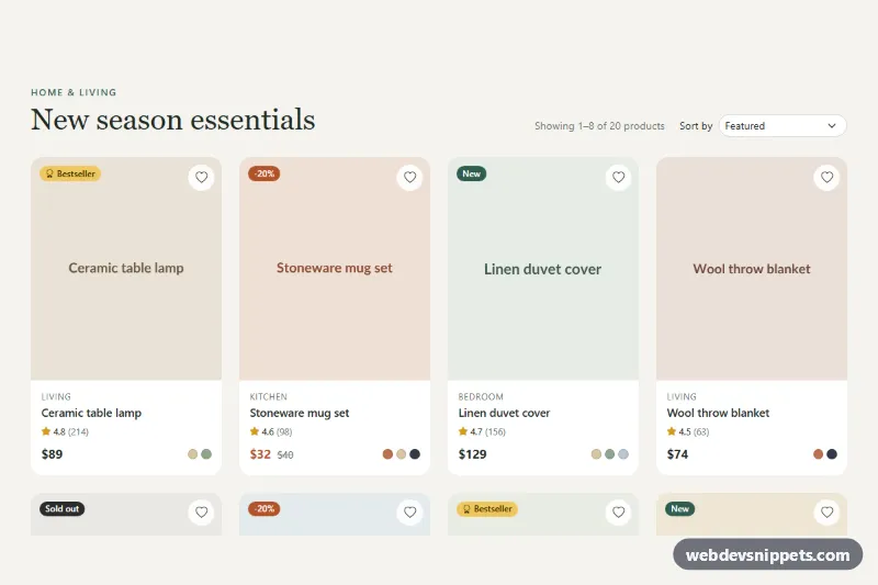
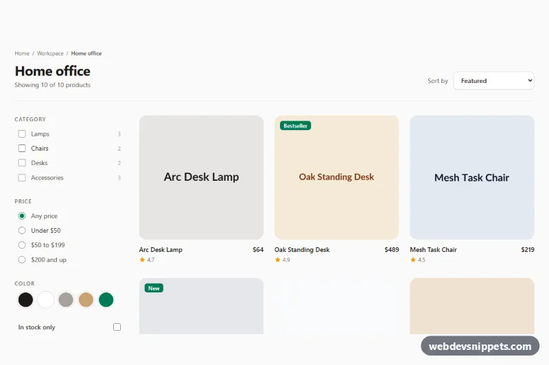
A responsive Bootstrap 5 product listing grid for shop category pages and collection landing pages. It shows twenty sample products with status badges, ratings, sale prices and color swatches, and adds sorting and client-side pagination on top of a standard Bootstrap row.
How it works
The root .pl-shop has a header with the .pl-title heading, a .pl-summary status line and a .pl-sort__select dropdown. Products live in .pl-grid, a row whose .pl-item columns use col-6 col-md-4 col-lg-3, so the grid goes from two to three to four columns. Each .pl-card has an image area (.pl-card__media) with a .pl-badge and a round .pl-wish button, followed by the category, title link, rating, price and .pl-swatches. The .pl-card__link stretches over the whole card with a pseudo-element, while the wishlist button stays clickable above it. Sale prices turn the current price terracotta via :has(.pl-price__old), and .pl-card--soldout greys out the image.
The script reads data-pl-per-page and shows one page of .pl-item elements at a time, building the Bootstrap .pagination inside .pl-pages with previous, numbered and next buttons. Choosing a sort option reorders the columns in the DOM using data-pl-order, data-pl-price or data-pl-rating, then jumps back to page one. Changing pages updates the summary, scrolls to the top of the section and focuses the heading. Without JavaScript all products are visible.
Customization
data-pl-per-pageon.pl-shop: show more or fewer products per page; the page buttons are rebuilt automatically.--pl-accentinstyle.css: changes the "New" badge, the active page button and focus rings.--pl-card-radiuson.pl-shop: make the cards sharper or rounder.- Badge modifiers
.pl-badge--new,.pl-badge--sale,.pl-badge--bestand.pl-badge--soldout: swap or recolor the labels on each card. col-6 col-md-4 col-lg-3on.pl-item: change the column count at each breakpoint, e.g.col-lg-4for three columns.- Add a sort option by adding an
<option>to.pl-sort__selectand a matching function toSORTERSinscript.js. .pl-swatch--sand,.pl-swatch--sageand the other swatch classes: set the dot colors to your product variants.
Accessibility
The summary is a role="status" live region, so page and sort changes are announced. Pagination sits in a labelled nav; the current page has aria-current="page", arrows have aria-label values and disabled ends use the disabled attribute. Ratings are role="img" with text such as "Rated 4.8 out of 5", old prices include a hidden "Was" prefix and color dots are hidden from assistive tech with a text alternative. Wishlist buttons toggle aria-pressed. The whole card shows a focus outline when its link is focused, and hover and scroll animations respect prefers-reduced-motion.
Usage notes
Requires Bootstrap 5 (added automatically) and Bootstrap Icons. For large catalogs, render one page on the server and keep the same markup.