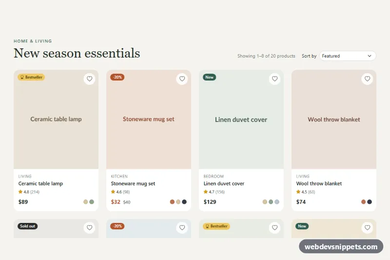
Product Listing Grid
Responsive Bootstrap 5 product grid with sale, new, bestseller and sold-out badges, color swatches, wishlist buttons, sorting and client-side pagination.
Product listings and category pages.
2 component(s)
Responsive Bootstrap 5 product grid with sale, new, bestseller and sold-out badges, color swatches, wishlist buttons, sorting and client-side pagination.
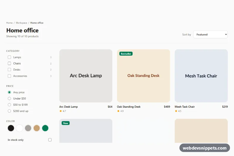
Tailwind CSS category page with a collapsible filter sidebar, live result count, empty state and a product grid sortable by price, rating or date.
A product grid is the listing layout of an online store: a responsive grid of product cards, often combined with a heading, result count, sorting dropdown, filter sidebar and pagination or a "Load more" button. It is used for category pages, collection pages, search results and featured product sections on the homepage.
Mark the grid up as a list (<ul> with <li> items) so screen reader users hear how many products there are. Give the listing a clear heading and announce updated result counts after filtering with a role="status" region. Sorting controls should be native <select> elements or properly labelled buttons. Lazy-load images below the fold, set explicit dimensions to prevent layout shift, and serve appropriately sized images with srcset because product grids are often the heaviest pages of a shop.
These responsive product grid HTML CSS examples come in Bootstrap 6, Bootstrap 5, Tailwind CSS and pure CSS. Bootstrap versions use the row and column grid, Tailwind versions use grid-cols-* utilities and pure CSS versions use CSS Grid with auto-fill and minmax. Bootstrap 6 versions use the theme-* colour roles. Use the live preview to test different widths, then copy the code from the code tabs or download it and feed it with your own product data.