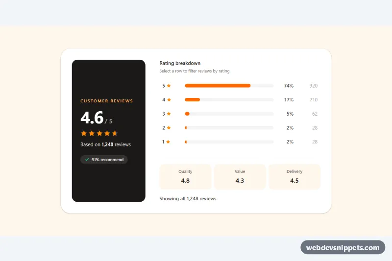
A product rating summary built with Tailwind CSS: a dark score panel with the average rating, partially filled stars and the review count, next to a five-row distribution chart with horizontal bars. Each row doubles as a filter button. It fits product pages, app listings, course pages and any review section in an e-commerce theme.
How it works
The root is .trs-summary. The left panel shows the average in data-trs-average, the review total in data-trs-total and a star row marked data-trs-rating (role="img"). The stars are two stacked layers: five grey stars underneath and five orange stars inside data-trs-stars-fill, an overflow-hidden wrapper whose width (for example w-[92%]) reveals exactly 4.6 stars.
The right side lists one button per rating, marked data-trs-row with data-trs-stars and data-trs-count. Each contains a track with a .trs-fill bar (data-trs-fill), the percentage (data-trs-pct) and, from the sm breakpoint, the raw count (data-trs-num). The markup ships with matching w-[74%] style widths, so it renders correctly without JavaScript. style.css animates each .trs-fill from scaleX(0) on load.
On DOMContentLoaded the script reads every data-trs-count, calculates the total, the weighted average and each percentage, and writes them back into the panel, the bars and the star overlay. Clicking a row sets aria-pressed="true" on it (styled with aria-pressed:bg-orange-100), shows the Clear filter button (data-trs-clear), updates the data-trs-status message and dispatches a trs:filter event with the selected star value. Clicking the same row again removes the filter.
Customization
data-trs-counton eachdata-trs-rowbutton: enter your real counts; the average, total, percentages, bar widths and star fill are recalculated automatically.- Listen for
trs:filteron.trs-summaryand readevent.detail.stars(nullwhen cleared) to filter or load the matching reviews. bg-orange-500on.trs-fillandtext-orange-400on the stars: swap foramber,yelloworemeraldto restyle the chart.bg-stone-900on the score panel: usebg-orange-500orbg-whitefor a lighter look.sm:grid-cols-[13rem_1fr]on the main grid: change the width of the score panel, or drop it to stack the two sections.- The
dlwith Quality, Value and Delivery: these aspect scores are static, so edit or remove them as needed. animation: trs-grow 0.8sinstyle.css: tune the bar entrance speed.
Accessibility
The star row is a single role="img" element with an aria-label such as "Rated 4.6 out of 5 stars"; the individual SVGs are hidden. Every distribution row is a native button with a full aria-label ("5 stars: 920 reviews, 74%") and an aria-pressed state, so screen readers announce it as a toggle. The filter result is announced through the role="status" live region, focus rings are visible on all buttons, and bar animations and transitions are disabled under prefers-reduced-motion: reduce.