
Star Rating Input
Accessible pure CSS star rating input with half stars, built on native radio buttons, hover preview and a live value label.
Star ratings and feedback controls.
2 component(s)
Accessible pure CSS star rating input with half stars, built on native radio buttons, hover preview and a live value label.
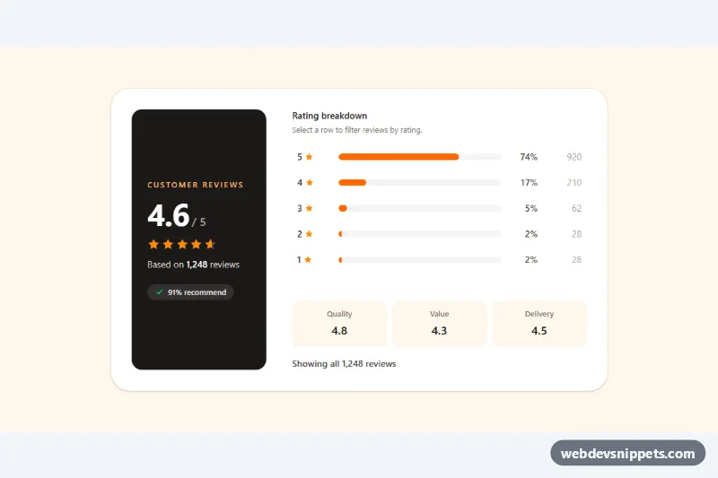
Tailwind CSS review summary with an average score, partial star fill and clickable rating distribution bars that filter reviews.
A rating component lets users give or view a score, most often with stars, but also with hearts, thumbs up and down, emoji faces or numeric scales. Read-only ratings show an average next to products, courses or reviews. Interactive ratings collect feedback in review forms, satisfaction surveys and "was this helpful?" prompts.
<fieldset> with a <legend>, so they work with keyboard and screen readers without extra scripting.aria-hidden="true".The star rating examples here include CSS-only star inputs, read-only rating displays, rating summaries, emoji feedback and thumbs up and down controls. Bootstrap 6 versions use theme-* colour roles for filled states. Bootstrap 5 versions combine form check inputs and utilities with icons, Tailwind CSS versions use peer variants for hover and checked states, and pure CSS star rating versions work without JavaScript. Preview them live, copy the HTML and CSS, and connect the values to your review system.