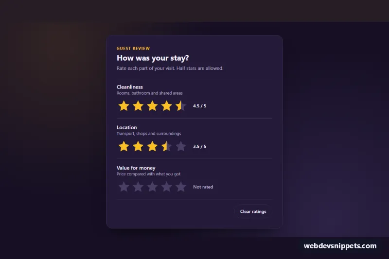
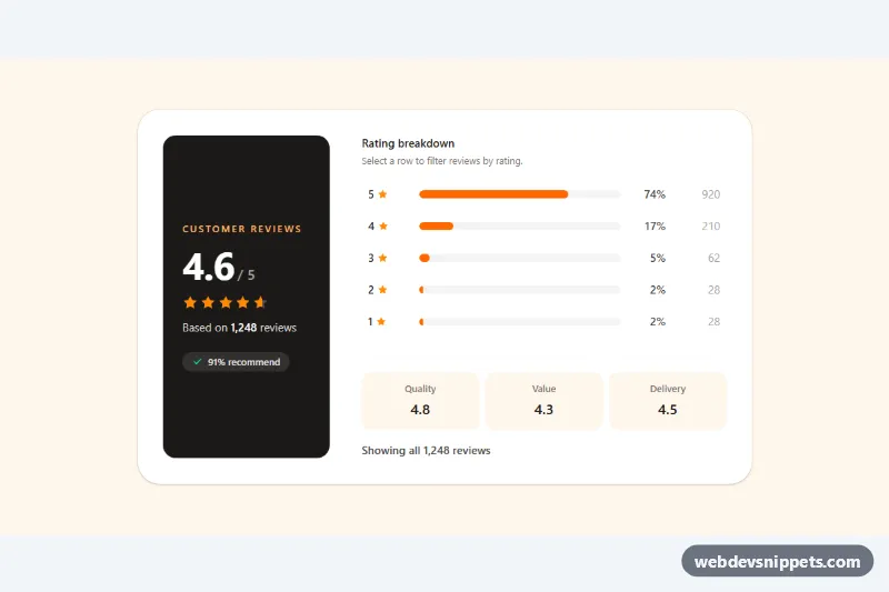
An accessible star rating input in pure CSS with half-star precision, built on native radio buttons. The example is a dark guest review card with three ratings, but the same block fits product reviews, feedback forms and survey questions. No JavaScript is required.
How it works
Each rating is a fieldset.sr-rating with a legend.sr-legend, an optional .sr-hint and a .sr-row. Inside .sr-stars sit ten label.sr-half elements in ascending order, each wrapping a visually hidden input.sr-input radio (values 0.5 to 5) and a hidden text such as "3.5 stars". The labels form a ten-column grid, so every star is split into a left and a right hit area.
The stars themselves are one decorative .sr-track element behind the labels. It is masked with an inline SVG star from --sr-star, repeated horizontally, and painted with a hard-stop linear-gradient whose stop is calc(var(--sr-value) * 20%). Rules such as .sr-rating:has(.sr-input[value="3.5"]:checked) set --sr-value and --sr-label, so the fill and the text in .sr-output follow the checked radio. A second set of :has(.sr-half:hover > ...) rules previews the value under the pointer, and .sr-stars:hover switches the fill to the lighter --sr-hover color. --sr-value is registered with @property, which lets the fill slide smoothly between values. The Clear ratings button is a native type="reset" button that unchecks every radio.
Customization
--sr-on,--sr-hoverand--sr-offon.sr-wrap: color of filled stars, the hover preview and empty stars.--sr-sizeon.sr-wrap: star size; it is2.5remon phones and2.75remfrom 480px.--sr-star: replace the SVG data URI with another shape (heart, circle) to change the icon.- Add
checkedto a different.sr-inputto change the starting value, or remove it to start at "Not rated". - Change the
nameattribute of a group's radios (for examplesr-location) to match the field your backend expects. - Remove
.sr-hintor.sr-outputif you want a more compact row. --sr-card,--sr-bgand--sr-border: the card, page background and divider colors.
Accessibility
Every rating is a real radio group inside a fieldset with a legend, so screen readers announce the question and values like "4.5 stars, 9 of 10". Tab moves into the group and the arrow keys change the value. A focus ring is drawn around .sr-stars through :has(.sr-input:focus-visible). The track and .sr-output are aria-hidden because the radios already expose the value. The fill animation is disabled under prefers-reduced-motion: reduce.
Usage notes
The fill relies on :has(), which is supported in all current browsers. Give each group a unique name; several ratings can live in one form and submit like normal radio fields.