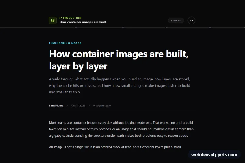
A reading progress bar for long articles, built with Tailwind CSS and a small vanilla JavaScript controller. A sticky dark header shows a glowing gradient bar that fills as you read, clickable chapter markers, the current section name, an estimate of the minutes left and a circular percentage button that jumps back to the start. Use it on blog posts, documentation pages and long-form guides.
How it works
The root is .tsp-reader. Inside it, the sticky .tsp-header holds the section label (data-tsp-section), the article title, the time estimate (data-tsp-time), the .tsp-ring button (data-tsp-top) and the .tsp-track with the .tsp-bar progress element. The text being measured is the element marked data-tsp-article, and every heading marked data-tsp-heading becomes a chapter.
The script initializes each .tsp-reader on DOMContentLoaded. It measures where the article starts (its top meeting the bottom of the header) and where it ends (its bottom reaching the bottom of the viewport), so progress reflects the article rather than the whole page and reaches 100% even when a footer follows. A passive scroll listener schedules one requestAnimationFrame update, which writes the value from 0 to 1 into the --tsp-progress custom property on the root. style.css turns that single number into transform: scaleX() on .tsp-bar and a stroke-dashoffset on the .tsp-ring-value circle, so no layout is recalculated while scrolling.
For every heading with an id, the script appends an a.tsp-tick marker to the track at the heading's position; markers turn light once passed (.is-passed) and scroll to their section when clicked. Positions are re-measured on resize, on load and through a ResizeObserver on the article.
Customization
data-tsp-wpmon.tsp-reader: the reading speed used for the minutes-left estimate; lower it to180for technical content.from-lime-300 via-emerald-400 to-cyan-400on.tsp-bar: swap the gradient stops, for example tofrom-fuchsia-500 to-orange-400.h-1.5on.tsp-track: useh-1for a hairline bar orh-2.5for a bolder one.box-shadowin the.tsp-barrule instyle.css: remove it to drop the glow on light backgrounds.--tsp-speedon.tsp-readerinstyle.css: the smoothing transition of the bar and ring; set0msfor an instant response.data-tsp-heading: remove it from a heading to hide its chapter marker, or add it toh3elements for finer chapters.- Delete the
data-tsp-timeparagraph or the.tsp-ringbutton for a minimal bar; the script skips missing parts.
Accessibility
.tsp-bar has role="progressbar" with aria-label="Reading progress", aria-valuemin, aria-valuemax, and aria-valuenow plus aria-valuetext updated as the percentage changes. The ring button has a descriptive aria-label, while its SVG and number are aria-hidden. Chapter markers are real links with aria-label="Jump to section: ...", reachable by keyboard and shown with a lime focus outline. Under prefers-reduced-motion: reduce the transitions are removed and jumps scroll instantly instead of smoothly.
Usage notes
The header uses sticky, so it stays within its own .tsp-reader; several readers on one page each track their own article. Keep heading id values unique across instances.