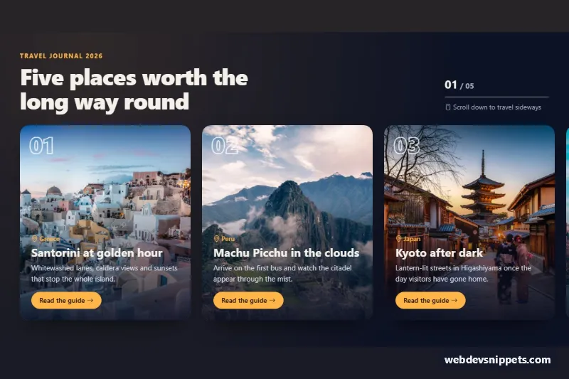
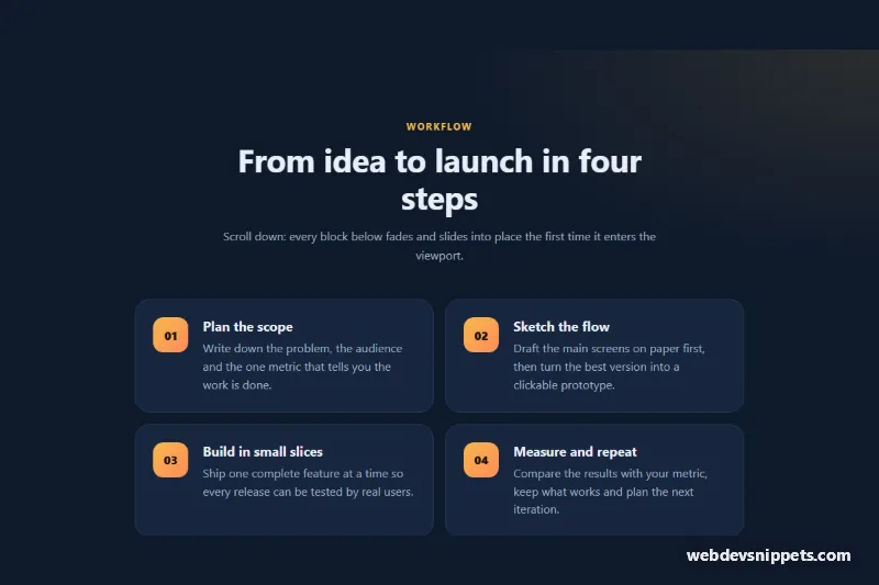
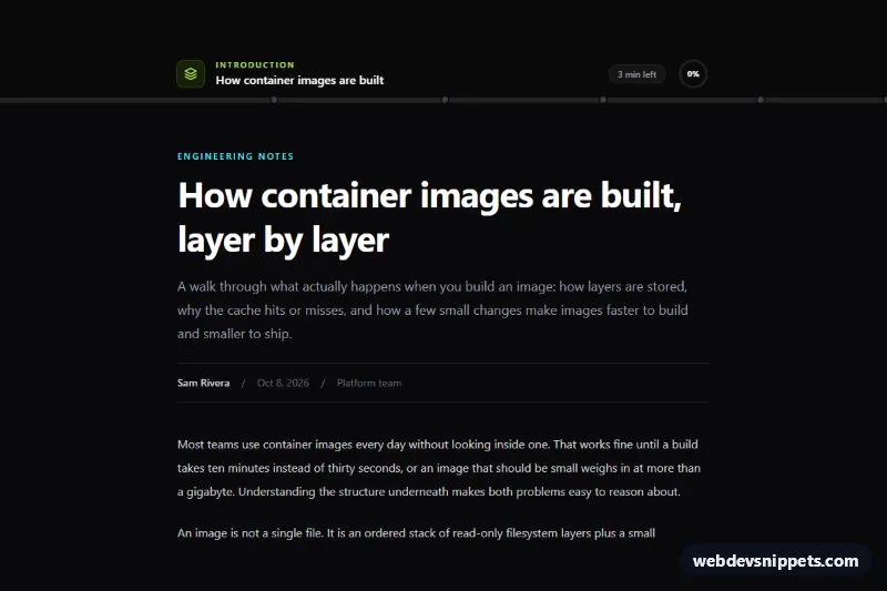
A Bootstrap 5 scroll-driven section that pins itself to the viewport and slides a row of photo cards sideways while the visitor keeps scrolling down. Use it for travel stories, product timelines, case-study reels or any "chapter" sequence on a landing page.
How it works
The root is section.hs-section. Inside it, .hs-sticky holds a container-xl heading row (.hs-head) with a counter (.hs-current / .hs-total) and a Bootstrap progress bar, followed by .hs-viewport and the ol.hs-track of .hs-panel items. Each panel is a Bootstrap card with a full-height photo (.hs-img) and a card-img-overlay that stacks the outlined number, place, title, text and a pill button.
On DOMContentLoaded the script initialises every .hs-section on the page. When the media query (min-width: 768px) and (prefers-reduced-motion: no-preference) matches, it adds .hs-section--pinned, measures how far the track overflows and stores the section height in --hs-height (overflow width plus one viewport height). .hs-sticky then becomes position: sticky and a requestAnimationFrame-throttled scroll listener converts the vertical scroll position into --hs-shift, which moves the track with translate3d. The same progress value drives --hs-progress (the bar's scaleX) and the 01 / 05 counter. Measurements are refreshed on resize, load and media query changes.
Without JavaScript, on phones or with reduced motion, the section stays at its natural height and .hs-viewport becomes a normal horizontal scroller with scroll-snap-type: x mandatory; when the script runs, the counter and bar then follow scrollLeft.
Customization
--hs-accenton.hs-sectioninstyle.css: changes the eyebrow, place labels, progress bar and the button color.--hs-bgand--hs-ink: switch the dark navy background and the light text to your brand palette.--hs-panel-w: set the card width (defaultmin(82vw, 360px)); wider cards mean fewer panels on screen and a shorter scroll.--hs-gap: adjust the space between cards; the pinned distance is recalculated automatically.height: min(62vh, 520px)in.hs-card: make the cards taller or shorter.PIN_QUERYat the top ofscript.js: change the breakpoint where pinning starts, e.g.(min-width: 992px).- Add or remove
li.hs-panelitems;.hs-totalis filled from the number of panels.
Accessibility
The section is labelled by its heading through aria-labelledby, and the cards are an ordered list so screen readers announce the count. The progress bar has role="progressbar", an aria-label and an updated aria-valuenow; the visual counter is aria-hidden. When a keyboard user tabs to a "Read the guide" button in pinned mode, a focusin handler scrolls the page so that panel slides into view, and the button has a white focus ring. Every photo has descriptive alt text, and prefers-reduced-motion: reduce disables both the pinned effect and the image zoom.
Usage notes
Requires Bootstrap 5 (added automatically) and Bootstrap Icons. Place content above and below the section so the pinning is visible on a real page. The photos come from Unsplash; replace them with your own images.