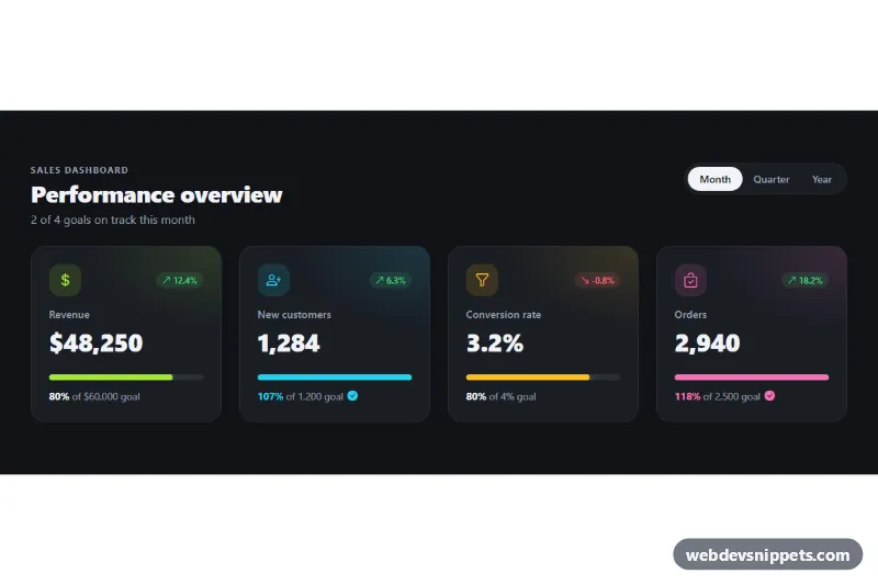
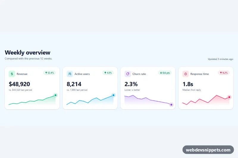
A dark Bootstrap 5 KPI card grid that shows four business metrics with a trend badge, a goal progress bar and a Month / Quarter / Year switch. Use it at the top of admin dashboards, sales reports and analytics pages.
How it works
The root is section.kp-kpis. The header holds the title, the .kp-summary line and the .kp-period button group, built from Bootstrap btn-check radio inputs. The cards sit in a row row-cols-1 row-cols-sm-2 row-cols-xl-4, so they stack on phones, form a 2×2 grid on tablets and a single row on wide screens.
Each article.kp-card stores its numbers as JSON in data-kp-month, data-kp-quarter and data-kp-year, for example {"value":48250,"goal":60000,"trend":12.4}, and data-kp-format (currency, number or percent) decides how they are printed with Intl.NumberFormat. On DOMContentLoaded the script renders the checked period: it fills .kp-value and .kp-goal__target, computes the goal percentage, sets the .progress-bar width (capped at 100%) and swaps .kp-trend--up / .kp-trend--down with the matching arrow icon. Cards at or above their goal get .kp-card--met, which colors the percentage and adds a check icon. Listening for change on the radios re-renders every card and updates .kp-summary ("3 of 4 goals on track this year"). The bars grow with a CSS width transition.
Customization
--kp-bg,--kp-surface,--kp-border,--kp-textand--kp-mutedin.kp-kpis: retheme the section, for example with light colors for a light dashboard..kp-card--lime,.kp-card--cyan,.kp-card--amberand.kp-card--pink: each sets--kp-toneand--kp-tone-rgb, which color the icon, the glow and the progress bar. Add your own modifier with two variables.data-kp-month,data-kp-quarteranddata-kp-yearon.kp-card: replace the sample JSON with real values from your API.data-kp-formaton.kp-card: switch betweencurrency,numberandpercent; edit thecurrencyformatter inscript.jsto show EUR or GBP.--kp-upand--kp-downin.kp-kpis: change the colors of positive and negative trend badges.--kp-bar-heightin.kp-kpis: make the progress bars thicker or thinner.row-cols-xl-4on the card row: userow-cols-xl-3for three metrics per row.
Accessibility
The section is labelled by #kp-title, and the period switch is a role="group" with a label, so it works with Tab and arrow keys like any radio group and shows a visible outline on focus. Each .progress element has role="progressbar", an aria-label, aria-valuenow and an aria-valuetext such as "118% of goal", so overachieved goals are read correctly. Trend badges include visually hidden text, and .kp-summary is a polite live region that announces the new totals after a period change. Icons are aria-hidden. The bar transition and card hover lift are disabled with prefers-reduced-motion: reduce.
Usage notes
Requires Bootstrap 5 and Bootstrap Icons. The bar widths are set by script.js, so without JavaScript the numbers and percentages are still shown but the bars stay empty. Several .kp-kpis sections can live on one page; give each a different radio name and unique id/for pairs.