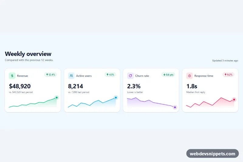
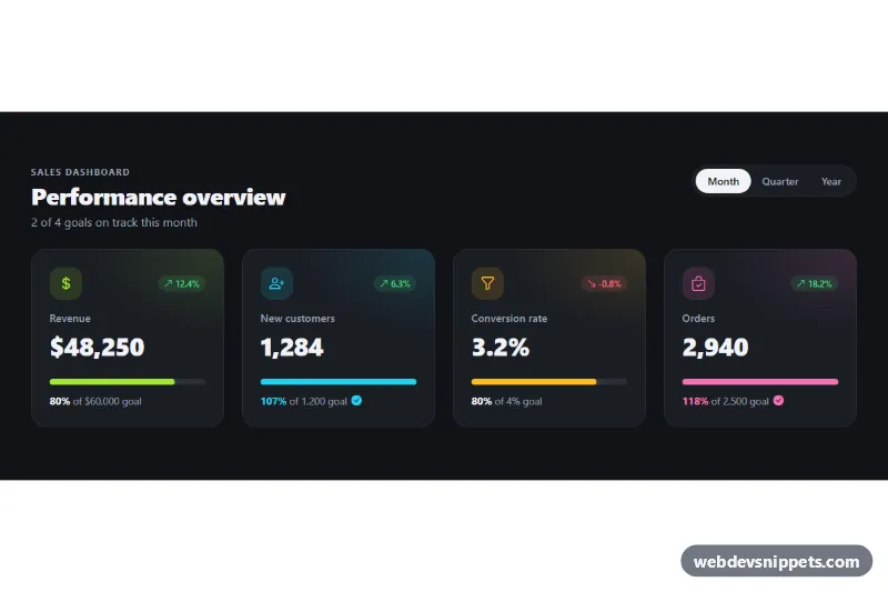
A row of KPI stat cards built with Tailwind CSS, each with an icon, a large value, a change percentage pill and a mini sparkline drawn as inline SVG. It fits analytics dashboards, admin home screens, SaaS billing pages and weekly report emails rendered on the web.
How it works
The root is .tsc-root. The cards are li elements marked data-tsc-card inside a responsive grid: one column on phones, two from sm and four from lg. Each card holds a heading with a tinted icon, a change pill (green bg-emerald-50 for good news, red bg-rose-50 for bad), the value in tabular-nums so digits line up, a comparison line and an empty .tsc-spark box.
The sparkline data lives in markup: .tsc-spark carries data-tsc-points, a comma-separated list of numbers, and data-tsc-label, a short description. On DOMContentLoaded the script reads the points, scales them between the minimum and maximum, and builds an SVG with a viewBox of 120 by 40 and preserveAspectRatio="none", so it stretches to any card width. It draws a line path with vector-effect="non-scaling-stroke" (the stroke stays 2px), an area path filled with a vertical linearGradient (unique id per card), and an HTML .tsc-dot positioned on the latest value. Every color uses currentColor, so the text color class on .tsc-spark controls the whole chart.
style.css sizes the SVG to its box, draws a halo around .tsc-dot and lifts the card on hover, widening the halo at the same time. Without JavaScript the cards still show every number; only the chart is missing.
Customization
data-tsc-pointson.tsc-spark: paste your own series, e.g."5,8,6,9,12"; any length of two or more works.text-emerald-500on.tsc-spark: change to any text color to recolor the line, area and dot together.h-14on.tsc-spark: make the chart taller (h-20) or flatter (h-10).WIDTH,HEIGHTandPADinscript.js: adjust the internal aspect and the padding above the highest value.'stop-opacity': '0.28'inscript.js: strengthen or remove the area fill under the line.- Swap the pill classes between
bg-emerald-50 text-emerald-700andbg-rose-50 text-rose-700based on whether a change is good or bad, as the churn card shows, where falling is green. sm:grid-cols-2 lg:grid-cols-4on the list: show three cards per row withlg:grid-cols-3.
Accessibility
Cards are list items with real h3 headings. Arrows and icons are aria-hidden; the pill includes sr-only text such as "Increased by" or "Improved, down by", so the direction is never conveyed by color alone. Each sparkline has role="img" and a generated aria-label that states the first, latest, lowest and highest values. The hover lift and halo transitions are disabled under prefers-reduced-motion: reduce, and all text meets WCAG AA contrast on white.
Usage notes
Several .tsc-root sections can share a page. To show live data, fill data-tsc-points on the server or after a fetch() call; drawSparkline in script.js clears the box before drawing, so you can expose it and call it again whenever the numbers change.