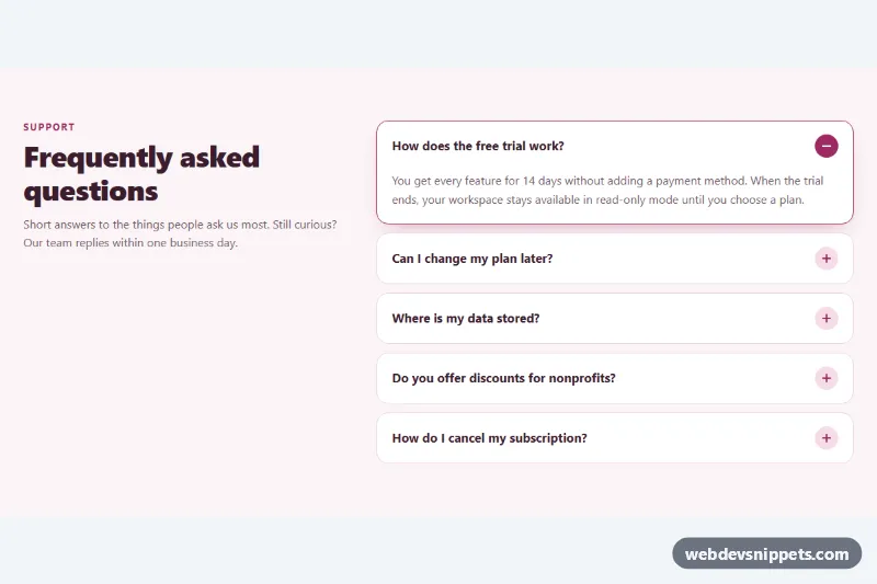
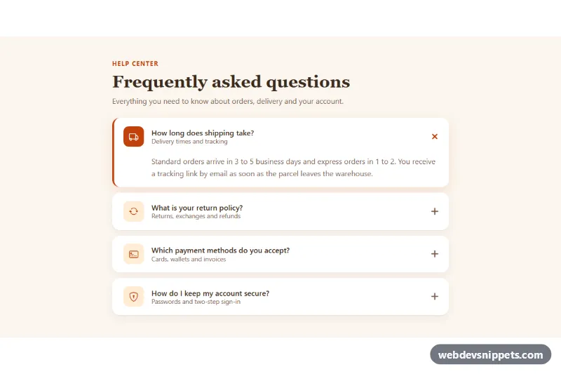
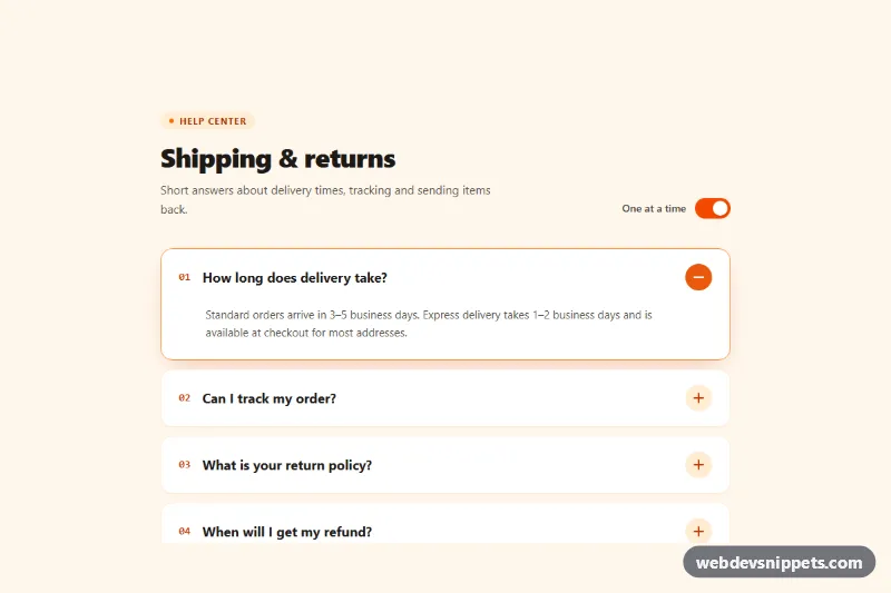
A FAQ accordion built only with HTML and CSS, using the native details and summary elements. Items open with a smooth height animation, the plus icon turns into a minus, and only one answer is open at a time, all without a single line of JavaScript. Use it for FAQ pages, help centers, pricing page questions or product spec sheets.
How it works
The root section.acd-faq is a grid with an .acd-intro column (kicker, heading and lead text) and an .acd-list of details.acd-item elements. Each item has a summary.acd-summary containing the .acd-question text and a decorative .acd-icon, followed by an .acd-panel with the answer.
The browser handles opening and closing: clicking the summary, or pressing Enter or Space on it, toggles the open attribute. All items share name="acd-faq", which turns them into an exclusive group, so opening one closes the others. The default triangle is hidden with ::-webkit-details-marker and ::marker.
The animation has two layers. In browsers that support the ::details-content pseudo-element, .acd-item::details-content animates block-size from 0 to auto, which works because .acd-faq sets interpolate-size: allow-keywords; the content-visibility transition with allow-discrete keeps the content visible until the closing animation ends. In every browser, the acd-reveal keyframes fade and slide the .acd-panel in when an item opens. The .acd-icon is drawn from two pseudo-element bars; when the item is [open] the vertical bar rotates flat, the circle fills with the accent color and spins half a turn. From 900px the intro and list sit side by side and the intro stays sticky while you scroll long lists.
Customization
--acd-accenton.acd-faq: color of the kicker, open border, icon and focus ring.--acd-accent-soft: background of the icon circle on closed items.--acd-speed: duration of the height, icon and fade animations.--acd-radius: corner radius of each item and its focus outline.--acd-bg,--acd-item-bgand--acd-border: section background, item background and resting border color.- Remove the
name="acd-faq"attribute from thedetailselements to let several answers stay open at once. - Remove
openfrom the firstdetailsto start with every item closed. grid-template-columnsin the 900px media query: the width ratio of the intro and question columns.
Accessibility
Native details and summary elements come with built-in semantics: screen readers announce each summary as an expandable control with its expanded or collapsed state, and keyboard users can Tab between questions and toggle them with Enter or Space. The .acd-icon is aria-hidden, so only the question text is read. A clear outline appears on .acd-summary:focus-visible. With prefers-reduced-motion: reduce, the height transition, the fade-in and the icon rotation are all turned off, and items open instantly.
Usage notes
Browsers without ::details-content or interpolate-size still open and close items normally and show the fade-in, just without the height animation. The exclusive name grouping is supported in all current browsers; older ones simply allow several open items. Give each accordion on a page its own name value so groups do not affect each other.