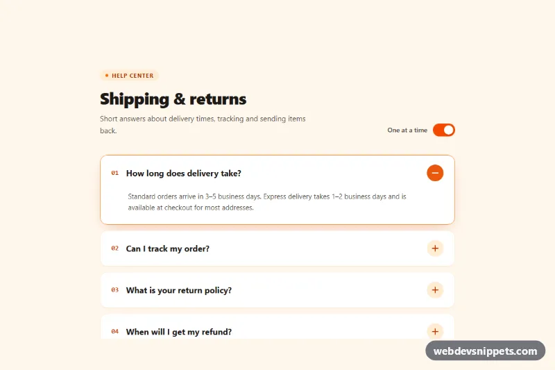
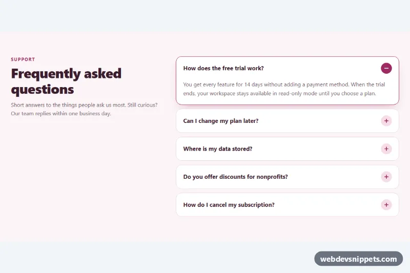
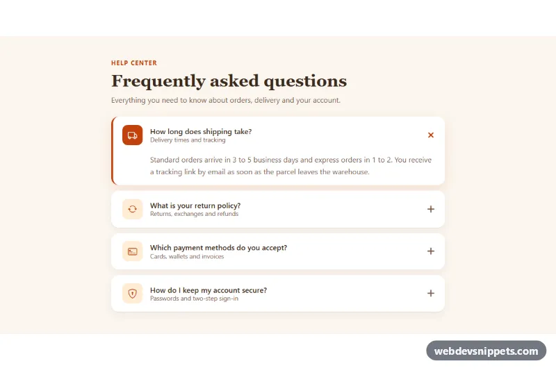
A numbered accordion built with Tailwind CSS and a few lines of vanilla JavaScript, shown as a "Shipping & returns" help section. Each question has a round plus icon that turns half a turn into a minus, and a switch lets visitors choose between single-open mode and opening several answers at once. It fits FAQ and help pages.
How it works
The root is section.tpm-accordion with data-tpm-single="true". Every question is a .tpm-item card containing an h3 with a button.tpm-trigger and a .tpm-panel region. The trigger holds a mono number, the question text and the .tpm-icon circle, which is built from two .tpm-bar lines; the second one, .tpm-bar-v, is rotated 90 degrees to form the plus.
On DOMContentLoaded the script initializes every .tpm-accordion. It reads aria-expanded from each trigger, mirrors it as a data-open attribute on the item and then adds data-tpm-ready to the root. Only from that moment does style.css collapse closed panels, using the grid-template-rows: 0fr to 1fr technique for a smooth height animation without measuring content, plus visibility: hidden so collapsed answers cannot be focused or read. Without JavaScript all answers remain visible and the icons and mode switch are hidden.
A click on a trigger toggles its item. In single-open mode every other item is closed first. On an open item the icon rotates 180 degrees, fills with orange, and .tpm-bar-v returns to 0 degrees so both bars overlap as a minus. The .tpm-switch button flips data-tpm-single between true and false; switching back to single mode keeps only the first open answer.
Customization
data-tpm-singleon.tpm-accordion: setfalseto start in multi-open mode; the switch syncs itsaria-checkedstate on load.- Remove the
.tpm-modewrapper to lock the accordion to the mode set indata-tpm-single. aria-expanded="true"on a.tpm-trigger: choose which answer is open on load, or set all tofalseto start fully collapsed.transform: rotate(180deg)in.tpm-item[data-open] .tpm-icon: userotate(90deg)for a quarter turn, or remove it to keep only the bar animation.background-color: #ea580cin the same rule andborder-color: #fb923con.tpm-item[data-open]: change the open-state accent color.bg-orange-50on the root andbg-orange-100on each.tpm-icon: switch to another Tailwind palette such astealfor a cooler look.0.35sin the.tpm-paneltransitions: speed up or slow down the expand animation.
Accessibility
Each question is a native button inside an h3, with aria-expanded and aria-controls pointing to its panel. Panels use role="region" and aria-labelledby, so they are announced with their question. ArrowUp and ArrowDown move between questions, and Home and End jump to the first and last. The mode switch is a button with role="switch", aria-checked and an aria-labelledby label. Numbers and icons are aria-hidden. Every control shows a 3px orange focus-visible outline, and all transitions are disabled under prefers-reduced-motion: reduce.
Usage notes
Several accordions can share a page because all queries are scoped to each .tpm-accordion; give each copy unique id values for its triggers, panels and switch label.