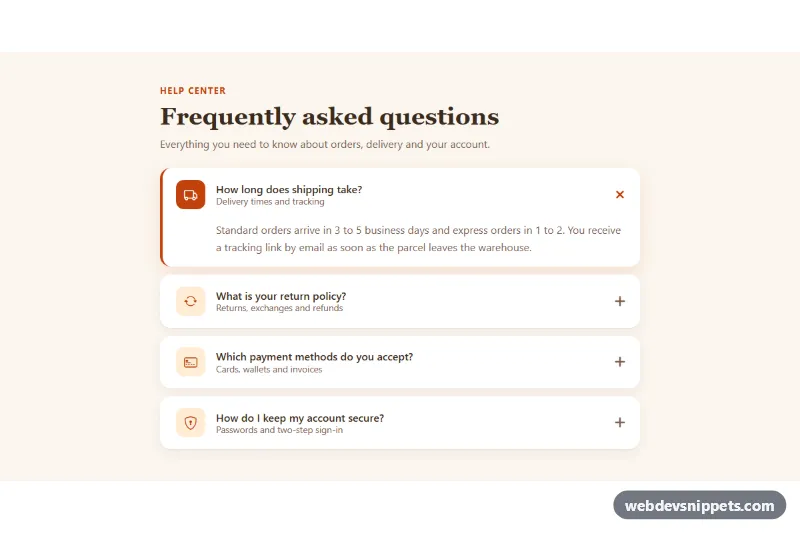
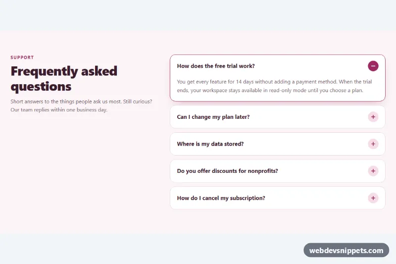
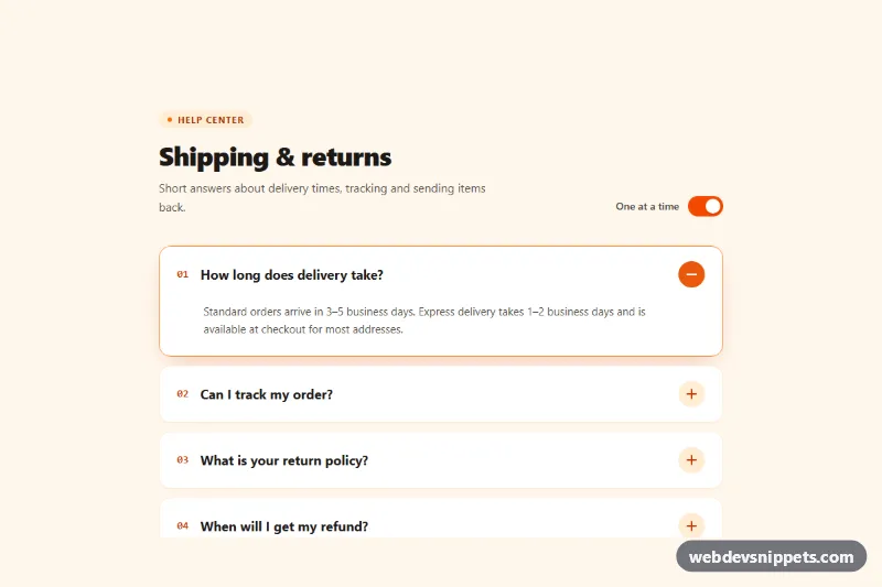
A Bootstrap 5 accordion restyled as a warm FAQ section, with a leading icon tile, a title and a short subtitle in every header, separated rounded cards and a plus icon that turns into a close mark when a panel opens. It fits help centers, product pages, checkout pages and support sections.
How it works
The root section.aci sets the cream background and holds an eyebrow, a serif heading and the .accordion.aci-accordion itself. Each accordion-item contains a h3.accordion-header with an accordion-button. Inside the button, .aci-icon holds a Bootstrap Icon and .aci-label stacks the .aci-title question above the .aci-sub subtitle. The answers live in standard accordion-collapse panels.
There is no custom JavaScript. Opening and closing is handled by Bootstrap's collapse plugin through data-bs-toggle="collapse", data-bs-target and data-bs-parent="#aci-faq", which keeps only one panel open at a time. The styling is done almost entirely through Bootstrap's own accordion custom properties on .aci-accordion: borders are removed, the radius is set from --aci-radius, and --bs-accordion-btn-icon is replaced with an inline SVG plus sign that --bs-accordion-btn-icon-transform rotates by 45 degrees into an "x". The open item gets a terracotta left border and a stronger shadow through :has(.accordion-button:not(.collapsed)), and its .aci-icon switches to a solid accent tile.
Customization
--aci-accentand--aci-accent-softon.aciinstyle.css: recolor the icon tiles, the eyebrow and the active border.--aci-bgand--aci-card: change the section background and the card color, for example to a gray and white scheme.--aci-radius: set to0.5remfor tighter corners or1.5remfor softer cards.- Swap the
bi-truck,bi-arrow-repeat,bi-credit-card-2-frontorbi-shield-lockclasses inside.aci-iconfor any other Bootstrap Icon. - Remove
data-bs-parent="#aci-faq"from eachaccordion-collapseto let several answers stay open at the same time. - Delete
--bs-accordion-btn-icon-transform: rotate(45deg)to keep a plain plus icon, or replace both icon SVGs to use your own chevron. - Remove the
.aci-subspan for a compact, single-line header.
Accessibility
Bootstrap keeps aria-expanded on each button in sync, and aria-controls / aria-labelledby connect every header with its panel. Headers use real <button> elements inside h3 headings, so they are reachable with Tab and work with Enter and Space. Icons are aria-hidden because the question text already explains each item. The focus ring uses --bs-accordion-btn-focus-box-shadow in the accent color and is shown on :focus-visible. Transitions on the card border and icon tile are turned off under prefers-reduced-motion: reduce, and Bootstrap's collapse animation follows the same media query.
Usage notes
Requires Bootstrap 5 with its JS bundle (added automatically) and Bootstrap Icons. For several accordions on one page, give each one a unique id and update the matching data-bs-parent, data-bs-target and panel ids. The :has() highlight is ignored in very old browsers; the accordion still works there.