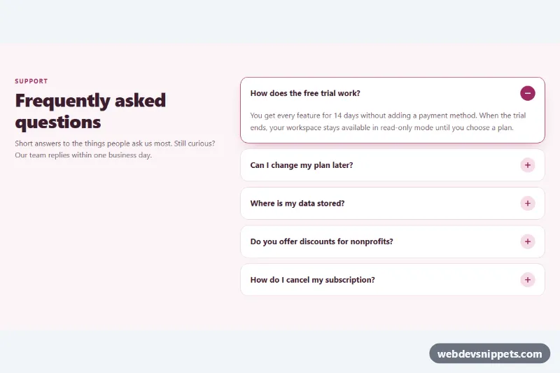
Accordion with details and summary
No-JavaScript FAQ accordion built on native details and summary elements with smooth height animation and one-open-at-a-time behavior.
Collapsible content panels.
3 component(s)
No-JavaScript FAQ accordion built on native details and summary elements with smooth height animation and one-open-at-a-time behavior.
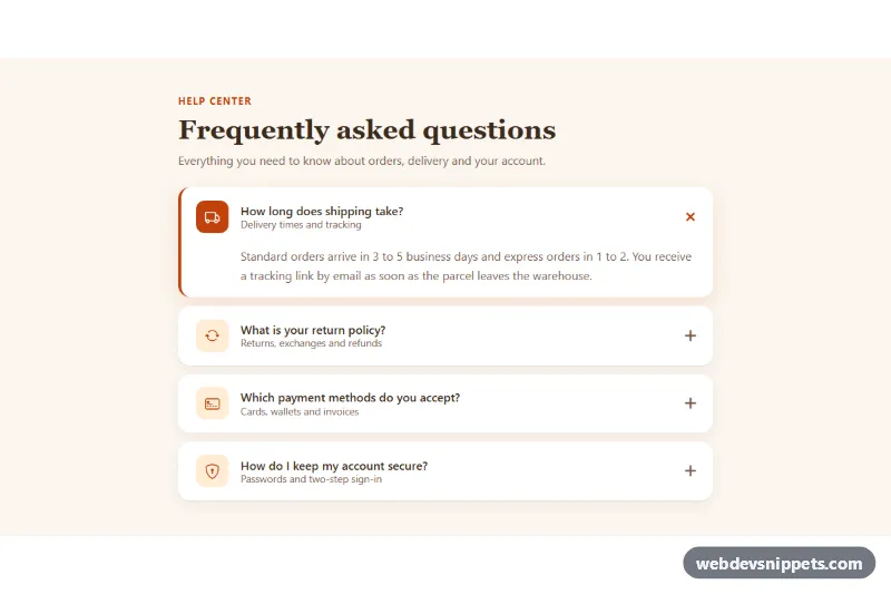
Bootstrap 5 FAQ accordion with leading icon tiles, subtitles, rounded cards, a rotating plus icon and a warm accent color.
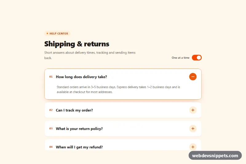
Tailwind CSS accordion with a rotating plus/minus icon, smooth height animation, keyboard navigation and a switch for single-open or multi-open mode.
An accordion is a vertically stacked list of headers that expand and collapse to reveal related content panels. Only the header is visible until the user opens it, which keeps long pages compact. Accordions are widely used for FAQ sections, product specifications, filter groups in shops, settings panels, documentation and mobile navigation.
Use one when content can be split into clearly labelled sections and users usually need only some of them. Avoid accordions for content everyone must read, and for very short content where collapsing adds clicks without saving space.
<details> and <summary> pair, which provides keyboard support and state without JavaScript.<button> inside a heading element, with aria-expanded and aria-controls linking it to its panel.prefers-reduced-motion.The accordion examples are available for Bootstrap 6, Bootstrap 5, Tailwind CSS and pure CSS. Bootstrap 5 versions use the accordion and collapse components with the bundled JavaScript; Bootstrap 6 versions load the JavaScript as an ES module and use the theme-* colour roles. Tailwind CSS versions combine utilities with a small script or <details>, and the pure CSS versions are usually based on <details> and <summary>. Use the framework filter to find bootstrap accordion examples or CSS-only variants, open and close the panels in the live preview, then copy or download the code.