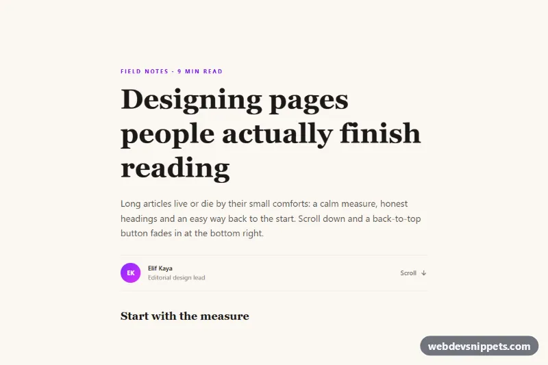
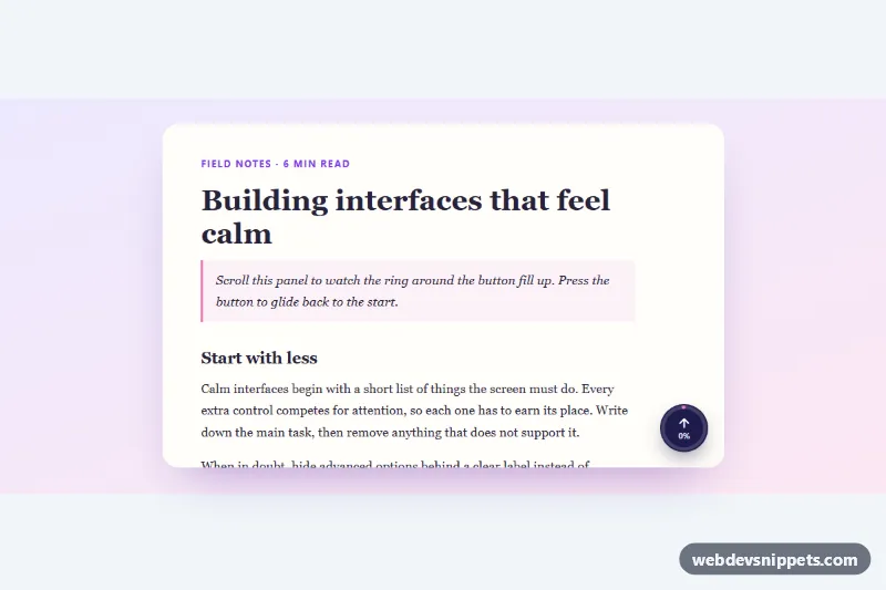
A floating "Back to top" button built with Tailwind CSS that stays hidden at the top of the page, fades and slides in once the visitor has scrolled down, and smoothly scrolls back to the start when clicked. The demo places it on a long-form article, the typical home for this pattern alongside blogs, documentation and long landing pages.
How it works
The demo wrapper .btt-page holds an article whose title, #btt-top, is the scroll target. The button itself is a single link, a.btt-button, positioned with fixed bottom-5 right-5 (sm:bottom-8 sm:right-8 on larger screens) and styled with a violet to fuchsia gradient, an arrow icon and a visible "Back to top" label.
style.css keeps the button invisible by default with opacity: 0, visibility: hidden and a small downward transform. When .btt-visible is added, it transitions to full opacity and its resting position. The visibility transition is delayed while hiding, so the fade finishes before the button leaves the tab order.
script.js finds every .btt-button on DOMContentLoaded and listens to the window scroll event (passive and throttled with requestAnimationFrame). When window.scrollY passes the value in data-btt-offset, it toggles .btt-visible. On click it prevents the default jump, calls window.scrollTo with smooth scrolling (instant under reduced motion) and moves focus to the element named in the link href.
Customization
data-btt-offset="400"on.btt-button: the scroll distance in pixels before the button appears; use150for short pages or1000for very long ones.href="#btt-top": point to any element id, such as your site header or a skip-link target, to control where focus lands after scrolling.bottom-5 right-5andsm:bottom-8 sm:right-8: move the button, e.g.left-5for the opposite corner.from-violet-600 to-fuchsia-500on the button: change the gradient, or replace both with a singlebg-stone-900.- Remove the text "Back to top" and add
aria-label="Back to top"to the link for an icon-only round button (also changepl-4 pr-5top-3). transform: translateY(1rem) scale(0.95)in.btt-button: change the entrance, for exampletranslateX(1rem)for a slide from the side.0.3sin the.btt-buttontransitions: speed up or slow down the fade.
Accessibility
The control is a native link with a visible text label and a decorative aria-hidden icon, so screen readers announce "Back to top, link". While hidden, visibility: hidden keeps it out of keyboard focus and the accessibility tree. After a click, focus moves to the #btt-top heading (which has tabindex="-1"), so the next Tab continues from the top of the content. A focus-visible ring marks keyboard focus. With prefers-reduced-motion: reduce the scroll jumps instantly, the fade and hover lift are disabled and the header's bouncing "Scroll" arrow stops.
Usage notes
Copy only a.btt-button, style.css and script.js into an existing page and point the href at your own top element. The article is demo content. Several buttons work independently if needed, although one per page is typical.