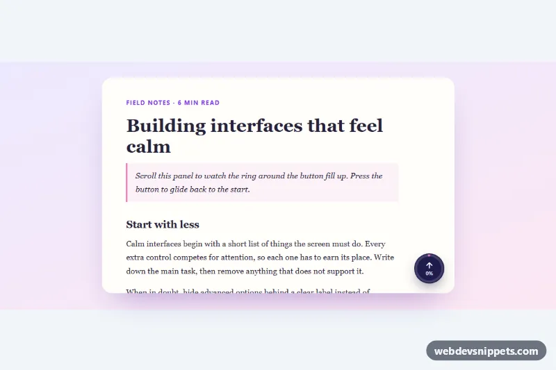
Back to Top Button with Scroll Progress
Round back-to-top button with an SVG ring that fills as you scroll, a percentage label and smooth scrolling, for the page or any scroll container.
Components tagged with "button".
5 component(s)
Round back-to-top button with an SVG ring that fills as you scroll, a percentage label and smooth scrolling, for the page or any scroll container.
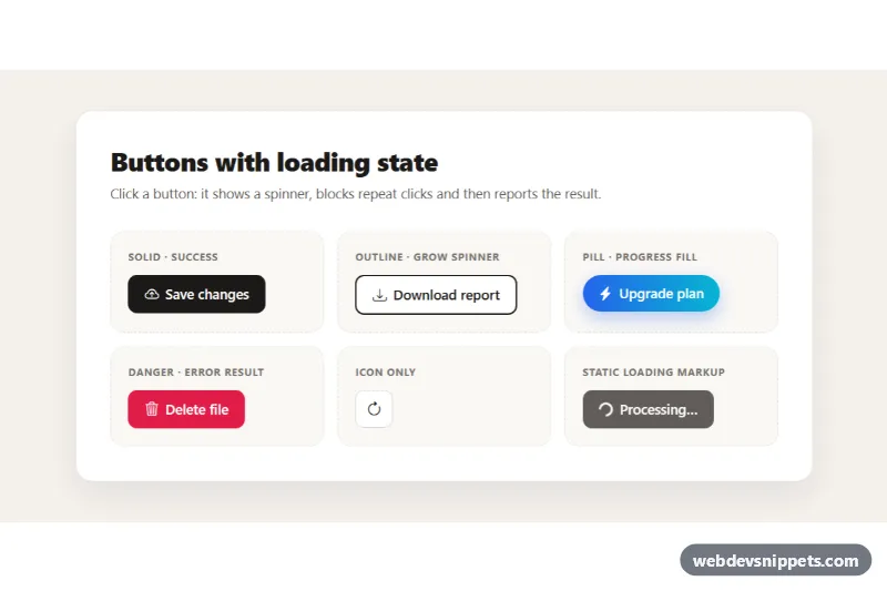
Bootstrap 5 buttons that show a spinner, block repeat clicks while working and then display a success or error state, in solid, outline, pill and icon styles.
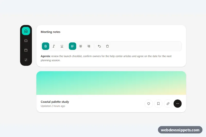
Accessible Tailwind CSS icon buttons with tooltips as labels, toggle states, a keyboard-friendly toolbar, a navigation rail and Escape to dismiss.
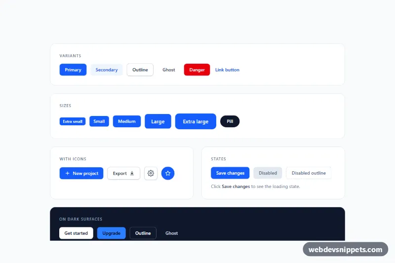
Tailwind CSS button set with primary, secondary, outline, ghost, danger and link variants, five sizes, icon buttons, loading and disabled states.
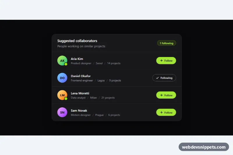
Dark Tailwind CSS user list with initials avatars, online status, meta details and accessible Follow toggle buttons with a live counter.