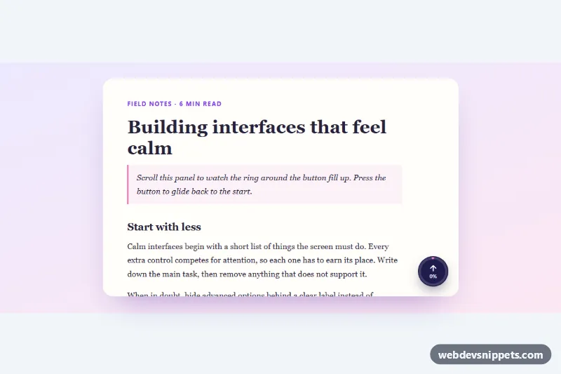
A round back-to-top button with a circular scroll progress ring, built with pure CSS, an inline SVG and a few lines of vanilla JavaScript. The ring fills as the reader moves down the page and a small percentage label sits under the arrow. It suits blogs, documentation, long landing pages and any scrollable panel.
How it works
The component is a single button.bt-top. Inside it, svg.bt-ring draws two circles: .bt-track is the faint full ring and .bt-meter is the progress arc with a gradient stroke. The meter uses pathLength="100" and stroke-dasharray: 100, so its stroke-dashoffset is simply calc(100 - var(--bt-progress)). The ring is rotated by -90 degrees so it starts at twelve o'clock. .bt-inner holds the arrow icon and .bt-pct.
By default the button is position: fixed in the bottom-right corner and tracks window scrolling. In this demo it is placed in .bt-frame next to the scrollable article.bt-scroll, where it becomes position: absolute and tracks that panel instead.
On DOMContentLoaded the script initializes every .bt-top. It listens for scroll (passive, throttled with requestAnimationFrame) and resize, calculates the scrolled percentage, writes it to --bt-progress and .bt-pct, and adds is-visible once the scroll position passes the threshold. Hidden buttons use visibility: hidden, so they cannot be focused. A click calls scrollTo with smooth behavior and moves focus to the element named in data-bt-focus.
Customization
data-bt-targeton.bt-top: a CSS selector of a scroll container; remove it to track the whole page.data-bt-show: the number of pixels scrolled before the button appears (default300); the demo uses0so it is always visible.data-bt-focus: selector of the element that receives focus after jumping to the top, such as the main heading withtabindex="-1".--bt-size: the diameter of the button; the ring and icon scale with it.--bt-bg,--bt-fgand--bt-track: the button fill, the arrow and text color, and the unfilled part of the ring.--bt-offset: the distance from the bottom-right corner of the viewport or frame.- The two
stop-colorvalues in#bt-grad: the gradient of the progress arc. - Remove
.bt-pctfor an icon-only button.
Accessibility
The control is a native button, so Enter and Space work. Its aria-label is updated to read, for example, "Back to top, 42% scrolled", while the icon and visible percentage are aria-hidden. After the jump, focus moves to the heading so keyboard and screen reader users continue from the start instead of being left at the bottom. The button and the scrollable article both have visible :focus-visible outlines, and the article has tabindex="0" so it can be scrolled with the keyboard. With prefers-reduced-motion: reduce the page jumps instantly and all transitions are removed.
Usage notes
For a site-wide button, copy only .bt-top and its styles, drop data-bt-target and place it at the end of body. Several buttons can track different containers on one page.