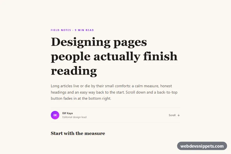
Back to Top Button that Fades In
Floating Tailwind CSS back-to-top button that fades in after scrolling, smooth-scrolls up and returns keyboard focus to the page title.
Scroll-to-top buttons.
2 component(s)
Floating Tailwind CSS back-to-top button that fades in after scrolling, smooth-scrolls up and returns keyboard focus to the page title.
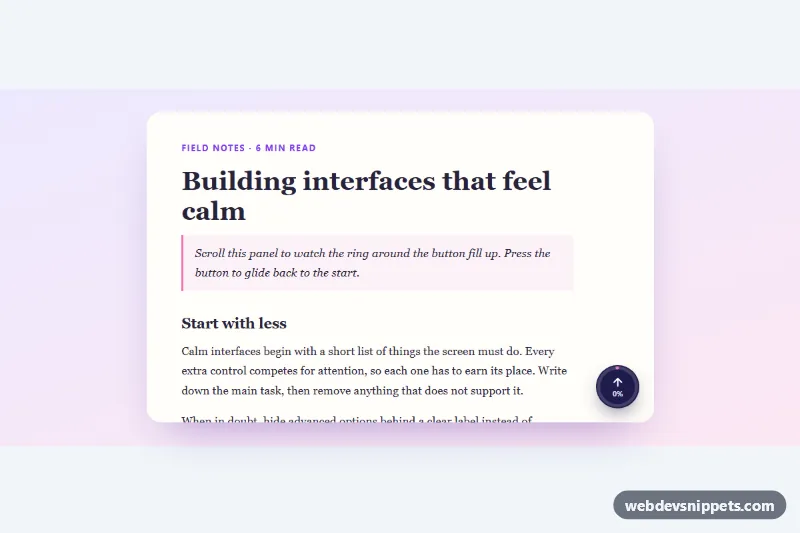
Round back-to-top button with an SVG ring that fills as you scroll, a percentage label and smooth scrolling, for the page or any scroll container.
A back to top button is a small control, usually fixed in a lower corner of the screen, that scrolls the page back to the start. It typically appears after the user has scrolled a certain distance and may show an arrow icon, a label or a circular scroll-progress indicator. You see it on long articles, documentation, product listings and one-page websites.
Add one when pages are long enough that scrolling back up becomes tedious, especially on mobile. On short pages it is just clutter. It works best alongside a sticky header or a table of contents, not as a replacement for good navigation.
Best practices for a back to top button:
<button> or a link to #top so it works with the keyboard, and give it an accessible name such as aria-label="Back to top" when it only shows an icon.scroll-behavior: smooth or window.scrollTo({ top: 0, behavior: "smooth" }), but switch to instant scrolling when prefers-reduced-motion is set.IntersectionObserver or a throttled scroll listener to keep scrolling smooth.Each back to top button has a live preview, code tabs and a copy button. Bootstrap 6 versions use the new alpha ES module build and theme-* colour roles, Bootstrap 5 versions use buttons and position utilities, Tailwind CSS versions use utility classes, and pure CSS versions keep it lightweight with optional vanilla JS. Pick your framework with the filter, copy or download the snippet and change the icon, offset and colours.