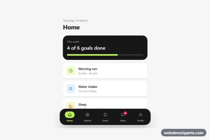
A mobile bottom tab bar built with Tailwind CSS: a dark floating pill fixed to the bottom of the screen with five icon tabs, short labels, a lime active indicator and an unread badge. It is the familiar navigation pattern of native apps, ready for progressive web apps, mobile dashboards and app-like websites.
How it works
The root .tbt-root holds the page content and the nav.tbt-bar, which is fixed inset-x-0 bottom-0 and adds pb-[max(1rem,env(safe-area-inset-bottom))] so it clears the home indicator on modern phones. The wrapper is pointer-events-none and only the inner list accepts clicks, so the empty strip around the floating pill never blocks the page. The list is centered with max-w-md, so it also looks right on tablets and desktops.
Each tab is a link marked data-tbt-tab. Styling comes entirely from the aria-current="page" attribute: aria-[current=page]:text-lime-300 colors the label and group-aria-[current=page]:bg-lime-300 fills the pill behind the icon. script.js initializes every .tbt-root on DOMContentLoaded; a click moves aria-current to the chosen tab and copies its data-tbt-label text into the data-tbt-heading title of the demo screen. Links whose href starts with # are handled in place, real URLs navigate normally.
With data-tbt-hide-on-scroll on the root, a passive scroll listener sets data-away="true" on the bar while the user scrolls down and removes it when they scroll up, and data-[away=true]:translate-y-[130%] slides the bar out of view. The bar always returns when one of its links receives keyboard focus.
Customization
bg-neutral-900on the inner list: change the bar color, e.g.bg-whitewithtext-neutral-500labels for a light theme.aria-[current=page]:text-lime-300andgroup-aria-[current=page]:bg-lime-300: pick a different active color.rounded-[1.75rem]andmax-w-md: userounded-noneandmax-w-nonefor an edge-to-edge bar.- Remove
data-tbt-hide-on-scrollfrom.tbt-rootto keep the bar visible at all times. SCROLL_DELTAinscript.js: how far the user must scroll before the bar hides or returns..tbt-badgeinside the Inbox tab: update the number or delete the span when there is nothing new, along with itssr-onlytext.
Accessibility
The bar is a nav labelled "Primary" with a list of real links, so it is reachable with Tab and announced as navigation. The active tab uses aria-current="page", icons are aria-hidden and every tab has a visible text label; the badge adds ", 3 new messages" for screen readers. The demo title is an aria-live="polite" region, focus outlines are lime and clearly visible on the dark bar, and the hide and color transitions are turned off with motion-reduce:transition-none.
Usage notes
Add enough bottom padding to your page (the demo uses pb-36 on main) so the last content is not covered by the bar.