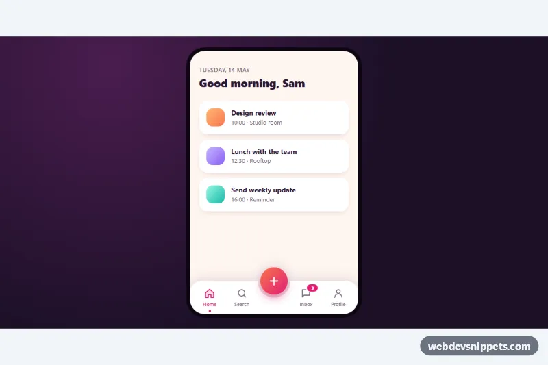
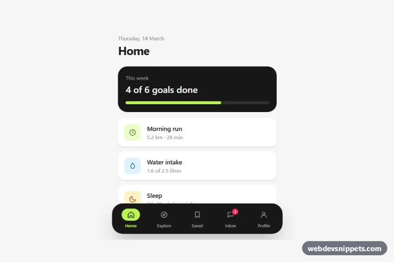
An app-style bottom navigation bar in pure CSS with a raised, gradient center action button that sits in a curved notch and fans out three quick actions. It is shown inside a phone frame and suits mobile web apps, PWAs, social and productivity apps where the main "create" action should always be one tap away.
How it works
The root .bnc-app holds the scrollable .bnc-screen, a .bnc-scrim, the .bnc-actions group and the nav.bnc-bar. The bar is a five-column grid: two .bnc-tab links on each side and a .bnc-center cell in the middle. The white bar background is drawn by .bnc-bar::before, and a radial-gradient mask cuts a half circle out of its top edge. Because the drop-shadow filter is applied to the bar itself, the shadow follows the curve of the notch. The .bnc-fab button is centered on the top edge with translate(-50%, -50%), so it rises out of the notch.
The script listens for click on the center button and toggles the .is-open class on .bnc-app together with aria-expanded. With that class the plus icon rotates into a cross, the scrim fades in, and the three .bnc-action buttons spring from behind the button into an arc (.bnc-action--left, --center and --right). Clicking the scrim, an action or pressing Escape closes the menu. Clicks on a tab move aria-current="page" to that tab, which turns it pink and adds a small dot under the label. Without JavaScript the bar and tabs still render; only the action menu needs the script.
Customization
--bnc-accentand--bnc-accent-2on.bnc-app: the two gradient stops of the center button, plus the active tab, badge and action colors.--bnc-fab-size: the center button diameter; the notch radius is calculated from it, so they always match.--bnc-bar-heightand--bnc-bar-bg: height and background color of the tab bar, e.g. a dark#1f1029bar.--bnc-speed: duration of the springy open and close animation.- Edit the
.bnc-actionbuttons inside.bnc-actionsto change the quick actions, and add your logic in the actionclickhandler inscript.js. - Add
.bnc-bar--fixedto.bnc-barto pin it to the bottom of the viewport in a real app instead of the demo frame.
Accessibility
The bar is a nav landmark labelled "Primary", and the active tab uses aria-current="page". The center button has an aria-label, aria-expanded and aria-controls pointing to the actions group, which has role="group". Closed actions are visibility: hidden, so they are skipped by Tab and screen readers. Escape closes the menu and returns focus to the button. The inbox badge contains hidden text ("3 new messages"), icons are aria-hidden, and every control shows a :focus-visible outline. prefers-reduced-motion: reduce turns off the spring and fade transitions.
Usage notes
Several instances can share a page; give each .bnc-actions a unique id and update aria-controls to match.